I hate this feature but if that UI is real it's beautiful
can you mark a NSFW post as NSFW please ty
You can change it back to a top panel in settings, any major change visible immediately will probably have an option to revert it
Ya I noticed that shreddit uses a similar layout to photon
Ya I use the same code for markdown as lemmy-ui and it has a separate markdown setting for titles so that headers, lists, images, etc don't work in titles
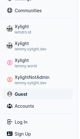
update: in v1.20.0, i've added an explicit guest button which should make it more obvious when you're a guest:

I'll make it more obvious if you're using a guest account later today. (I'll add a "guest" option and show that as selected if you're not active in a user account)
That's a good question you have, and a bad design on my part.
(you can also view all the accounts you have from the accounts page)
Your account isn't active. Click your account on the sidebar to use it.
Bedankt!
Idk but Microsoft does their modern UIs really well. just don't open the properties menu or anything there's nothing there I promise