this post was submitted on 24 Apr 2024
-13 points (37.7% liked)
Programming
17537 readers
122 users here now
Welcome to the main community in programming.dev! Feel free to post anything relating to programming here!
Cross posting is strongly encouraged in the instance. If you feel your post or another person's post makes sense in another community cross post into it.
Hope you enjoy the instance!
Rules
Rules
- Follow the programming.dev instance rules
- Keep content related to programming in some way
- If you're posting long videos try to add in some form of tldr for those who don't want to watch videos
Wormhole
Follow the wormhole through a path of communities [email protected]
founded 2 years ago
MODERATORS
you are viewing a single comment's thread
view the rest of the comments
view the rest of the comments


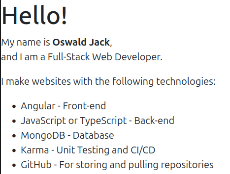
I understand what you're saying, but I designed my website to be short and sweet, something that can be skimmed through and move on.
Can you expound?
I asked ChatGPT to make an ATS friendly change to the About Me section. Is this what you mean, and can it be beautified with the ability for the ATS to go through it
I think we need to take a step back and add some context. Every company will have their own hiring process, but they are mostly the same. Where I work it goes like this.
During this entire process the only people that are going to look at your website are the hiring manager, stake holders, and peers. That is only if they are feeling motived to do additional research on you after having looked at your application and resume. Your application and resume should have already told them that you know the technologies you listed. This means that the user is not rewarded with any additional information. What was the point of me seeing this page? As one of those people interviewing you the only thing this page actually tells me is that you know how to put words on page with a template. That template should be custom and look amazing.
Jeff Geerling’s website is a good example for content. The design isn’t something I would expect from a front end developer, which he is not.
https://www.jeffgeerling.com/ https://www.jeffgeerling.com/about
Nowhere does he have a list of icons of technologies used. You learn that he knows how to use git by the link to his GitHub profile. He doesn’t have a dedicated contact page. The only thing that is really needed is mention an email address on the about page and links to socials. It’s almost like he shows us his skills instead of telling us about them.
I see so make the website look like a resume, genius.