Man, that's really impressive
Fantastic work!
I think if there's anything different responsible for the intensity, its in the brow. But frankly I think you definitely got a whole lot of intensity in your version
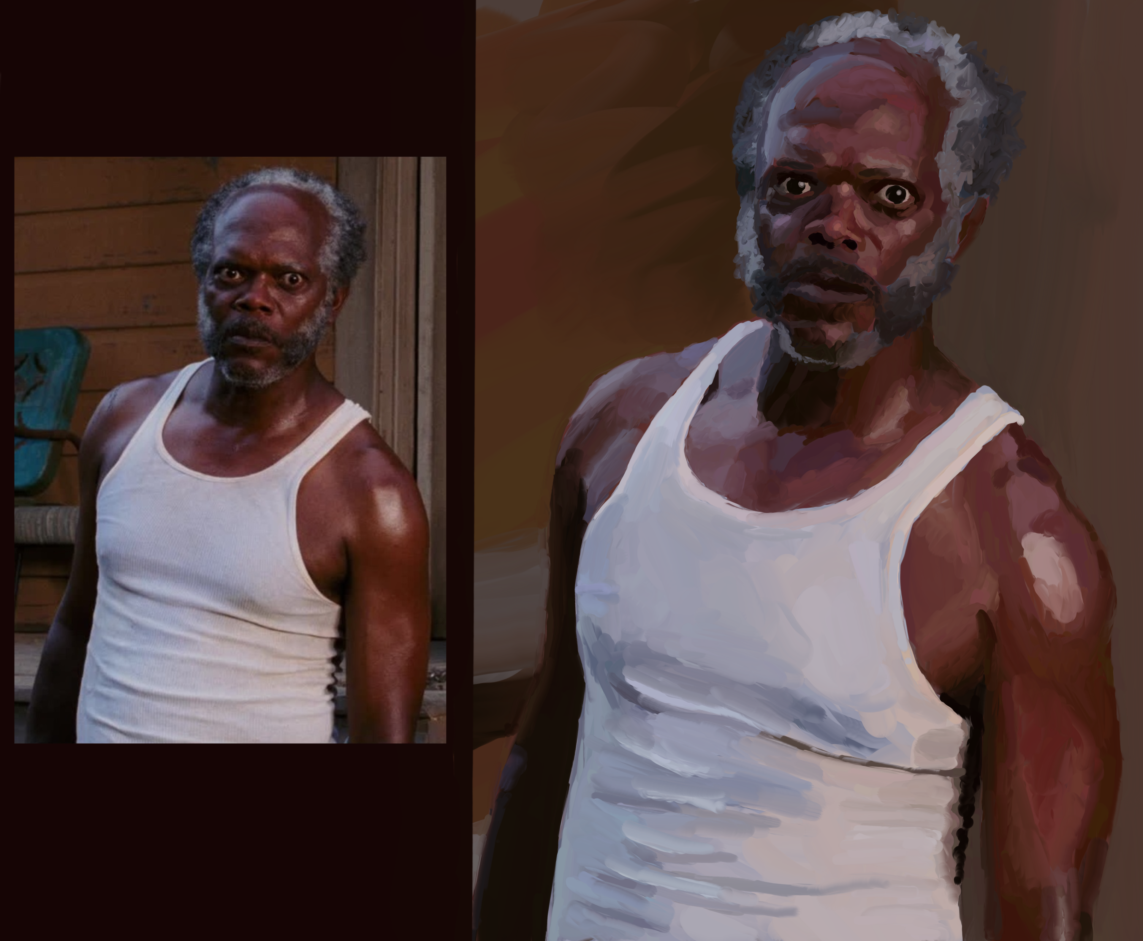
This is a friendly community for everyone who wants to share their art with the world! Everyone is welcomed π¨
Rules
AI Art: While we appreciate AI generated art, there are more appropriate communities to post that type of art to. Please keep posts to non-AI generated art only. This rule includes AI art that was then manually manipulated (e.g. drawing on top of something generated by AI).
Nudity: Nudity is and has always been a part of art, but it may be something that some users don't wish to see or cannot view in certain circumstances (e.g. at work). If your work contains nudity, please mark it as NSFW. Work that contains nudity that is not marked as NSFW will be taken down. As long as the NSFW tag is used, we welcome nude subject matter.
Spam: Please do not spam this community. Self promotion is fine if you just want people to be aware of your work, but blatant attempts at spam will result in the past being removed and possibly a ban. If you aren't sure if what you are posting is spam, please contact the moderator first.
Conduct: Be nice, and don't be a jerk. Constructive criticism is OK, but don't be mean. Encouragement is always welcomed.
Man, that's really impressive
Fantastic work!
I think if there's anything different responsible for the intensity, its in the brow. But frankly I think you definitely got a whole lot of intensity in your version
π€£π€£π€£
I think it's in the eyebrows
Looks fantastic though!
Oh yeah, particularly his right one. Damn, nice catch!
Honestly I think you nailed it. I loved the burger one too. You could make some money on these
Thank you! And maybe I can con my wife out of some money for em π€£
Your forms, lighting, colours, and values are all technically quite strong, but I see what you mean about not conveying as much emotional intensity.
It might be a limitation of the style itself? The way colour and light are used here make the eye want to appreciate the play of sunlight across foliage rather than connect with Sam's baleful gaze.
It'd be interesting to see if you could achieve the emotionality of the original with either increased realism or perhaps less, to emphasize the feelings on display. Or you might try a more surreal composition to give it some Edvard Munch energy. That'd be a fun angle.
I want to emphasize that you really have a great piece of work here, and it's hard to be very critical when the technical achievements of the work are so strong. Thanks for sharing.
Edit to add: or you could just try emphasizing the tension in the eyes and mouth, just pushing them a little bit past what is shown in the reference photo to make them more legible in this style.
Oh wow, all great ideas. I do feel like to push myself as an artist I will need to go beyond what is right in front of me. Thinking about it is intimidating and I'm not really sure where to start. But I will absolutely save your comments and reference them when I'm ready to give it a go!
In terms of digital painting, you've already far surpassed what I can do and I would love to see how much further you can take it. It can be intimidating to push yourself, but I for one would be delighted to see that happen.
Me too! It's nice having adult kids and discretionary time to get back into things I gave up when I started having kids.
hey where is the painting - I can only see 2 identical images, just 1 is bigger /s
π€£π€£π€£
Thank you!
Iβve caught most of these, and the massive leaps of improvement are genuinely impressive. Not only in how recognizable he is, but in your general style over the series. I think youβve nailed SLJ more than a few times now.
Psyched to see Mace!
Thank you, that's so kind!
And I'm intimidated by the reference picture of Mace. It'll be the hardest yet... Gotta step up my game...!?
I thought you were doing a Samuel Jackson Disco Elysium portrait for a second.
π€£
You have the look with the eye on the right. The eye of the left holds a more muted expression. Someone else pointed out some of the facial shadows would help, and I agree. Higher contrast around the eyes at least will help convey 'The Stare'.
Nice work.
Great advice, thank you!!
I hope you are hanging these all over your home, or maybe just one SLJ room. Good job!
Thank you! I'm planning to stitch all 16 together in a simple 4*4 grid, print, and frame to hang somewhere.
It has the vibe, nice work.
I think it's a tiiiny bit less intense than the original because his face looks fuller. Maybe going a shade darker in the facial shadows would make him more gaunt so the expression really pops.
I see what you mean, thank you!
Excellent work
Thank you!
One of my favorite movies and scene. You did really good, indeed! Agree with the other commenter about the eyebrow.
Thank you!!
I'm not sure how to give constructive criticism, especially since I don't paint at all. But I'd like to point out that your first couple of SLJ paintings looked more like Eddie Murphy to me. And this one... Kinda looks like Donald Faison. I also may have a mild case of face blindness.
Or you're better at picking up nuance than the rest of us! Thank you!!