this post was submitted on 14 Jan 2024
143 points (100.0% liked)
technology
22683 readers
1 users here now
On the road to fully automated luxury gay space communism.
Spreading Linux propaganda since 2020
- Ways to run Microsoft/Adobe and more on Linux
- The Ultimate FOSS Guide For Android
- Great libre software on Windows
- Hey you, the lib still using Chrome. Read this post!
Rules:
- 1. Obviously abide by the sitewide code of conduct. Bigotry will be met with an immediate ban
- 2. This community is about technology. Offtopic is permitted as long as it is kept in the comment sections
- 3. Although this is not /c/libre, FOSS related posting is tolerated, and even welcome in the case of effort posts
- 4. We believe technology should be liberating. As such, avoid promoting proprietary and/or bourgeois technology
- 5. Explanatory posts to correct the potential mistakes a comrade made in a post of their own are allowed, as long as they remain respectful
- 6. No crypto (Bitcoin, NFT, etc.) speculation, unless it is purely informative and not too cringe
- 7. Absolutely no tech bro shit. If you have a good opinion of Silicon Valley billionaires please manifest yourself so we can ban you.
founded 4 years ago
MODERATORS
you are viewing a single comment's thread
view the rest of the comments
view the rest of the comments

I've started using Windows with Windows 98, and they're basically three UIs that clash with each other:
The OG UI design that started with Windows 95 and continued up to Windows 2000 like this: https://stealthsettings.com/wp-content/uploads/2016/03/change_ip_v4_address.jpg
Stuff added in from Windows XP to Windows 7 like this: https://blog.usro.net/wp-content/uploads/2015/11/windows-10-classic-control-panel-1024x607.jpg
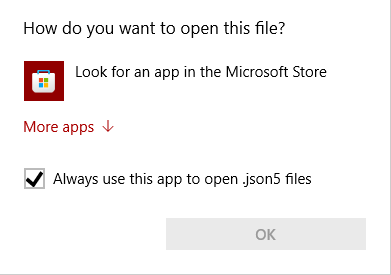
That Metro-phone crap that started from Windows 8: https://www.windowslatest.com/wp-content/uploads/2018/01/Windows-Update.png
Honestly, people don't talk enough about how the XP-Vista-7 stuff clash with the 95-98-2000 stuff, but it's there. Microsoft fucked up again by layering yet another UI design on top of the first two, and it just looks like ass.