this post was submitted on 12 Nov 2023
26 points (100.0% liked)

Pangora

127 readers
1 users here now

๐Ÿ An activitypub compatible forum and link aggregator. Downstream from Lemmy.

https://github.com/PangoraWeb

Kanban board


Info

Info

Pangora is the name of the lemmy soft fork thats being primarily worked on by members of programming.dev. Its aimed so that we can add features on top of lemmy and prioritize them based on what the instance needs while still being able to push changes upstream to lemmy if they accept them.

This also makes us more decoupled from lemmy so that if anything major happens to lemmy we can keep going with maintaining the site without any issues.


Credits

Credits

Icon base by Lorc under CC BY 3.0 with modifications to add a gradient


Pangora

Pangora-UI


founded 1 year ago
MODERATORS
26
submitted 1 year ago* (last edited 1 year ago) by Ategon to c/pangora
 

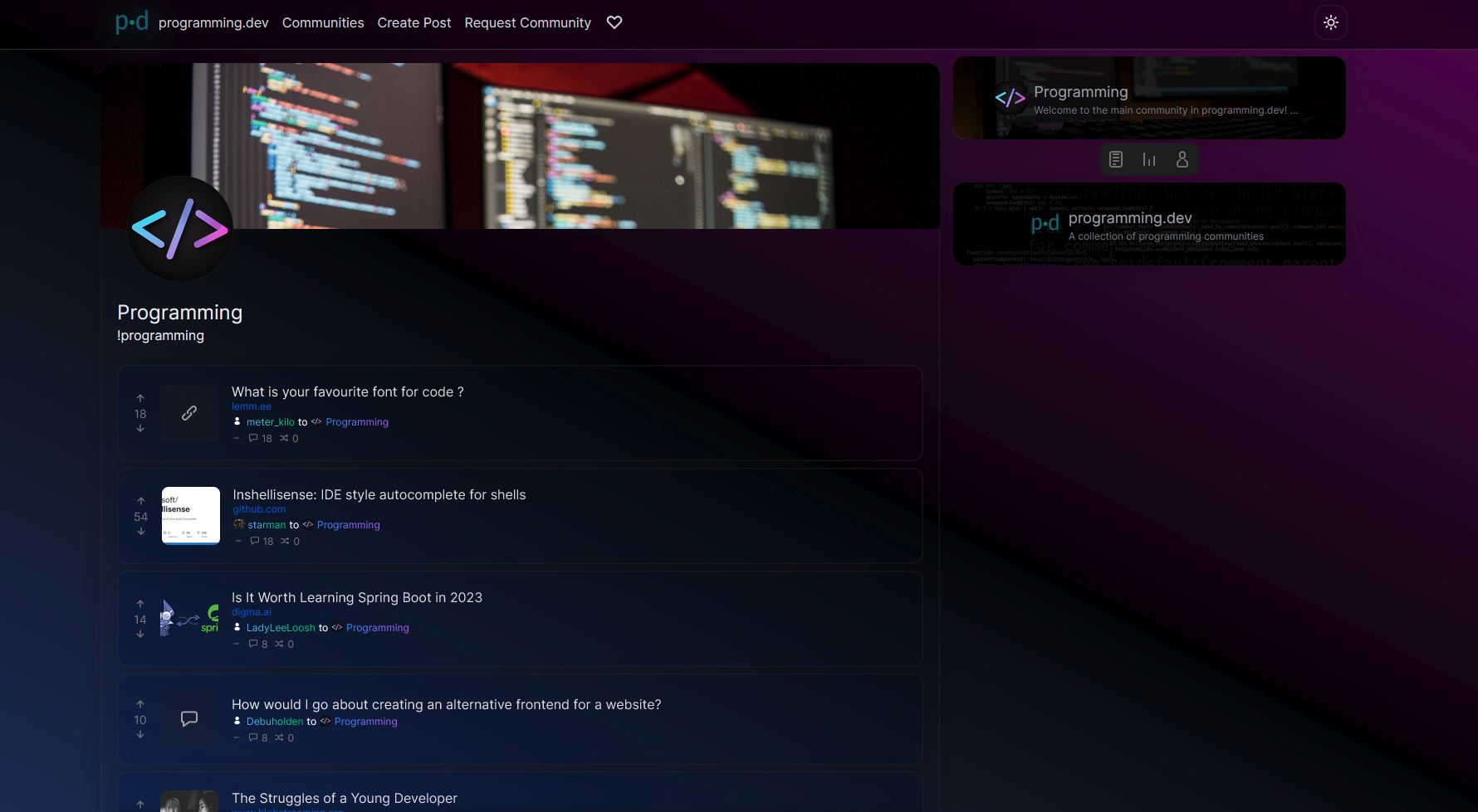
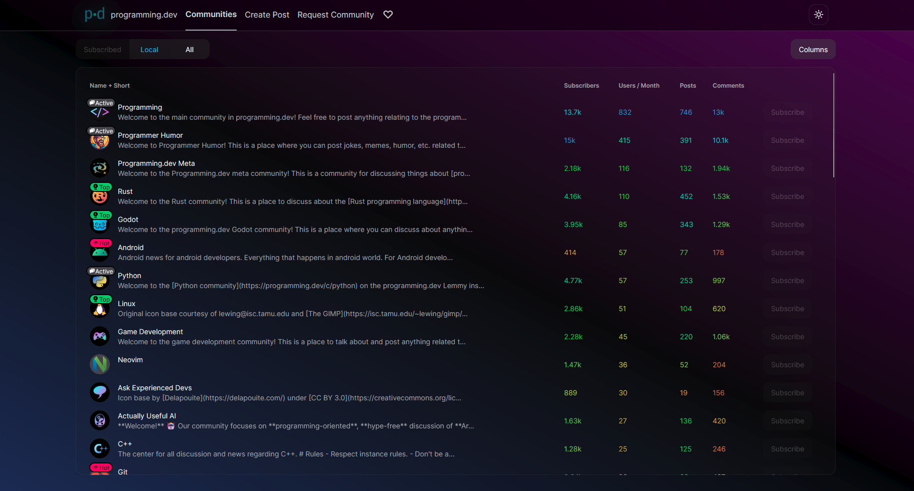
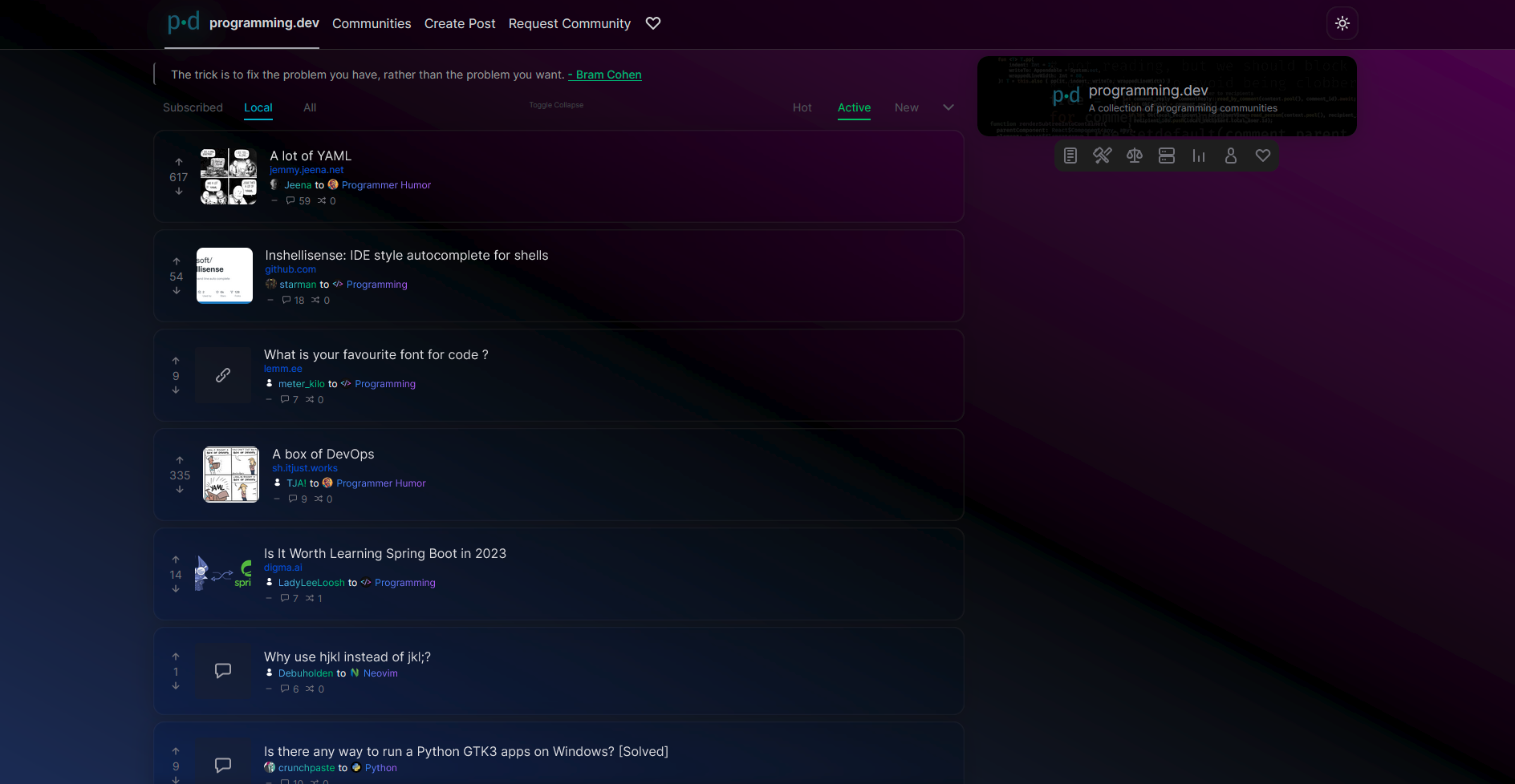
Hello everyone! I've pushed out a public alpha build to https://beta.pangora.social for people to start giving feedback on the design before it becomes more fleshed out

Feel free to check it out and say what you like or dont like in the comments here.


โš  Warning: This is an alpha, things are still very unfinished. You cant use this as an alternative to lemmy-ui yet since things such as logging in aren't supported

โš  Warning 2: If you attempt to use this on mobile currently it will be very broken


I constructed the UI by seeing what people liked from lemmy-ui, alexandrite, and photon and trying to match it up to how lemmy-ui is built so that it would be an easy switch between them

Main site mechanics that is different from lemmy-ui

  • Comments from cross-posts show up when looking at a post (will be changed in the future to only communities that community has whitelisted to do it for once I mess around in the backend more)
  • Comments and posts that have 0 or less score in terms of upvotes/downvotes will be collapsed by default
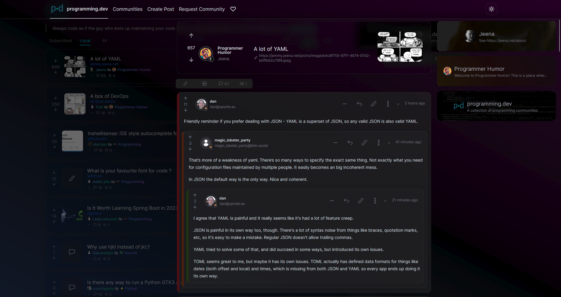
  • Clicking on a post in the post feed makes it show up overlayed on top of the feed similar to alexandrite's system instead of sending you to a new page. (hitting the name of the post when in this preview state will send you to the actual page)

Images:

you are viewing a single comment's thread
view the rest of the comments
[โ€“] Ategon 1 points 1 year ago

thanks for the feedback!

yeah ill have to look at the colors a bit more. I was trying to draw attention towards the post titles since its the most important thing on the page but made other things too much darker

Will look into fixing the upvotes and the bar icons.

I hid the details from the right since I felt it was information overload for people looking at the site but yeah its a bit empty there so can look into changing that and maybe just doing things like tweaking colors