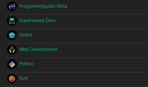
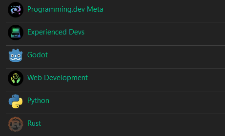
Edit: if you already voted see edit at bottom of post
Hey everyone, this is another post regarding choosing the icon style for communities in the instance
There was a bunch of issues raised about the last poll so Ive remade it. The last poll results will not count and instead these ones will be used
- Voting is done by single transferable vote
- You can no longer accidentally click vote
There are two Parts of the poll: The icon style and the icon shape
Icon Style
Note this is just to determine the recommended style for communities, individual communities can choose not to follow it if they want
Option 1: All Unified Same Color
This option is for every icon to have the same style and same color gradient

Option 2: All Unified Diff Colors
This option is for every icon to have the same style with the black background and gradient. However each community has their own colors for the gradient rather than having the same one for all of them. For example the godot community might have a blue purple gradient for their logo and functional programming might have orange red.

Option 3: General Unified Same Col
This option is for general communities (such as experienced devs, meta, programming, game development (things that arent specific to one language, engine, etc.)) have the unified style but other communities instead have the logo for the language, engine, etc.. For example game development would have the gradient icon but godot would have the godot logo

Option 4: General Unified Diff Col
This is a combination of options 2 and 3 where general communities have the gradient style but they also have different colors from each other

Option 5: No Unified Style
No gradient logos for any communities, instead having different style ones for every community

Icon Shape
This is the default shape that you want community logos to have when they show up. If a community logo has a specific shape (ex the godot logo) the voted on shape is overridable. Users will also be able to override whatever gets chosen locally, its just the default. Currently lemmy uses circles for both users and communities.
Poll Link
Edit: the website that was being used makes it very easy to cheat by just downloading a new browser and voting again as many times as you want. Due to this voting will be happening through dms to me. Sorry for all of the iterations of the vote but this will be a big change in the instance and I want to get accurate info
If you want to vote send me a dm with the options ordered based on your preference. Here are the available options (for the two different votes):
Icon Style
- All Unified Same Color
- All Unified Diff Colors
- General Unified Same Col
- General Unified Diff Col
- No unified style
Icon Shape
- Circle
- Squircle
- Square
- Diamond
- Hexagon
- Pentagon
Rank each category from your first choice to your last choice. If your first choice ends up having the least amount of votes then your second choice vote counts instead, etc. until one option has 50% or more of votes.
To dm me go to my profile Here and click on one of the send message buttons (secure message sends it through matrix while the other just sends it through lemmy)
Ill respond to you when I note down your vote to be counted (shouldnt take longer than 8 hours and I try to respond quickly, if I dont then something went wrong with the dm)
Voting will end in a week
dm sent 👍