Yeah, they are my most reliable anti paywall technology. wayback machine is down very often right now, but for the express porpuse of getting rid of paywalls archive.today works very well for me
deedan06_
I have yet to see unpaywall workk ever. All that site does is link you to free versions if legally available. So it does nothing. Bypass Paywalls clean sometimes works, but if you want non mainstream sites going to archive.today is the most reliable option.
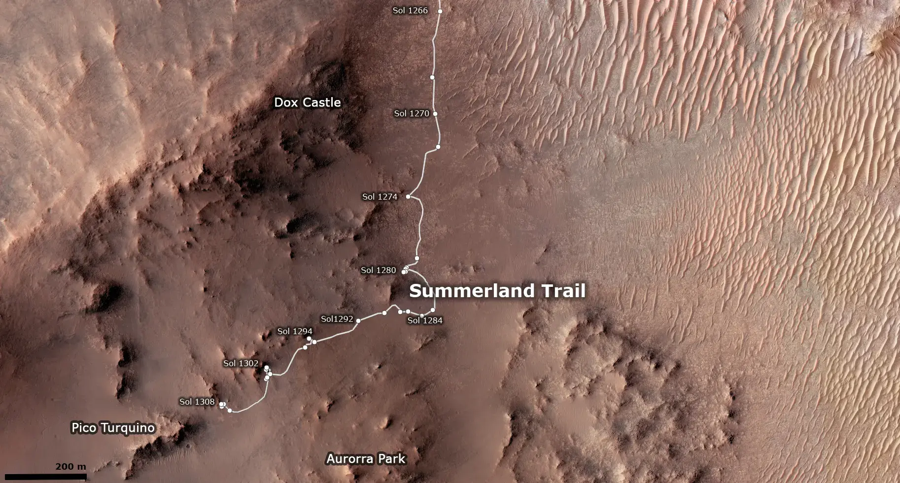
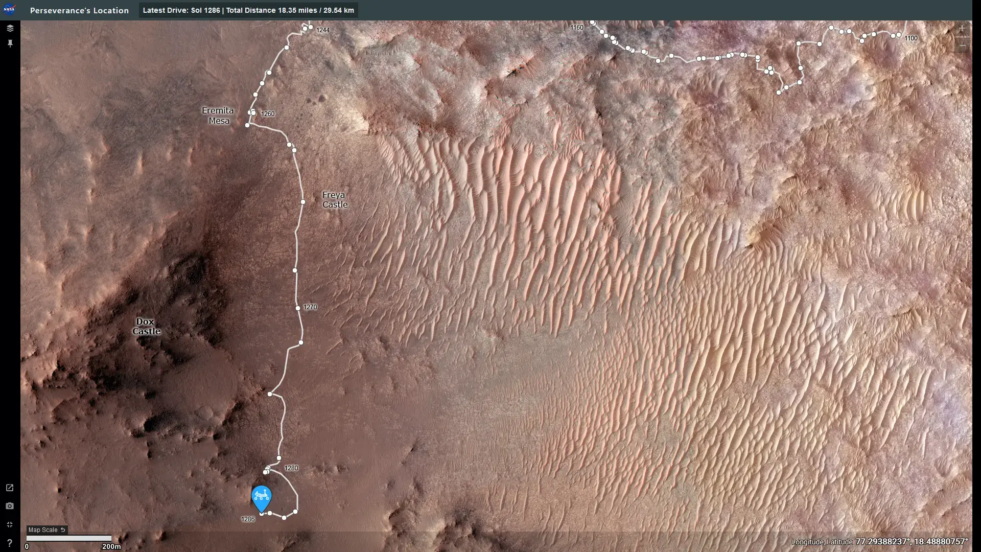
I prefer the jpl one, as the hirise color is more useful than the low res low contrast hrsc one, and the contour lines aren't that useful zoomed in. However, making a more zoomed out context map based on the esa one could be interesting.
Even the MSL map has more details, so I'd say that they very much can. The issue is that the interactive mapps are probably created by the PR team (as is the entire website) not the mission team itself, and that PR team doesn't know most of the Place names and doesn't thing that the average joe, who they make the sites for, cares enough to add them.
true. I didn't consider that. That would could work. Lemmy is a lot more advanced in that regard. Currently the best ideas are Discord and give up, and the original owners are done with the idea, but I could try and create a spiritual successor on here. Lemmy suffers a bit from the same isues as Forums with lack of people, but I only need to convince the OGs. I need to think about that, and a forum from 2004 whose software is a decade out of date is easy to beat in that regard
Also thanks for creating this awesome instance.
photoshop. I just wanted to see the names on a map, and took the easiest route to make that happen
Yeah. Federating forums seem like a useful feature to keep them going. The forum style has it benefits that the discord and reddit style lacks. Sadly a forum I used a lot for my community is now in its final days, even if it managed to last a lot longer than others
Guess I'll gotta check up her more often now that umsf is dying
Its best if the rules are the same for anyone, but public votes is something power hungry mods will eventually abuse. If you dare upvote the wrong post you will get banned.
yeah. tbh, void works best at filled canvases, not places like this with lots of space, so I focused on turning as much background white black as possible
We have to few people for wars. and there was so much free space that was way easier to take


Still my season favorite. To see an actual villain is interesting, but I still kinda wanna see Date as a dark magical girl. Also, this is way funnier than My Deer friend Nokotan ever was