Metal_Zealot

joined 1 year ago
MODERATOR OF
[–] [email protected] 4 points 6 months ago (1 children)

Google search
site:VK.com "font" "yourfontnamehere"

[–] [email protected] 2 points 6 months ago (4 children)
[–] [email protected] 2 points 9 months ago
[–] [email protected] 6 points 9 months ago (1 children)

I grit my teeth reading that

[–] [email protected] 21 points 9 months ago* (last edited 9 months ago) (3 children)

Wish Linus had the energy to be a less shitty person and NOT work his team at an unmanageable rate, and had a clear idea of what his company even is.

Btw, nice condoning sexual harassment by completely minimizing it.
"Linus isn't a big company, so it shouldn't matter as much"

Fucknuckle

[–] [email protected] 76 points 9 months ago* (last edited 9 months ago) (9 children)

You're already unpopular, Linus. You swept a workplace sexual harrassment scandal under the rug, were called out for your lack of proper testing, and your data is constantly incorrect.

[–] [email protected] 5 points 9 months ago (1 children)

Lol everyone wanted a Cinematic Universe back then.
Now it's the "Multiverse".

Wonder what the next bandwagon will be

[–] [email protected] 1 points 9 months ago


Was working on a logo for a client, went a little too pointy for their taste but I like how simple it is.
One of the few I've made that isn't 100% symmetrical either.

39
submitted 1 year ago* (last edited 1 year ago) by [email protected] to c/[email protected]
 

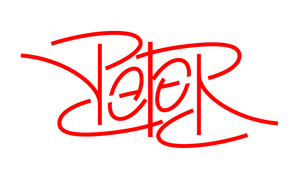
I noticed there wasn't a community made yet for Ambigrams, so I'm going to shamelessly plug the one I made.

I'm looking for sister subs to add to the sidebar, and recommendations of related communities would be appreciated!


I usually start with a doodle, then bring it into illustrator to refine it.
The line work is pretty basic, I want to add some flare and varying widths, but it works surprisingly well as is.

I don't like mixing uppercase and lowercase letters, but what can you do


This is a little typography I made for my wife and I, it's our initial "g" and "S"

the lowercase G was way easier to make into an S, nearly fully enclosed letters are hard to work with


Ambigrams are a hobby of mine, and I saw that there wasn't a community dedicated to them on Lemmy yet.

I love the trickery of the eye and letting your mind fill in the gaps, It's a niche art form that is difficult to master.
I'm not the greatest, but I doodle a lot and see what I come up with.

It seems appropriate that the first post be of the commnunity icon, let me know what you think! I feel it could use improvements, but I've been staring at it so long that I need a second opinion lol.


Will there be a means to view the Mod Log and list of instances that you are federated with?


This is how I imagine most split keyboard users to look


After the giant hand of God comes and scoops them up, It's so cute how they just need a quick look and then instincts immediately take over


Selecting the Search icon in most user interfaces immediately places the text cursor in the text box, allowing you to start typing right away.
With Lemmy, after selecting Search, you have to manually select the text box afterwards.

This really isn't a huge issue, just a quality of life suggestion


I still remember this being the funniest shit to exist on the internet.
Oh how times have^'nt^ changed.


During the "big move", I subscribed to a bunch of emerging communities.
Now that the craze has died down, lots of these communities have been abandoned for 3 months or so.

Are these communities worth preserving, or do they take up unnecessary space and could be removed?

Just genuinely interested, I'm sure other instances have their own methods of handling that but was wondering how it's managed here.

view more: next ›