It's gotta be this one if they've got any sense.
Vexillology
A community dedicated to flags and discussion about flags.
Other communities:
- Vexillologyjerk /c/[email protected]
Imo, F1953 is also pretty good, though that one's also nice.
What has me a bit disappointed is that the North Star Flag wasn't a finalist. I prefer it to all of the 6 here.
I do too, the North Star is my favorite. I like the other one you linked, I guess we have similar flag preferences
Agreed. The other designs resemble corporate medical/biotech/pharma logos, which are big in Minnesota, but don’t belong on the flag.
That's beautiful.
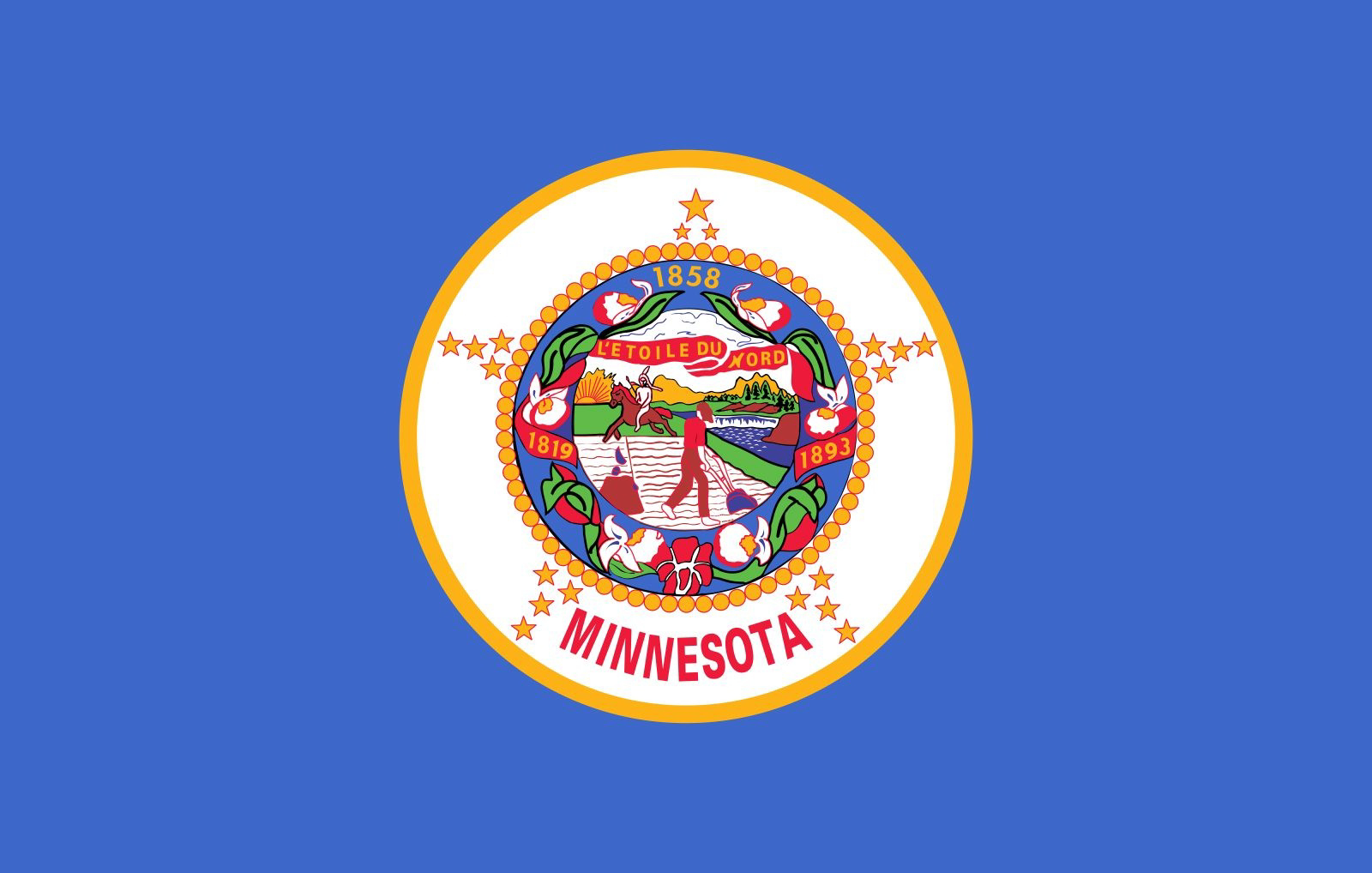
This is the current state flag for reference. Any they pick is a huge improvement IMO

Goodness, that is terrible, I see why they're looking to replace it.
These two are probably my favourites:


Not to much a fan of swirly designs like this, looks too much like a logo and not so much like a flag:

But mostly, I'm disappointed that my laser loon flag did not qualify as a finalist:

Any explanation as to what these are supposed to symbolize?
I am curious, what is the story behind "L'étoile du nord" ?
It translates as The Star of The North, or The North Star, in reference to the position of Minnesota as the northern-most contiguous US State, because of the small bit that sticks up higher than the 48th Parallel (aka The Northwest Angle).