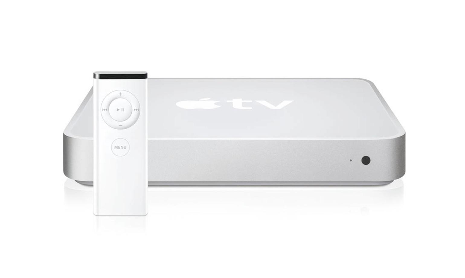
Implying Mac Minis haven't looked like Apple TVs from the beginning?
Mac Mini (2005-2009):

Apple TV (1^st^ gen, 2007):

Mac Mini (2010, first redesign after Apple TV came out):

This is a most excellent place for technology news and articles.
Implying Mac Minis haven't looked like Apple TVs from the beginning?
Mac Mini (2005-2009):

Apple TV (1^st^ gen, 2007):

Mac Mini (2010, first redesign after Apple TV came out):

Exactly my same thought, it's just a smaller Mac Mini.
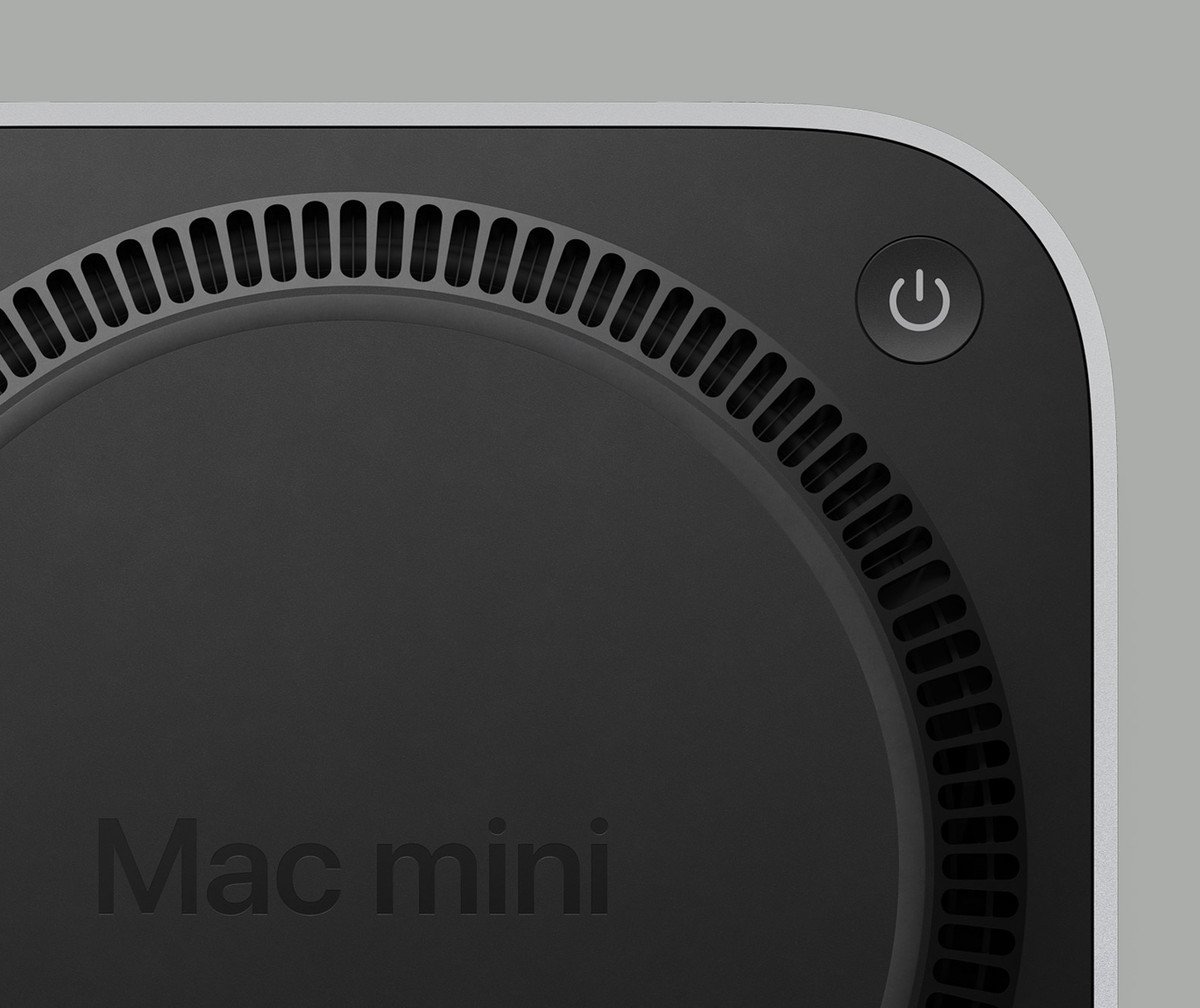
Mac Mini's are cool, and I appreciate that Apple has some of the most experienced and talented designers in the world... But they put the power switch on the bottom. You have to lift it up and turn it over to turn it on and off.

Power Bottom
I assume that the plinth lifts it high enough for your finger to comfortably fit under.
who let the magic mouse engineers loose
Remember these are the same engineers who put the Magic Mouse charging port on the bottom, making the mouse unusable while you charge it
People treat it like a mistake but not be able to use the mouse while it’s plugged in is the entire point of the design. Right or wrong the Apple designers thought a cord drag was a bad experience and designed to prevent it.
They probably looked at their target audience and realized there was a certain percentage of folks that would just leave the mouse on the cord 24/7 and wanted to prevent that.
They also know their target audience has plenty of people who gobble up every bad design decision and even defend it online years later.
I don't understand what was wrong with the original version that just took 2 AA batteries. Reaching for the AA charger and swapping cells not awkward enough or something?
Smart and elegant design would be hiding a battery charger in the iMac it self (maybe even use something smaller than AA), not expect you to flip and plug in your mouse every time ya leave it. The Nintendo Switch, while a completely different form factor, is a great example of an elegant (you could even say "wireless") charging solution.
I'm getting really sick of the Apple esthetic of sticking out wires, be it the mouse or the dozen dongles for every portable device they now make. Uh! Can't forget the world's only pen that needs charging, for seemingly no reason.
They can fit a bigger rechargeable battery in the same space as a battery bay for replaceable batteries. Plus it eliminates the waste of throwing away batteries, and has longer battery life than similarly sized alkalines.
IT here. They were terrible.
Very insightful comment Mr. IT of lemmy.
People treat it like a mistake, but the Emperor has no clothes and people are catching on.
Honestly, the mouse charger screams marketing or management. Apple's brand is partially form over function.
But WHY??
The previous model has it in the back, you can’t even feel it properly because it’s not recessed.
On the other hand the last time I turned off my M1 mini was when we moved. It’s 100% silent and takes less power than a lightbulb when it sleeps, so why would I bother powering it off.
So while it sleeps, it still wastes electricity on literally nothing. Gotcha
What.
The fuck.
Well, it would be
That cilinder Mac Pro was a fever dream but I still love the design
Would rather buy a Beelink SER7.
Looks like that power button wasn't placed by a circus clown and it has an option for USB PD, yeah this is more like it.
Most, if not all, Apple devices look almost exactly the same as their sibling devices.
The price of the storage upgrades. Jesus.
It's because they launched this product with an actual reasonable amount of ram (16gb) compared to the 8gb they are still selling MacBooks with. So, if they can't charge you $300 for a little bit of ram now, they instead are going to rape you on storage. Apple is still apple.
With the 10G NIC upgrade, I would see some use in this if it ran Linux
It can possibly run Asahi Linux in the future. I had the same idea
You can get cheaper options with 10G nics in the same form factor
It's kinda cute