this post was submitted on 10 Sep 2024
21 points (100.0% liked)

Data is Beautiful

852 readers
48 users here now

Be respectful

founded 3 months ago
MODERATORS
 

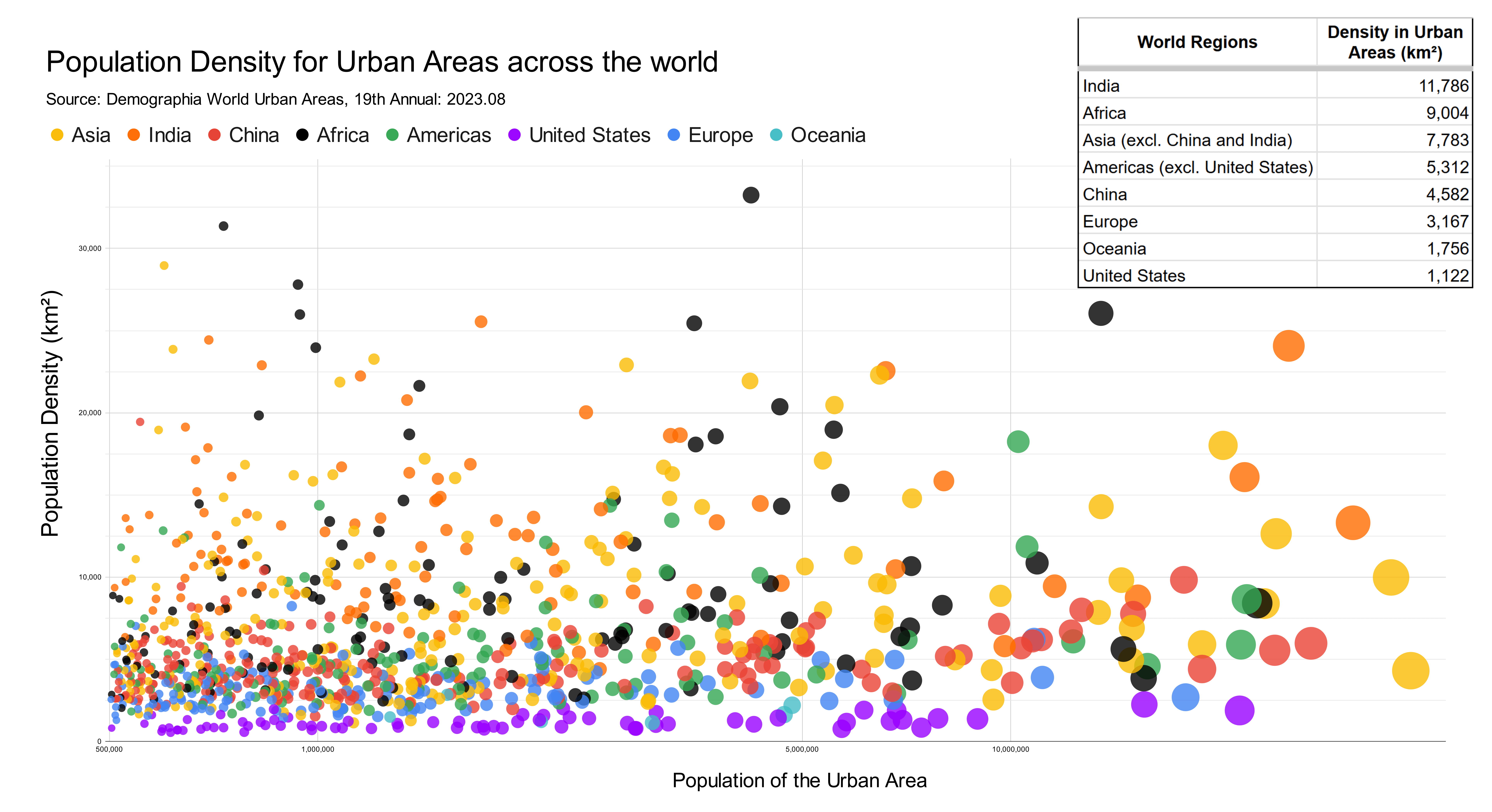
My chart shows population density in all urban areas that have over half a million people. "Urban area" basically means the built up area in and around a city, including its suburbs. The chart would be way too busy if it included labels for each city, so instead I opted to group them by the part of the world they are located in. This shows the striking difference in urban density across different parts of the world.

My data source for both population and population density came from Demographia World Urban Areas, 19th Annual: 2023.08_. This is a regularly updated collection of statistics for urban areas that include population and land area. I made this chart using Google Sheets and edited it with Inkscape.

If you're interested in diving deeper into this data, I put together a spreadsheet of the data and a detailed version of the map with city labels (which is still very cluttered). Enjoy!

Source: https://old.reddit.com/r/dataisbeautiful/comments/1fbbuer/population_density_in_900_urban_areas_across_the/

top 3 comments
sorted by: hot top controversial new old
[–] [email protected] 8 points 1 week ago

Huh. I hadn’t really thought about it before, but it would seem to indicate that size and density are mostly independent parameters of a city.

[–] [email protected] 2 points 1 week ago* (last edited 1 week ago)

I'm shocked Canadian cities are still somehow denser than American ones, by this measure.

The top one is Mogadishu, if anyone is wondering. I'm not sure how that works, given that you'd expect things to thin out in a failed state.

[–] [email protected] 0 points 1 week ago

Africa wins the population density game.