this post was submitted on 16 Apr 2024
1559 points (98.7% liked)
Comic Strips
16153 readers
2494 users here now
Comic Strips is a community for those who love comic stories.
The rules are simple:
- The post can be a single image, an image gallery, or a link to a specific comic hosted on another site (the author's website, for instance).
- The comic must be a complete story.
- If it is an external link, it must be to a specific story, not to the root of the site.
- You may post comics from others or your own.
- If you are posting a comic of your own, a maximum of one per week is allowed (I know, your comics are great, but this rule helps avoid spam).
- The comic can be in any language, but if it's not in English, OP must include an English translation in the post's 'body' field (note: you don't need to select a specific language when posting a comic).
- Politeness.
- Adult content is not allowed. This community aims to be fun for people of all ages.
Web of links
- [email protected]: "I use Arch btw"
- [email protected]: memes (you don't say!)
founded 2 years ago
MODERATORS
you are viewing a single comment's thread
view the rest of the comments
view the rest of the comments

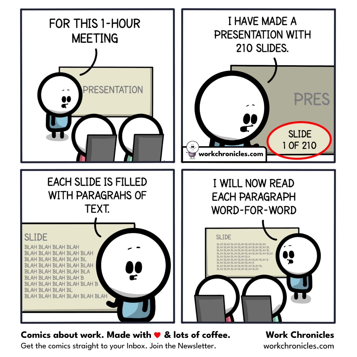
If the slide has all the information, then it's a poor slide deck.
The slides are supposed to be an outline. The rule of thumb is max seven lines and max seven words per line.
Here's a couple examples.
Good slide:
Also good slide, depending on who you're presenting to:
Bad slide:
All the extra information on the bad slide can be delivered by the presenter. It's not necessary on the slide. The slide is for people to glance at to assist them during and after the presentation and to help them anchor themselves in the discussion.
I like your examples, you really capture how the definition of a "good" slide is context and audience dependent, and yet despite this, a "bad" slide is something that can be understood fairly objectively.