this post was submitted on 27 Mar 2024
966 points (98.7% liked)
Memes
47008 readers
740 users here now
Rules:
- Be civil and nice.
- Try not to excessively repost, as a rule of thumb, wait at least 2 months to do it if you have to.
founded 5 years ago
MODERATORS
you are viewing a single comment's thread
view the rest of the comments
view the rest of the comments

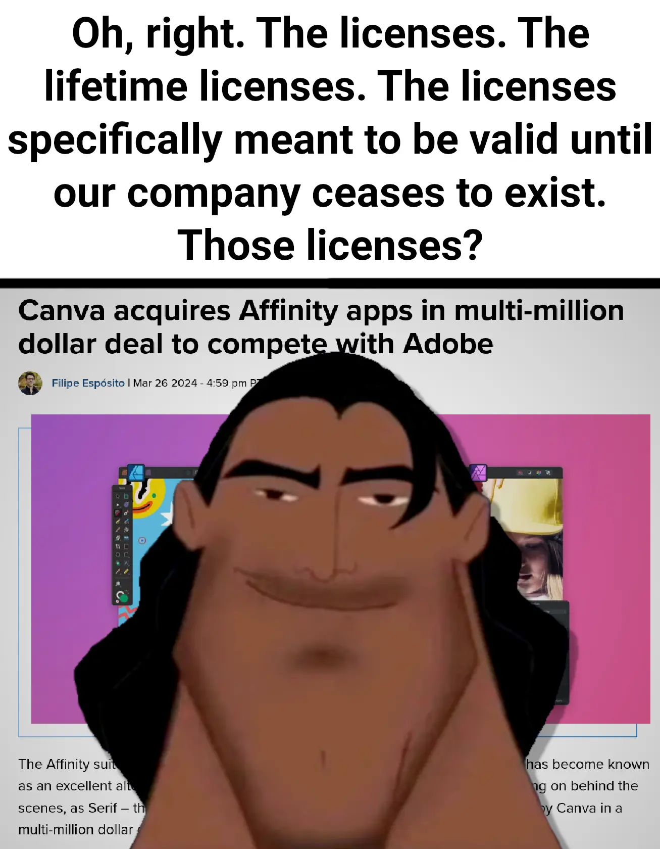
GIMP or Krita might not be up to the standard as Affinity and Photoshop are, but at least while perfecting my skills in GIMP, I don't have to worry about having to find a different software because a random company purchases it.
I really wish I liked gimp but I hate it so much. It's so unintuitive it actually hurts every time I use it
That's what I used to think as well actually. I opened it, saw the airplane control center, and closed it. But then I volunteered for editing a photo for my school, and I had to learn how to effectively create borders around the text, as I would have to makes a lot of changes to them. So I searched and came across this video. And then I understood that GIMP is actually a really powerful tool, you just have to learn how the developers intended you to work with it. Admittedly, having to use the drop shadow feature for text borders is pretty retarded, but it lets you fine tune the how the end result will look.
Yea, people don't like it simply because they're not used to it.
For instance, Cntrl-A, select all. Cntrl-Shift-A is a way more intuitive way to deselect all.
It's the same reason people complain about OnlyOffice, which is stellar.
I love open office. Partially true though with gimp. I just loathe how it does layers and I hate how the tools and shortcut keys are. Some of the most common design patterns are completely ignored. Unintuitive design is unintuitive design, even if you get used to it.
OnlyOffice is different from OpenOffice. And OpenOffice nowadays is poorly mainted, it has been forked a while back to LibreOffice
Yeah I meant libre office actually. Only office I'm not familiar with.
OnlyOffice is much better IMO. Local or web, integrates with Nextcloud, and has very good office compatibility, even with fonts.
I think I just learnt about only office. Been using libre office for a while, might switch!
Edit: I saw it doesnt natively support odt, so I might not switch after all..
I switched, never looked back. It's so much better for me.
I've become used to an alt modifier being typically negative and shift positive so ctrl+alt+a would be more like the unselect all and shift would add to a selection (though I guess you can't add more to the selection after "all")
We’re not using that word are we!
I'll give the video a watch but yeah I've used it countless times at this point. Doing extremely basic things like adding text to a document is painful for me due to the extremely weird way layers and selection works. Not to mention basic stuff like zoom shortcut keys standard everywhere else do not work.
Iphone has always been pitched as intuitive and "it just works", and it seems like it is that way for iphone users.
But when I try using one I'm lost as hell. It seems God awful. In other words, intuitive is whatever you're used to.
It's not just what you are used to, but yes that can play a role. I think apple gets a pass because of the image they have. My mom has an iphone and struggles with anything new or changed on it. But people told her it's the easiest phone so she'll never switch...
I say it's "easy" because you have so little say in what you can do with it.
I feel the same about Krita. I used it for about a year of hobbyist drawing, and I just never could get comfortable using it.
Clip Studio Paint came out with 3.0, and after some deliberation I decided to pay for the update. Felt like coming home. I've done more art in two weeks than I've done in nearly a year of using Krita.
Even more so, you don't have to worry about hardware support, since they can be compiled from source code, as long as you have pc with enough power to run it, you can run it, no matter which architecture
People who claim GIMP isn't up to Photoshop inevitably reveal the only actual issue is that they learned photoshop first.
I used GIMP first and then Photopea (basically photoshop but web app) and GIMP is worse despite using it first. It's just bad.
I'm thinking I might switch, I'm only a casual user (Literally just for shitposting) but they changed how the brushes work as far as I can tell, and it's thrown me off.