this post was submitted on 03 Mar 2024
367 points (91.6% liked)
Climate - truthful information about climate, related activism and politics.
5383 readers
145 users here now
Discussion of climate, how it is changing, activism around that, the politics, and the energy systems change we need in order to stabilize things.
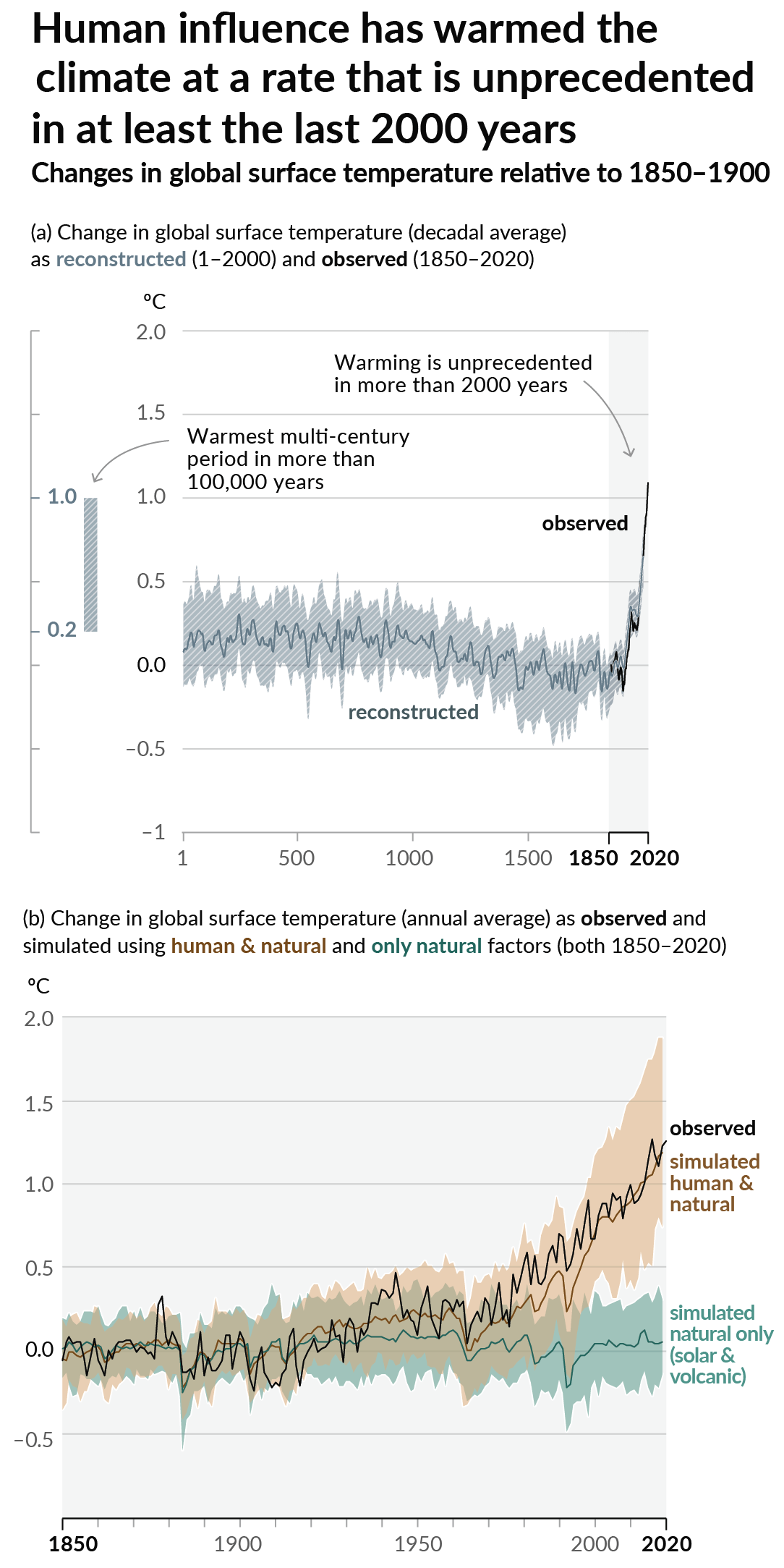
As a starting point, the burning of fossil fuels, and to a lesser extent deforestation and release of methane are responsible for the warming in recent decades:

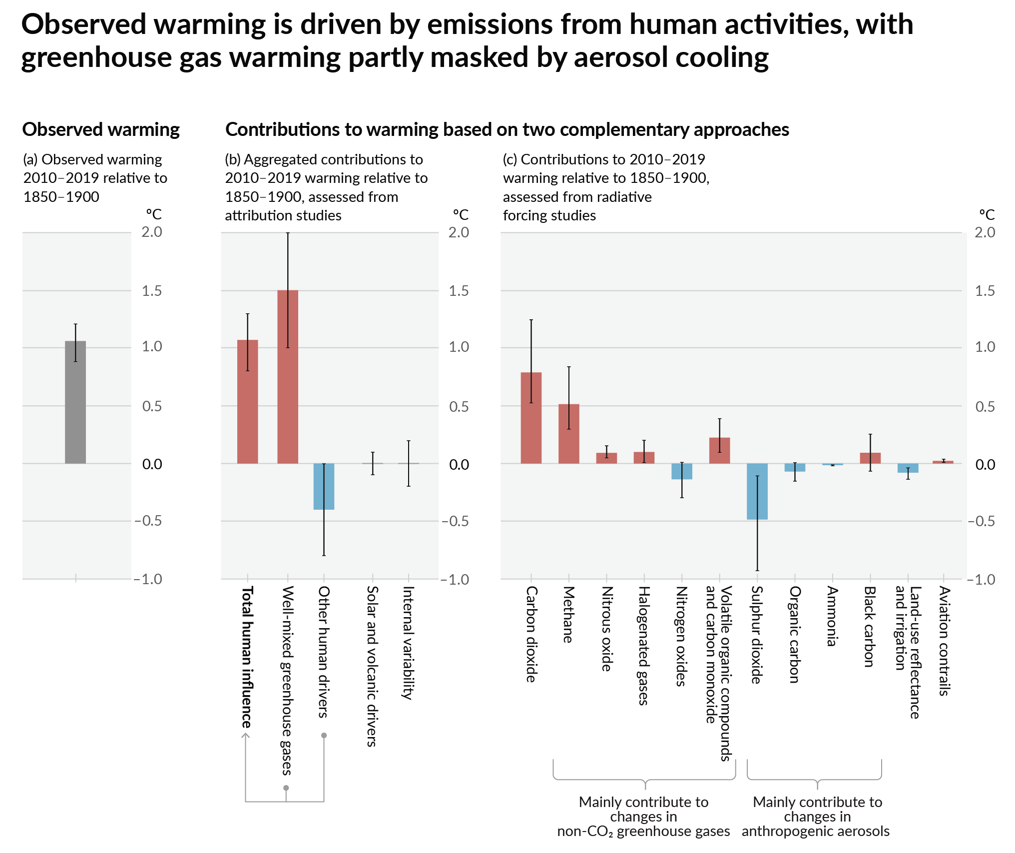
How much each change to the atmosphere has warmed the world:

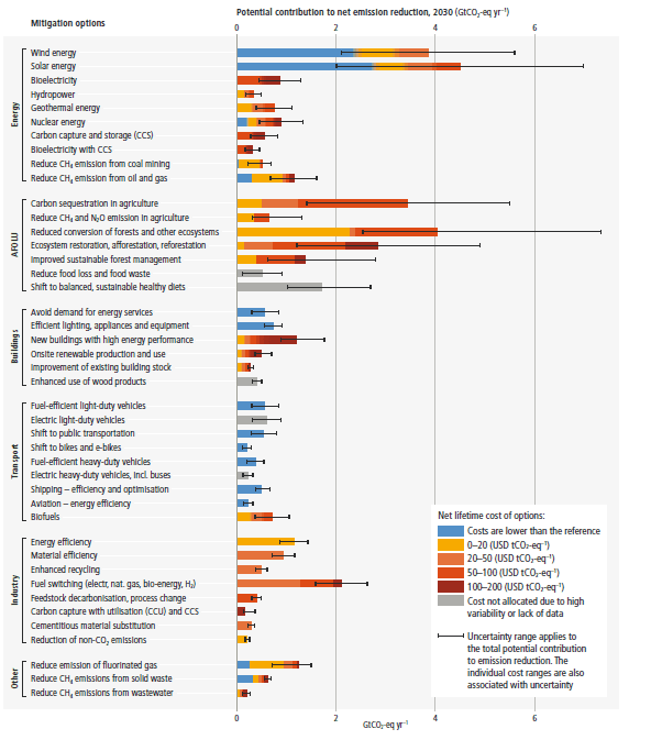
Recommended actions to cut greenhouse gas emissions in the near future:

Anti-science, inactivism, and unsupported conspiracy theories are not ok here.
founded 2 years ago
MODERATORS
you are viewing a single comment's thread
view the rest of the comments
view the rest of the comments

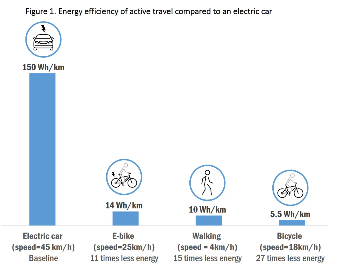
Now do it at the same speed.
What sense would that make?
Kinetic energy is E=1/2mv^2 and because of aerodynamics and friction factors, energy efficiency (or, consumption) varies a lot at different speeds.
This graph has a nonlinear x scale because each vehicle’s entry is at a different speed, therefore the energy scale is nonsensical.
The end result will be useless because you won't cycle at car speeds and won't drive at walking speeds, so the energy per km wouldn't be realistic.
Of course. But the way it is plotted now also gives a false sense of energy economy.
Maybe there’s another way to compare the data.
An energy-speed plot with multiple curves for the different vehicles comes to mind. Then simply stop plotting that curve when that vehicle is outside of its speed range.
I’m not contesting the notion that the plot is trying to convey; just that it’s not really the right format for visualizing this data.