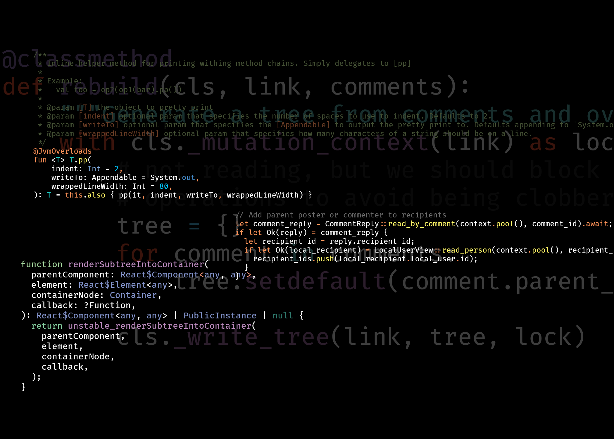
Hey everyone! Been a bit since the instance has been created (and 0.19 is dropping soon) so figured it was time to update the logo and banner to look a bit nicer
The current logo is made using fira code and the banner is a quick one made by snowe
The banner though tends to not look great when text is overlayed on it in certain apps due to it being text on text and it doesn't stand out that well due to it just being black
Submissions
You can submit new logos or banners below that you think would be good for the instance. After around a week theyll be collected together and then ill run a vote for which ones people like the most
Please only submit stuff you have a proper license to use (either you made it or its something such as CC0)
If you submit something you acknowledge that we can then use that for the instance
Current Icon & Banner


Ill be adding in the current icon and banner into the vote as well when im running that if people like them better than the new options
Other misc things
- Voting will be most likely ranked voting. I can try to create a web page that will handle voting so people can vote by logging into their p.d account and then voting with that
- You can submit as much as you want, just if someone is spamming way to many similar things ill limit the amount that is put in the voting section
📌Ill be pinning this post in the instance for a couple days, then will pin the vote when that happens


Starting off banner submissions with a quick banner generated from midjourney
Example view of it in lemmy explorer
Ill be submitting some logos and another banner that im making in gimp later in the week
Edit: exams are pain, will do that before the end of the month
Just wondering, what's the purpose of the logo / where is it shown? If the logo is just the favicon - you could create a very elaborate logo, but it doesn't really show up in a 25x25 image
top left of the site in the navbar, and for sites who collect all of the different instances such as join-lemmy and lemmyverse. Also shows up in things like error pages in the new frontend
Smaller in the navbar but in the cases of join-lemmy and the things like error pages its larger (you can see the size by going to https://join-lemmy.org/instances?topic=all_topics&language=all&scroll=true)