this post was submitted on 28 Aug 2023
316 points (97.9% liked)
Data Is Beautiful
7228 readers
7 users here now
A place to share and discuss data visualizations. #dataviz
founded 4 years ago
MODERATORS
you are viewing a single comment's thread
view the rest of the comments
view the rest of the comments
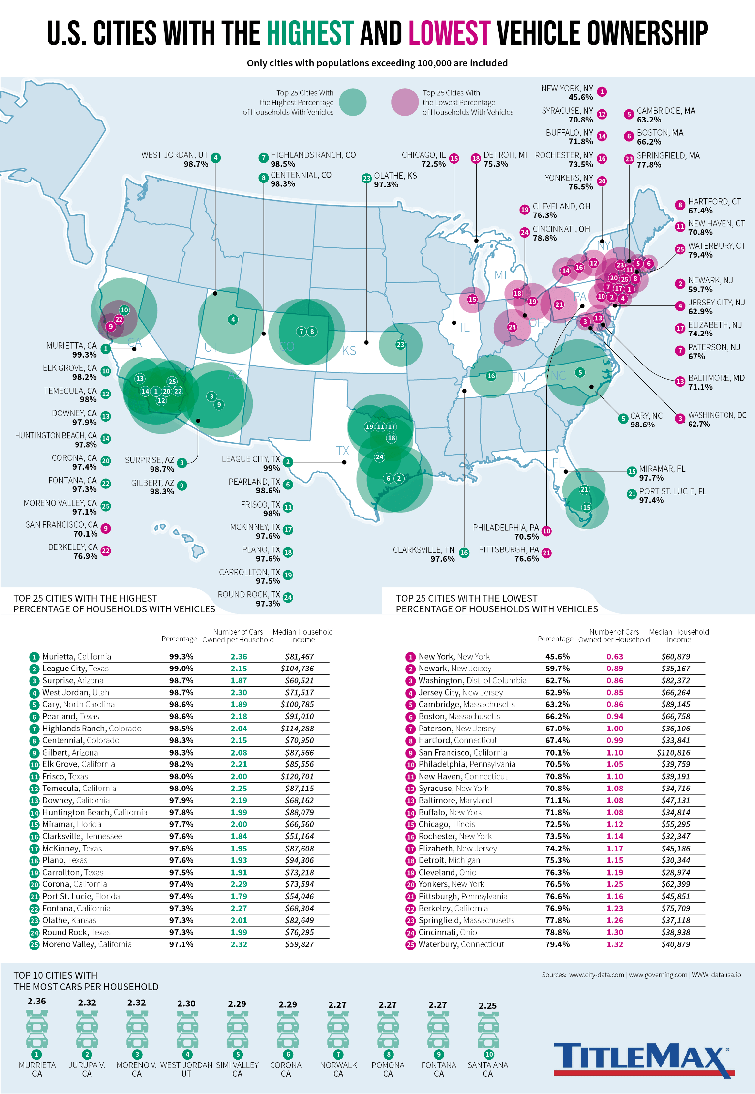
Why is Detroit labeled as being in the UP?
It's not. It took me a second to figure out, but there is a numbered dot with shading relative to ownership on the state. Then there is also a black dot with a line that labels it. For example, look at Cary, NC. I was confused because it looks like it's labeled twice, but it's just the way that the chart was designed. If you look at a state like Texas with more cities in the data, it makes sense that it makes it easier to name each of the cities from one point, but it can look confusing when a state only has one city in the data.