this post was submitted on 22 Apr 2025
467 points (97.6% liked)
Fuck AI
2518 readers
705 users here now
"We did it, Patrick! We made a technological breakthrough!"
A place for all those who loathe AI to discuss things, post articles, and ridicule the AI hype. Proud supporter of working people. And proud booer of SXSW 2024.
founded 1 year ago
MODERATORS
you are viewing a single comment's thread
view the rest of the comments
view the rest of the comments

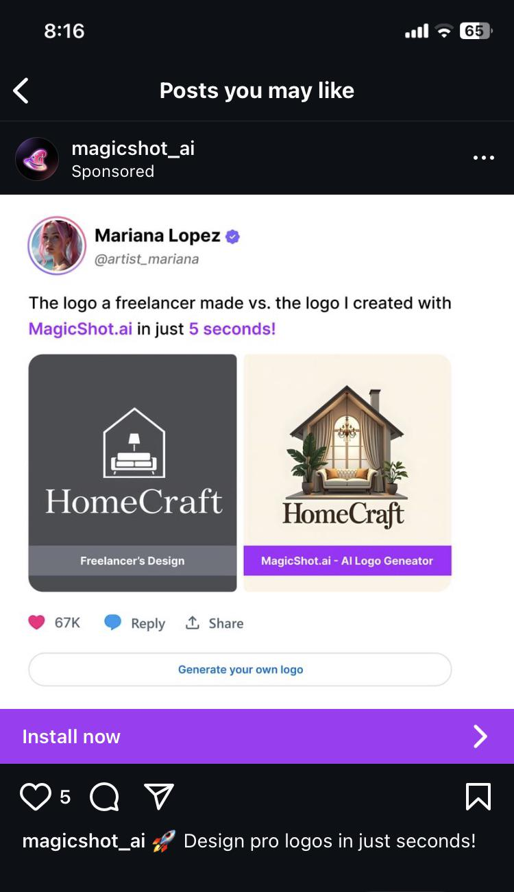
Imagine the printing costs of putting variations of the right on all your products? Just the color variety alone would add to the production costs.
Reminds me of German Designer Kurt Weidemann who redesigned the Logo of German train company Deutsche Bahn in the 90s. He inverted the colors, got rid of one outline — and still saves the company millions over the years because of the paint that is saved putting the logo on all trains. All while modernising the typography, but remaining true to the brand.
This is what design is about — everything else is decoration.
And will look like shit even if you manage to do it. Imagine that on a cushion cover after an year of use.