3DPrinting
3DPrinting is a place where makers of all skill levels and walks of life can learn about and discuss 3D printing and development of 3D printed parts and devices.
The r/functionalprint community is now located at: or [email protected]
There are CAD communities available at: [email protected] or [email protected]
Rules
-
No bigotry - including racism, sexism, ableism, homophobia, transphobia, or xenophobia. Code of Conduct.
-
Be respectful, especially when disagreeing. Everyone should feel welcome here.
-
No porn (NSFW prints are acceptable but must be marked NSFW)
-
No Ads / Spamming / Guerrilla Marketing
-
Do not create links to reddit
-
If you see an issue please flag it
-
No guns
-
No injury gore posts
If you need an easy way to host pictures, https://catbox.moe/ may be an option. Be ethical about what you post and donate if you are able or use this a lot. It is just an individual hosting content, not a company. The image embedding syntax for Lemmy is 
Moderation policy: Light, mostly invisible
view the rest of the comments


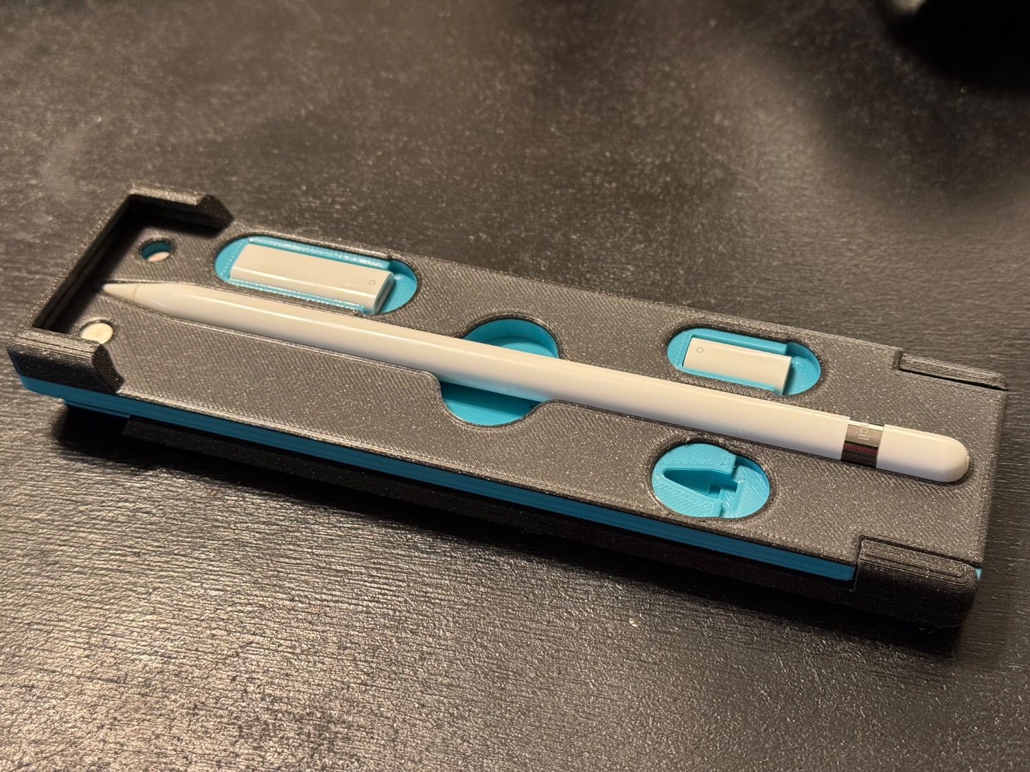
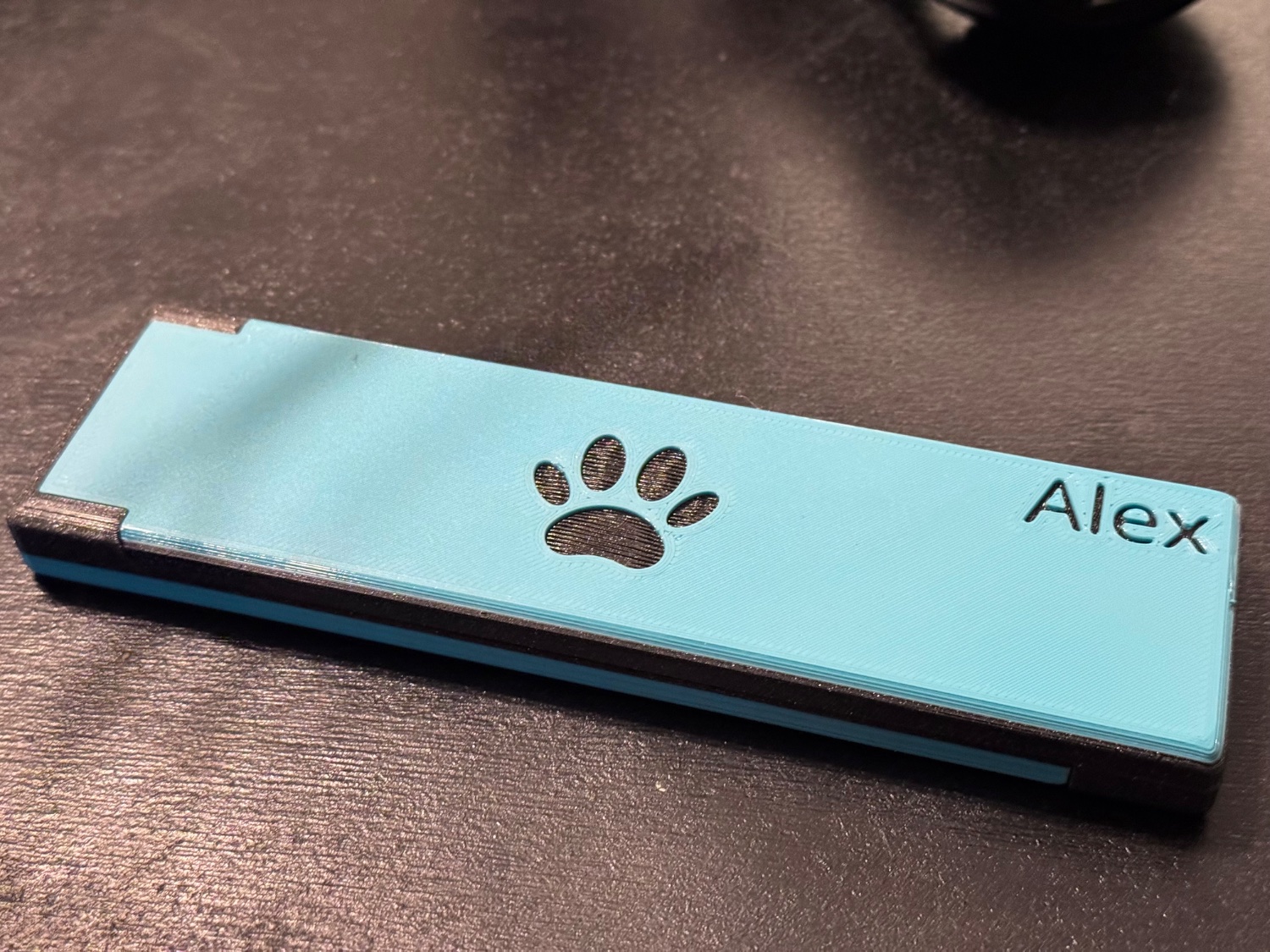
Well done! Big fan of the two tone finish.
Was the top piece printed as a single part with a filament swap part way through, or is it two separate pieces stuck together?
2 prints, swapped after the last solid infill on the bottom, and before the first solid infill on the top.
I see. It came out clean.
If I may make a suggestion for if you make a similar design in the future, there is a model I found for a dice tower that has a logo indented maybe 0.2mm on the front of case. You print this side face down on the plate, it prints the face with the logo cut out; swap the filament before the following layer, and it will print mostly smooth against the build plate with your contrasting color.
Of course, what you've done comes out with a thicker indented logo, so if that's what you're looking for this wouldn't be the same look, but just wanted to throw the idea out there in case you wanted to play around with it for the future.