Making a site JavaScript-less with bootstrap but the CSS is kicking my ass- I do the code directly as it is meant to be, then I try to add one thing and it breaks. I'm gripping on w3schools for dear life and I just can't seem to wrap my head around anything other than the basics. CSS is pain ESPECIALLY when I'm doing it on an external sheet. (I don't want to do internal because all the text gets overwhelming.) Anyone have some ideas to help with this?
Edit: So I realized the browser tool thing is really easy for visuals + that BOOTSTRAP IS INSANELY VAST. For just about every CSS element theirs another 1.5k sub rules which is great for getting specific but not great when you are basically creating a rule for a already ruled element that you have no way of finding easily. Bootstrap is just a functionality CSS sheet I think and not the equivalent to a HTML DLC
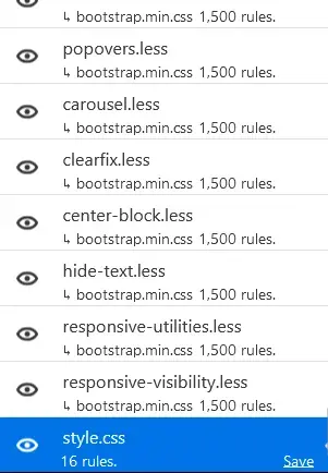
(Image is my CSS sheet compared to the crazy amount of CSS sub sheets that exist in bootstrap. My measly little 16 rules look pathetic)


Use the browsers inspector to see the computed sheet and visualize margins and padding. Also helps detect selectors that aren't quite right as you can see the selector stack.
Small and incremental changes. Test after each change.
Also using the inspector, you can adjust values to find to find the desired computed value. Useful for getting margins/padding pixel perfect.
Break it down. Widgets are ideally reactive to the parent container. Layout is done separate and should be maintained without any widgets.
Be aware of selector precedence. This is why the inspector is helpful. You may need to use something like
!importantto deal with precedence.If you are doing a lot with absolutes and relatives (e.g., menus), maybe look at the z-attribute to define how layers should overlap.