mpro

joined 1 year ago
 

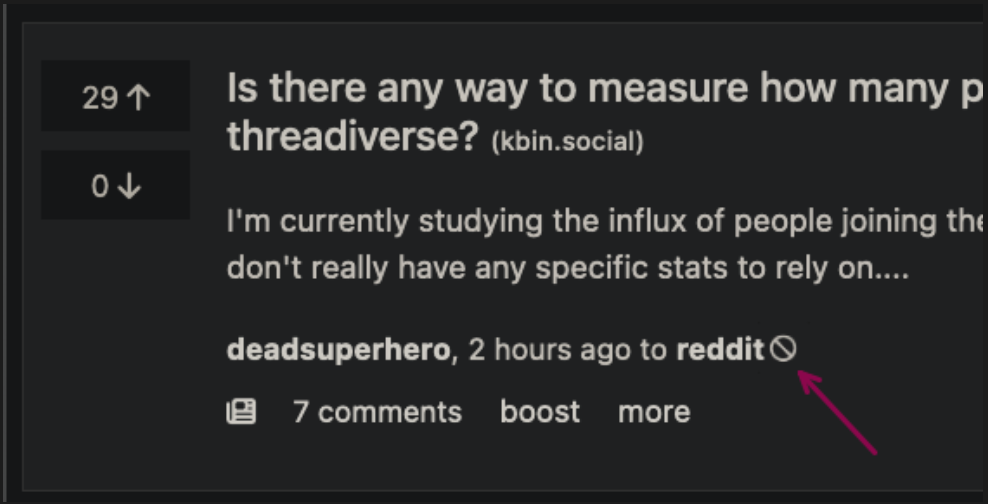
see attached image, but basically having the images on the right side makes it so hard to "read" a post with an image, going back and forth with your eyes to "get" the whole post. So much easier to just put the images between the up-/downvote buttons and the text post.

I don't know if there's a reason for that besides looking different from similar sites. If so, I don't think this is the way, it really puts a strain on your eyes and our brain is not used to absorb information in this way.


This site is getting better everyday, big shout out to @ernest , you're doing a fantastic job :)

I think some kind of user polled for a feature wishlist would really help you getting a grasp on what the users on kbin are eager to see on this site and maybe point out things that would improve it a lot and make an overall continually better user experience( kinda like a "ticketing system" for you/ people working on the project).

This should be as simple as possible, maybe there can/ should be different sections for UI, site functions, etc. so maybe important functional points won't get swepped under the rug by, but maybe someone with knowledge on this things can elaborate on this.

keep it up and take care :)