Thank you for the great writeup!
I would like to chime in:
- The name Mlem is a little bit of a pun. I took the first three letters from the name "Lemmy" (so, "Lem") and I noticed it's close to the interjection "mlem," which is the name for when a cute animal sticks their tongue out.
- Speaking of the first point, I imagined the logo to be a head of a rodent with its tongue out.
The Mlem Name
I think we can't change the name at this point. I'm already doing advertising on Reddit and other platforms, and the name is associated with the brand. It's also going to be on the Lemmy homepage soon (as in, it's already merged into the codebase), so I think we have to rule out any changes to the name.
On the spot, I don't know if any part of the name should be emphasized. There's that "LEM" part paying homage to "LEMmy", but also "Mlem" is a word of its own. I would love some ideas from other people.
The Icon
The icon is very close to the Mickey Mouse head because it's AI-generated (I'm horrible at graphics), and I couldn't get the AI to generate anythig else than a generic mouse head. And I couldn't get it to generate a mouse head with its tongue out at all, so I had to settle with that we have now.
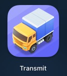
I would love the icon to be 3d, cute and minimalist, a-la Panic apps. Something like their logo for Transmit:

Another example of a pleasing icon is, in my opinion, NetNewsWire:

I also like this custom Telegram icon:

I think the most important thing for the logo is to be 3d and cute. If it had a lemming sticking its tongue out, it would be even better. Also, it shouldn't be hyper realistic and overly skeumorphic; I'm personally not a big fan of the iOS 6 icon design.
The Audience
The main purpose of Mlem is to be approachable (that's why I'm emphasizing cuteness in the Logo section) to everyone (for example, I'm doing user testing with my teen sisten, my mom and grandma). I found approachability to be lacking in the Fediverse in general, so that's what I'm focusing on with Mlem. Making a very coplicated concept friendly and approachable to the average user.
Mlem has to be as simple and easy to use, sometimes having to hide features that the average person would consider too complicated (for example, Mlem doesn't show instances at all, nor does it mention "Federation" or "Instance" and other terms the general public might consider confusing).
Other Points from the Post
Should the emphasis be to make it fit within the overall Lemmy GUI ecosystem itself, adhering to and following the default GUI design of the default Lemmy instance installation, and change with that as it changes?
For me, that's a no. As mentioned above, Mlem has its own way of naming things and doing things, so I think we shouldn't try to belong into the ecosystem too much.
Should the default icon style be ever-changing, similar to how Apollo’s icon designs were customizable?
This is something that I think we should consider. I think there should be a static, non-changing default icon, with users being able to submit their own designs. And if they fit well, they could become available as options.
Color theory should be applied to the default aesthetic of this design, of course, so I’ll give you a link to the emotional/cultural impact of colors to inform those decisions. If this app is going to be used worldwide, we will need to take into account cultural variations in terms of color interpretation.
and
Given that lemmings are native to the arctic tundra, should we take that into account in the design/coloration? Using whites and blues to bring to mind ice and snow? Or is that too cold/forbidding, and we want to be warmer and more inviting?
I think we should choose an approachable color. Mlem is not meant to be a business or overly serious app, so we shouldn't go that way. I'm leaving the color up to the others, just don't make it stuck-up or too formal.
So these were my points and opinions, I'd love to hear from everyone! :)
Alright, great to hear! Thank you for confirming 😊