LabPlot

joined 2 years ago
 

Have you seen this video tutorial on how to extract plots, curves and data points from images using #LabPlot's Data Picker tool ?

@[email protected]

Data Picker has been available in LabPlot since the version 2.2, but we renamed it recently to Data Extractor.

https://www.youtube.com/watch?v=D_Pz5aA-4Xg

#LabPlot #DataVisualization #PlotDigitizer #DataExtraction #DataExtractor #Plots #Graphs #FreeSoftware #OpenSource #FOSS #FLOSS

[–] [email protected] 1 points 2 months ago (1 children)

@bitigchi @[email protected] we finalized the port to Qt6 already long time ago. We’re finalizing the Qt6-port of Cantor now and we’ll switch in master to Qt6 once also this dependency was ported. The next release should be based on Qt6 already. So, it should be done soon.

[–] [email protected] 1 points 2 months ago

@nicemicro @[email protected]

That would be great, thanks! 🙂

[–] [email protected] 1 points 2 months ago* (last edited 2 months ago) (5 children)

@[email protected]

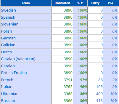
#LabPlot is now also fully available in Ukrainian and French! Thank you ❤️🙂

The following translations still need some work... And other languages need a bit more work 😉

[–] [email protected] 1 points 2 months ago (1 children)

@s3nnet @[email protected]

@kde

To whom from the KDE community should we forward this question?


#LabPlot is currently fully available in British English, Catalan, Dutch, Galician, German, Polish, Slovenian, Spanish, Swedish and partially available in French, Italian, Ukrainian, Russian and other languages.

@[email protected]

We would like to thank all LabPlot's translators and encourage others to provide translations in other languages ❤️ 🙂

Check translation statistics:
▶️ https://l10n.kde.org/stats/gui/stable-kf5/package/labplot/

Please get involved!
▶️ https://community.kde.org/Get_Involved/translation

#Translation #OpenSource #FreeSoftware #FOSS #KDE


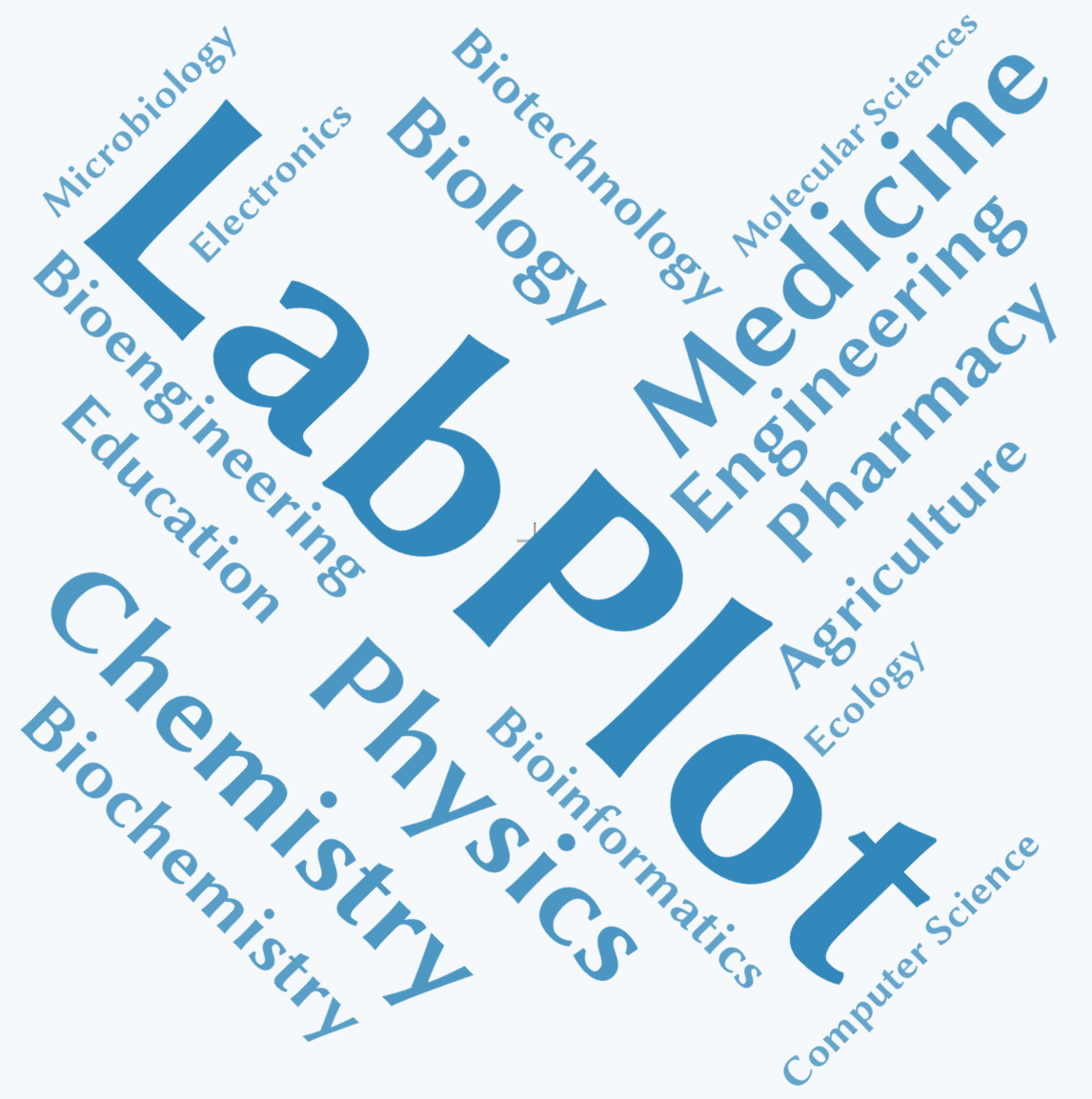
This page contains a list of external resources mentioning #LabPlot and its usage in various areas 👨‍🔬 🔭 🔬 .

➡️ https://labplot.kde.org/references/

@[email protected]

If you are aware of other resources that could be listed there, please contact us.

#LabPlot #Science #Research #Students #Physics #Medicine #Chemistry #Biology #Engineering #Ecology #Electronics #Robotics #Education #OpenSource #FreeSoftware


If you want to learn #statistics, we highly recommend this YouTube channel: #TileStats.

@[email protected]

You can start with this Basic Statistics course:
➡️ https://www.youtube.com/watch?v=YZGG5PpbJdc&list=PLLTSM0eKjC2eSEO7y7MZWb1sdDJiAejoI

#Students #DataAnalysis #DataScience #AI #MachineLearning #Teaching


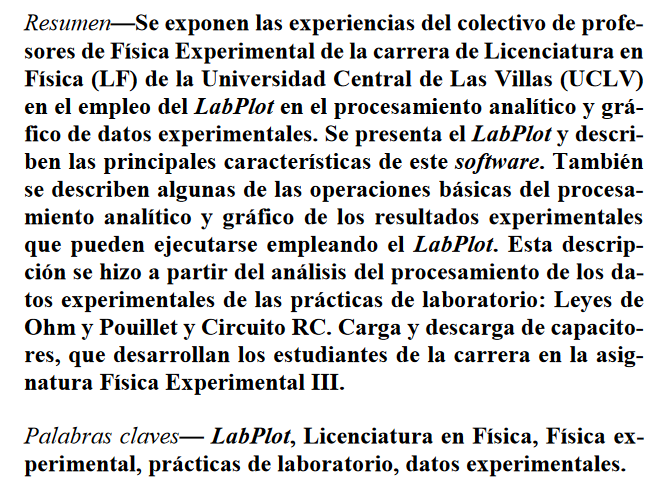
An open access article by W. Morales González and J. E. Hernández-Ruiz: Experiencias en el uso del software LabPlot en el procesamiento analítico y gráfico de datos experimentales

@[email protected]

➡️ https://www.researchgate.net/publication/361586279_Experiencias_en_el_uso_del_software_LabPlot_en_el_procesamiento_analitico_y_grafico_de_datos_experimentales

#LabPlot #Students #Research #DataAnalysis #Physics #DataVisualization #experimental #Física #Teaching #Chemistry #OpenSource #FreeSoftware

[–] [email protected] 3 points 3 months ago* (last edited 3 months ago)

@dataisbeautiful

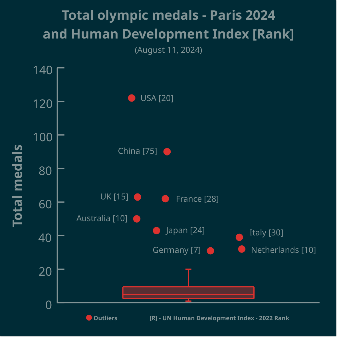
Thank you for all your comments. A jittering of data points along the x-axis was used to avoid over-plotting. But yes, a scatter plot with a boxplot attached along the y-axis (to show outliers) may be more informative in this case.

[–] [email protected] -4 points 3 months ago* (last edited 3 months ago) (2 children)

@clutchtwopointzero

A boxplot is a 1-dimensional plot. The data points are jittered along the x-axis to make them less crowded.

More on boxplots here:

➡️ https://labplot.kde.org/2021/08/11/box-plot/
➡️ https://userbase.kde.org/LabPlot/2DPlotting/BoxPlot


▶️ Total olympic medals won in Paris 2024 and Human Development Index 🏅

@dataisbeautiful

➡️ https://www.businesstimes.com.sg/opinion-features/what-olympic-medal-table-really-tells-us

After reading the article we made this #boxplot using #LabPlot, an open source data analysis and visualization software.

The plot doesn't provide answers, it rather invites some thinking.

#Olympics #Olympics2024 #France #China #USA #UnitedStates #UnitedKingdom #UK #Brazil #Australia #Japan #Italy #Canada #Germany #Italy #Netherlands #DataAnalysis #DataScience #OpenSource #FOSS

[–] [email protected] 1 points 3 months ago* (last edited 3 months ago)

@[email protected]

Since July you can enjoy the new 2.11.1 version of #LabPlot, an open-source data analysis and visualization software.

Check your current version and ask your package maintainer to provide the latest version for your #Linux and #FreeBSD distribution.

➡️ https://repology.org/project/labplot/versions

#DataAnalysis #Statistics #Research #Ubuntu #LinuxMint #ArchLinux #Slackware #Debian #Fedora #OpenSUSE #RedHat #HaikuOS #GNU #CentOS #FreeSoftware #OpenSource #Manjaro #Zorin #FOSS #FLOSS #KDE

[–] [email protected] 3 points 3 months ago

@architectonas

We used #LabPlot, a free, open source and cross-platform data visualization and analysis software.

LabPlot's homepage:
➡️ https://labplot.kde.org/

Video tutorials:
➡️ https://www.youtube.com/@LabPlot/videos

[–] [email protected] 0 points 3 months ago (1 children)

@Eheran

Great question! And what's _your_ answer?

[–] [email protected] 2 points 3 months ago* (last edited 3 months ago)

@Sconrad122

Any exploratory plot forms a question and your comment shows how to look for answers. Thanks!
[–] [email protected] 1 points 3 months ago* (last edited 3 months ago)
 

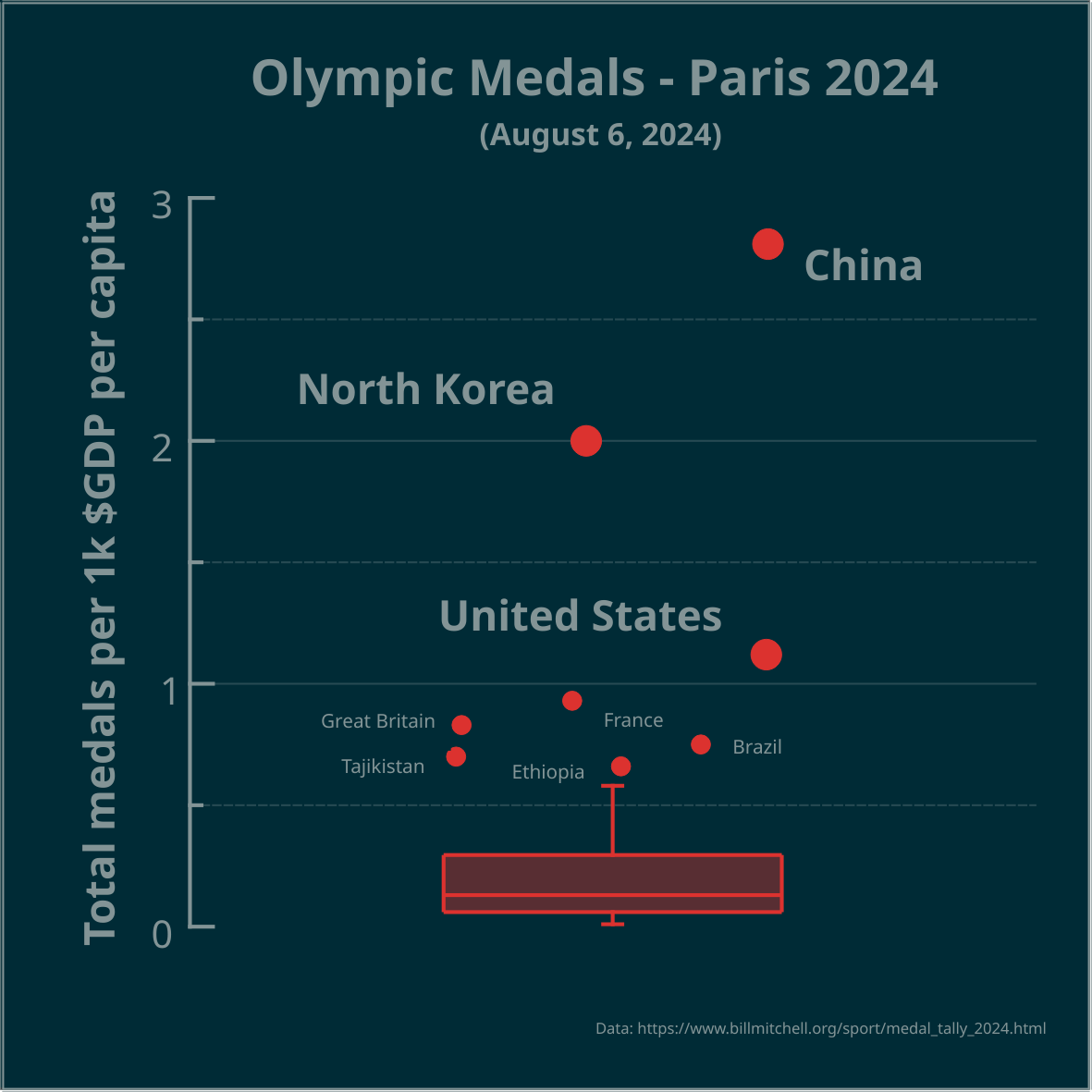
▶️ Total olympic medals per 1k $GDP per capita - Paris 2024 - represented in the Tukey's boxplot 🏅

@dataisbeautiful

Is the highest number, relative to $GDP per capita, best? Outliers marked as circles. Made in #LabPlot, an open-source data analysis and visualization software.

Edit: the problem is framed as a question.

#Olympics #Olympics2024 #France #China #NorthKorea #USA #UnitedStates #UnitedKingdom #UK #Brazil #Australia #Japan #Italy #Canada #Germany #Spain #DataAnalysis #DataViz


▶️ LabPlot - Tutorial - Stacked Plots

@[email protected]

Catalyst Nanomaterials Lab has published another video tutorial that shows how to create stunning stacked plots in #LabPlot. Go check it out!

https://www.youtube.com/watch?v=rZ5qYjM8FEg

#FreeSoftware #DataAnalysis #DataVisualization #Research #OriginProAlternative #Science #Tutorial #FLOSS #FOSS #OpenSource #StackedPlots #ProbabilityDistribution #AlternativeTo #KDE #Students #Researchers #Professionals #SciDavis #Technology

 
view more: next ›