FrostySpectacles

joined 1 year ago
[–] [email protected] 2 points 1 year ago

Lemminator is a web UI that aims to make Lemmy more approachable for a broad non-technical audience. It can be hosted by Lemmy instance owners, and Lemmy.world users can use https://lemminator.netlify.app/.

[–] [email protected] 2 points 1 year ago* (last edited 1 year ago) (1 children)

if i reply i usually open the whole thread anyways

I've noticed on both the official web UI and Thunder that the permalinks don't always scroll to the right comment. Lemminator only shows the relevant part of the conversation, e.g. https://lemminator.netlify.app/c/lemmyapps/post/3824810/comment/2824106.

[–] [email protected] 1 points 1 year ago

The former. The comment reply contains a path parameter listing the IDs of all its ancestors. I take its direct ancestor and fetch it.

[–] [email protected] 1 points 1 year ago (1 children)

What error were you seeing? If it's unrelated to Lemmy.world downtime, I might be able to help.


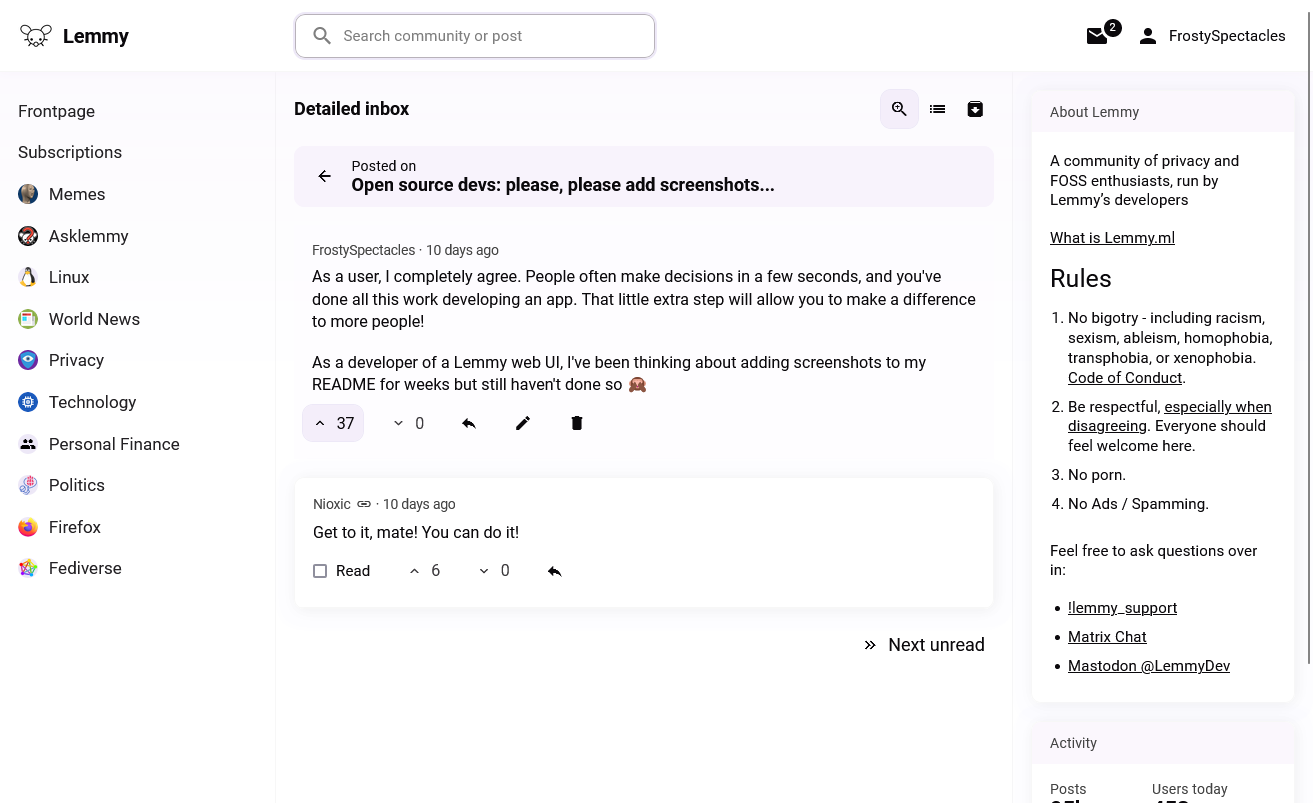
Most Lemmy UIs seem to have an inbox that works a bit like this:

Without context, I don't really understand what's happening. A link to the parent comment is usually available, but it takes me out of my inbox.

Here's how I approached it in Lemminator:

All context is right there, and I can work through my unreads one by one. A conventional compact inbox view is also still available:

Would this work for you? Do you prefer the classic inbox?

[–] [email protected] 1 points 1 year ago (1 children)

Interesting, I hadn't considered that before.

Suppose I modified Lemminator's search bar so you could paste a link like https://lemmy.ml/comment/1234 or https://lemmy.ml/post/5678 in it and press Enter to navigate to the relevant comment/post within the web UI. I could automatically infer that these are permalinks from other instances. Would that help at all?


I sometimes open comment permalinks when going through my inbox on the official web UI. I wasn't completely satisfied with how they work so I wanted to rethink permalinks.

Here's what I ended up with for now: https://lemminator.netlify.app/c/lemmyapps/post/3425509/comment/2569266

Lemmy.world's officially supported web UIs:

Some design decisions I made (for better or worse):

  • You can open a permalink by clicking a comment's timestamp. This minimizes UI clutter but trades off discoverability.
  • The permalink page shows the linked comment near the top, skipping all post information except for its title
  • The comment you link to is the one you'll see at the top (not the parent comment)
  • Context is available behind a button

Are permalinks something you use at all? Do you have any opinions on how they should work?

33
submitted 1 year ago* (last edited 1 year ago) by [email protected] to c/[email protected]
 

I added keyboard navigation for posts and comments to Lemminator. These hotkeys will feel familiar to Vim users.

Here's how it works:

  • j goes down, k goes up
  • For posts: o opens the post page
  • For comments: l goes to first child comment, h goes to parent
  • More posts/comments will load if you step over a page limit
  • Esc ends navigation

Keyboard navigation pairs well with browser plugins like Vimium, allowing you to reach features that aren't explicitly navigable with familiar key bindings. Just make sure to exclude the above hotkeys from Vimium.

[–] [email protected] 1 points 1 year ago (1 children)

The link is https://lemminator.netlify.app/. While it's still very much a work in progress, basic navigation and upvote/downvote are already working.

[–] [email protected] 2 points 1 year ago

You're hitting the nail on the head. Reddit-style websites are familiar to a lot of people, but we need to do a better job of explaining instances and federation. Not with text or technobabble, but with a UI that's so intuitive it almost speaks for itself.

[–] [email protected] 2 points 1 year ago (1 children)

Prior to starting my own web UI I considered becoming an Alexandrite contributor. I like how colorful it is compared to the regular web UI. My vision is too different from a technical, design and UX perspective though, so I still think it's worth pursuing a separate effort. I hope it'll pay off.

[–] [email protected] 2 points 1 year ago (2 children)

Thank you! There's obviously still quite a way to go, but I'm hoping I or someone else will get there eventually.

I agree that defaults matter a lot. You get only one chance to make a first impression, and most people will probably decide within a few seconds whether Lemmy is worth exploring. We need to get those users excited to explore the platform.

Granted, some people may be scared that it's going to "dumb down" Lemmy. But Lemmy will always continue to be about freedom of choice: you pick an instance you like, instances can offer any selection of web UIs they want, and you pick from the offered web UIs.

[–] [email protected] 3 points 1 year ago (1 children)

A readonly prototype is available at https://lemminator.netlify.app/ right now ;)

[–] [email protected] 2 points 1 year ago

Its working title is Lemminator. You can try a readonly prototype at https://lemminator.netlify.app/ right now.

[–] [email protected] 3 points 1 year ago

I have a readonly prototype up at https://lemminator.netlify.app/!


I'd like Lemmy to attract a wide range of folks who contribute to a diverse range of communities. While the official web UI is very rich in features, I think it might be a bit intimidating for non-IT people.

So I figured: why not try to be the change I want to see in this world? Here's my attempt, implemented in SvelteKit.

view more: next ›