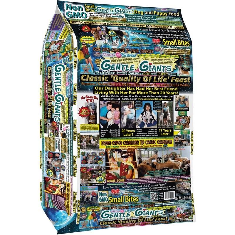
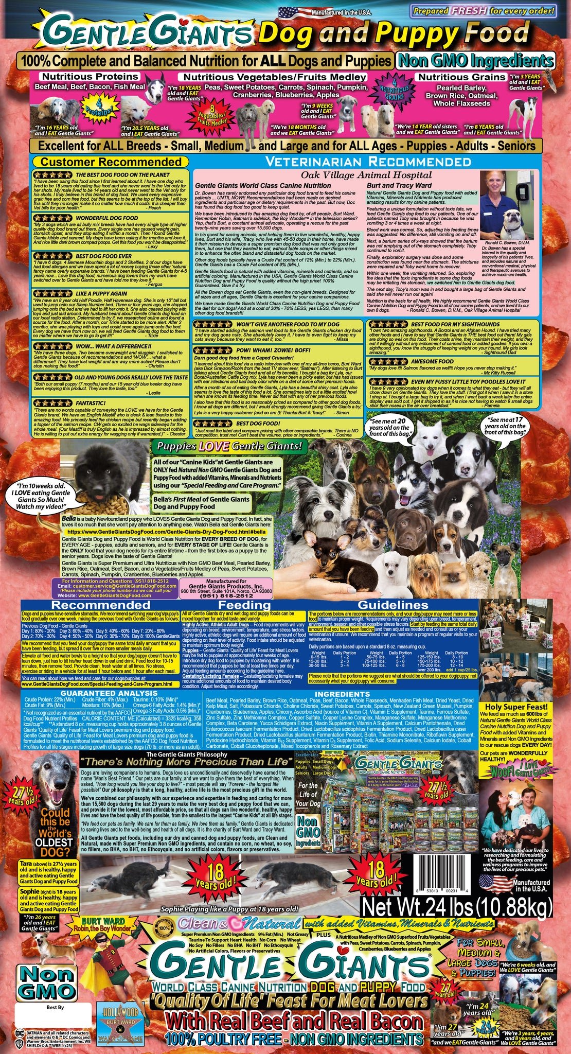
Whoa, their giant bag has an even crazier design: https://www.chewy.com/gentle-giants-natural-non-gmo-dog/dp/248670


Noticed that theres no equivalent to r/crappydesign here yet so i made one
Whoa, their giant bag has an even crazier design: https://www.chewy.com/gentle-giants-natural-non-gmo-dog/dp/248670


Sweet baby Jesus, I can only imagine how often the printer rollers need to be replaced.
I kind of like that first one for some reason? If you try and read it it's horrible of course but as a general pattern I don't hate it
Bacon is the most nutritious protein.

This very much reads like Burt Ward himself eats this dog food (and, presumably as a result, has remained 26 years old since 1971).
https://cari.institute/aesthetics/dollar-store-vernacular absolute treasure trove of design like this
This feels like something that would pop-up on your pc after you try to download a Minecraft mod from the third page of bing
r/place
Child stars all end up a bit loopy, apparently the Boy Wonder is no different.
ALL-ONE!
Like Dr Bronners, pretty sure I've heard this dog food is actually very highly recommended
I mean... I think that Dr Bronners bottle label is a clusterfuck and yet I swear by it.
DOG WALKING IS HOLY WORK!
Enjoy only one treat per day! Dilute in warm water if a good boi.
Every time I encountered a Gentle Giants bag while working the Pets department, I always found myself thinking "show, don't tell". I had to look all over the bag to get a less-than-one-square-inch glimpse of the actual food. Horrible packaging. No one's gonna read all that.