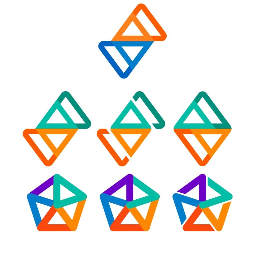
I like both the 2nd and 1st ones on the 2nd row in that order. Still looks similar to the app we lost, but the new colours are good for showing that Sync is still about doing the same for Lemmy. The bottom row is more noisy to me but as long as it isn't that last one (sorry it does look a bit too much like some kind of fascist symbol) I am good with what you go with!
this post was submitted on 25 Jul 2023
458 points (97.1% liked)
Sync for Lemmy
15088 readers
3 users here now
👀
Welcome to Sync for Lemmy!

Welcome to the official Sync for Lemmy community.
The rules for posting and commenting, besides the rules defined here for lemmy.world, are as follows:
Community Rules
1- No advertising or spam.
All types of advertising and spam are restricted in this community.
Community Credits
Artwork and community banner by: @[email protected]
founded 1 year ago
MODERATORS
Bottom right is my favourite. Although the original is also still amazing.
