Comic sans is so ubiquitous because it is easier to read for people with reading difficulties like dyslexia. So I let people do what works for them.
https://www.boia.org/blog/does-comic-sans-benefit-people-with-dyslexia
A community to discuss and share information about typography and fonts
Sibling community:
Rules of conduct:
The usual ones on Lemmy and Mastodon. In short: be kind or at least respectful, no offensive language, no harassment, no spam.
(Icon: detail from the title of Bringhurst's Elements of Typographic Style. Banner: details from pages 6 and 12, ibid.)
Comic sans is so ubiquitous because it is easier to read for people with reading difficulties like dyslexia. So I let people do what works for them.
https://www.boia.org/blog/does-comic-sans-benefit-people-with-dyslexia
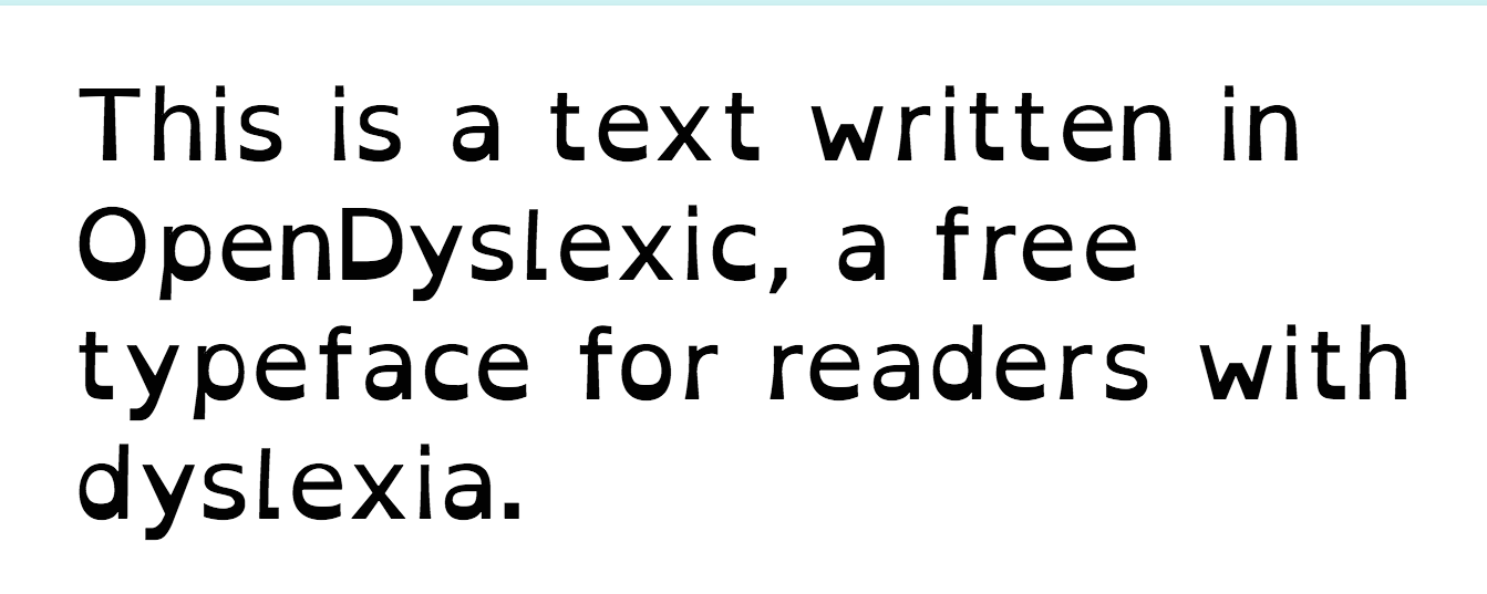
Atkinson Hyperlegible and OpenDyslexic are both fonts that were actually designed for that. And Atkinson at least doesn't look ridiculous.
That article all but rejects your claim...
Please stop spreading this BS and the typographic crimes it enables
There is an actual opendyslexic font and it doesn't look much like comic sans. It has a very distinct heavy and light weight line to it, on a printed page the light areas barely show.

I think Comic Sans has been demonized by virtue of its misuse. It's a fun, no-frills font that has been slapped on in just about every document on the face of the Earth. It's easy to see how people could decide to use it even in serious situations, so nowadays I just chuckle if I see it misused. Also, it's great for dyslexic people so that's a point in its favor.
I’m going to use it in the future.
On April 1st of 2024 our company is going to receive a notification that our knowledge base is going to switch to all Comic Sans.
I’m brimming with antici- pation.
I have never, and WILL never, respect anyone who uses Comic Sans. Do you want me to think you wrote something in crayon??
I recently saw a bio submitted for a board position that was done in Comic Sans, instant no vote from me. Do you not even know about Arial or Calibri? I mean, if you want to get crazy I'd even accept Times New Roman or Bookman if you think you can pull it off.
Come on people...
/humor
Shouldn't we debating font vs typeface, rather than comic sans being viable. LOL
I used it in the past but only because there was no real alternative at the time. I suppose as far as sans serif goes it’s the one that at a glance seems most like a handwritten font especially since fonts are usually alphabetically categorised, compared to courier new anything looks good. Once you use it and learn about typography you then see how bad it is.
Never thought about the alphabetization aspect. That's interesting. It probably does go into its popularity.
I wonder if that's why Arial, Calibri, and Cambria are so ubiquitous along with Courier. I guess Times New Roman is only commonly known because it's old.
A friend of mine told me he attended a quite serious seminar about neuroscience once, with slides all in Comic Sans. And yet, to his (and my) surprise, the speaker really managed to pull it off!
I quite like it for readability when you want something less formal, but it’s so looked down upon that I don’t dare use it anymore.
It's like using ain't as short for am not. It's correct, but the word is so reviled that it can't be used unless you're going for a particular affectation.
Comic Sans is for silly stuff. Nothing wrong with using it for silly things.
Oh well. I still like it. It's easy to read.