24
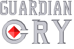
This is my game's title logo, please give advice on how to improve before I start shading
(hexbear.net)
Game Development
graphic design is not my passion but I think the C is too circular (or at the very least, the gap in it is too small, it doesn't immediately recognize as a C in my brain, it just looks like a circle), and the gem or whatever inside it may be a bit too big.
Oh and the centering is off, should be more like this:

I thought the same thing about the gem, actually. Easy fix at this point.
C will be trickier since widening the gap will mean I'll have to redraw the serifs at an angle, but that should be manageable.
EDIT: Thanks for the recentering!
there might also be something up with the kerning of the C (the gap between C and R) but honestly just fixing the L/R centering of guardian and adjusting the C/gem proportions a touch will look pretty good to me I think!
idk how kerning works, but some asshole taught me to recognize when it's slightly off lol
Hey, designer here (at least that's what I say at family functions). I'll need to look at it properly on a computer but I can see two things.
The kerning with the A is a bit wider than on other letters, either the A letter needs to be brought closer to the rest of the word, or it needs to be a little more top heavy.
Same alignment argument with the whole logo, the word Cry feels a bit too aligned to the right. I would bring it a little bit more to the left.
I assume you mathematically aligned the letters and so on paper they are all centred properly and stuff, but you need to do it optically for human eyes. Because the C is rounded, it looks further left than it actually is, you need to offset it to the left a little bit as the left edge of the C is very thin (if you looked at in 1D, imagine it's just a line).
I can provide a more visual example later but this is what jumps out at me.
The gem also clashes with the typeface as you don't really find that shape in the font (lozenge). You have straight lines for the most part with thin, needley ends (the serif) and a very rounded, almost circle C. Is it possible to try other shapes inside the C?
Thanks for the suggestions! Nice to hear what a designer has to say. I'll make some adjustments.