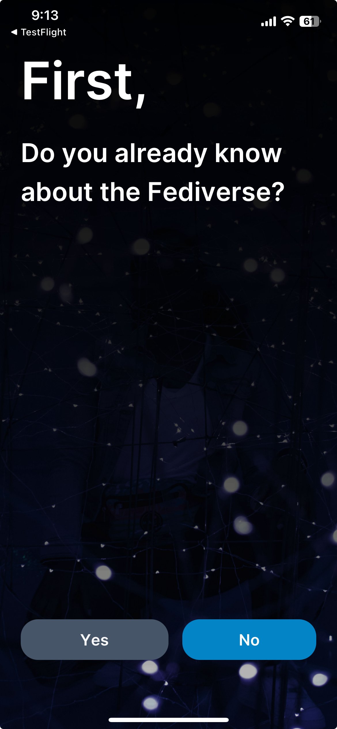
Yup, this is in the latest build. I’m planning on having the instance selection be available in the account screen in the future, although I called it hubs to make it more user friendly.
The whole idea of it was to be hopefully easy to understand for new users whilst having functionality that veterans would enjoy. Newbies will hopefully appreciate the guide and veterans should appreciate the instance selection for new and old accounts.
The background is just something I grabbed quickly from Unsplash. I’m planning on changing it in the future to something more appropriate. It was originally just supposed to be a placeholder :P
I’m quite pleased with how it’s turned out but I’m always looking for feedback on possible ways to improve it or things we should do differently.
The main focus of the redesign and the rebrand was to make things more user friendly and applicable to a larger audience. Hopefully this makes it much easier to bring new users over to the Fediverse!

