this post was submitted on 01 Sep 2023
14 points (93.8% liked)

Photon

2 readers
8 users here now

The community for the Photon Lemmy client.

https://photon.xylight.dev

founded 1 year ago
MODERATORS
 

You won't notice much on the cards design, except that body text is no longer in its own container, and it fades out.

The compact design was completely overhauled though, to look much better.

I used to only use cards but I exclusively use compact now.

top 7 comments
sorted by: hot top controversial new old
[–] [email protected] 3 points 1 year ago* (last edited 1 year ago) (2 children)

The cardless design for the compact view is nice... but could we make the body text optional (for compact view)?

I find it more distracting than useful.

Alternatively, maybe show the first line and then make it expandable (similar to how comments can be collapsed and expanded).

[–] [email protected] 2 points 1 year ago (1 children)
[–] [email protected] 1 points 1 year ago (2 children)

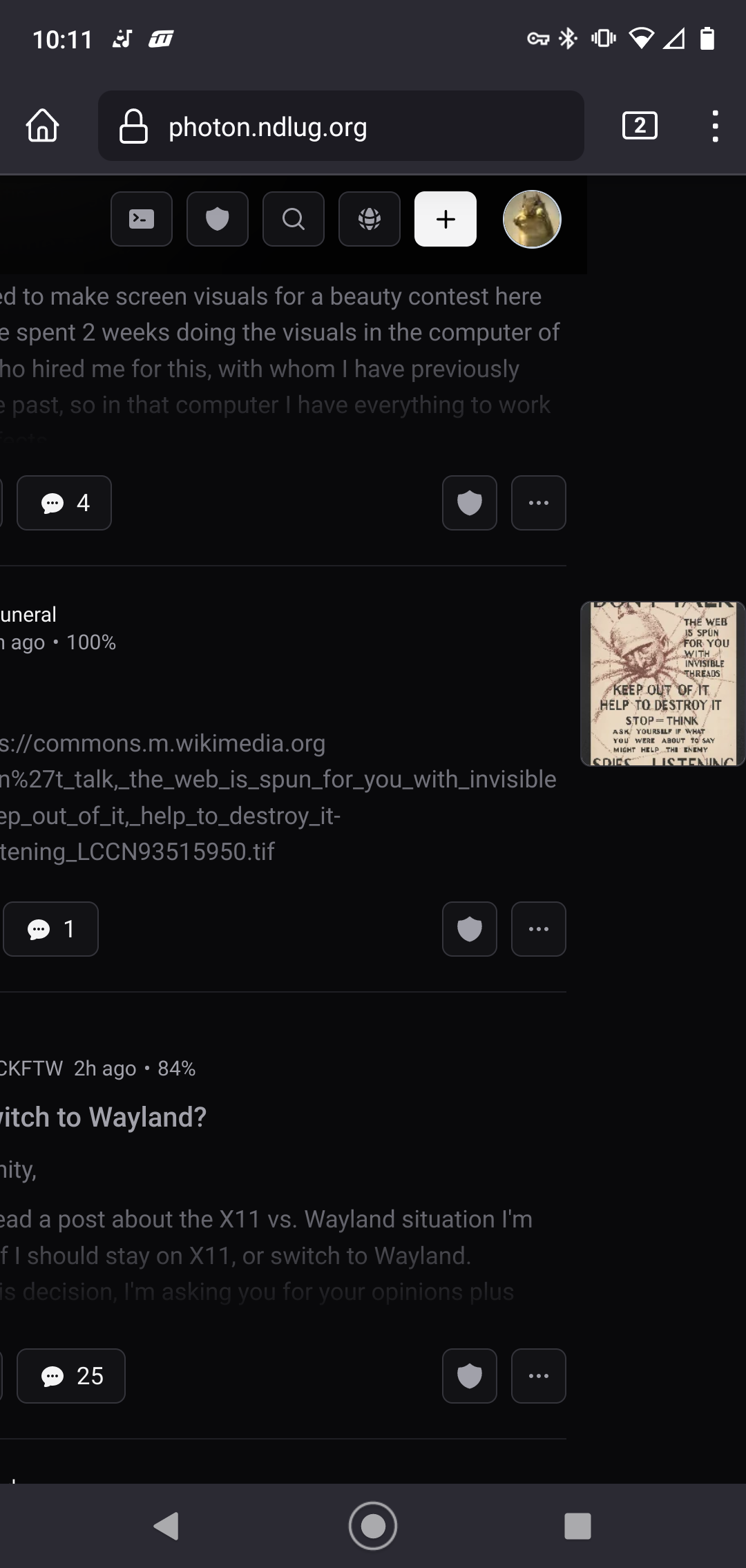
Hmm. With long/wise body text, this sometimes happens:

On mobile, the image is off to the right and you can slide the main column view horizontally.

[–] [email protected] 2 points 1 year ago

Fixed in v1.2.2

[–] [email protected] 1 points 1 year ago

I think I know the issue. Does this only occur when the body text contains a long line with no spaces, like a link?

[–] [email protected] 1 points 1 year ago (1 children)

Renamed "compact" to "list". I added a "compact" view which is just "list" without post bodies in v1.4.5

[–] [email protected] 1 points 1 year ago

Looks great! Thanks.