this post was submitted on 25 Jun 2023
4 points (100.0% liked)

Photo Critique

406 readers
1 users here now

A community to critique photographs and learn from others.


Rules

Trying to create a similar space to /r/photocritique

founded 1 year ago
MODERATORS
 

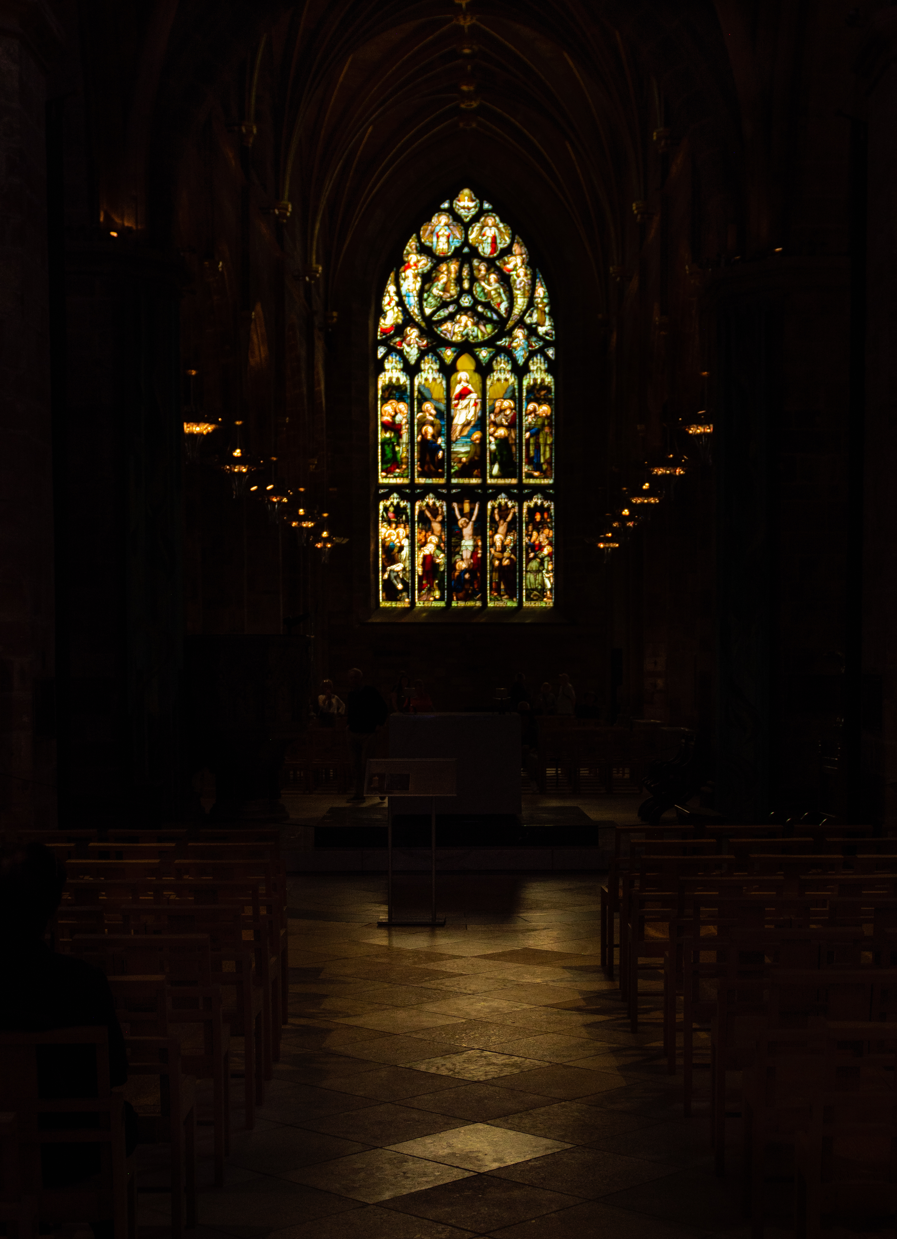
Hey all, I'm going back and forth on this one so I thought I'd ask for some feedback. I really like the moody atmosphere of this pic, but I'm worried that it's just too dark on most viewing devices except for a nice monitor or a good print. I can brighten the image, but there isn't much of visual interest in the darker areas, so I'm worried that it will be too boring of I do so. Thoughts?

top 6 comments
sorted by: hot top controversial new old
[–] [email protected] 2 points 1 year ago

The thing I’m most drawn to in this photo are the two tiles in the front that are highlighted - really like how they are catching the light at a different angle then the rest of the floor.

With that being the first focal point, cropping could help as mentioned by some others. I actually wish though that the camera closer to the ground for a more dramatic angle and a different perspective.

I didn’t notice the person on the left until I had my lights off, so yeah maybe a tad too dark.

[–] [email protected] 1 points 1 year ago (1 children)

Looking at it with my iPhone 14 Pro on full brightness it’s just a little too dark in my opinion. If I save the photo and view it it looks a little better but still a touch dark. It might would be bright enough if there was more of a glow coming through the windows.

I bet it would look absolutely sick printed though.

I struggle the same way with dark shots. If it’s something intended to post or share with people, then I’ll look at it at 50% brightness on whatever screen I’m using and brighten it until it’s how I want it to look. I think that takes care of most viewing situations in which people would see the photo.

However, If it’s something just for me I’ll make it as dark as it needs to be!

[–] [email protected] 1 points 1 year ago

Thanks for the response, I'm definitely going to print this one at some point. For now I'll make it a tad bit brighter :)

[–] [email protected] 0 points 1 year ago (1 children)

I get what you're doing with the composition here, but I feel like this would be a much stronger image if you cropped the bottom 15% or so, so like the first two diamond-shaped tiles off of the bottom. If you do that, you make the aisle look much brighter on average, which makes the image look brighter, which keeps you from having to bring up the darks as much.

That said, I do think that you need to be a touch brighter so that the geometry of the pews is visible, because all of those straight lines pushing towards the center will do some work in making the image look more interesting. I think there's also interesting geometry in the lights in the ceiling coming straight down, too.

[–] [email protected] 4 points 1 year ago* (last edited 1 year ago) (1 children)

I'll give this a try, i think the crop is definitely a good idea!

Here's an updated edit:

https://lemmy.world/pictrs/image/cd9f5b11-4d14-4035-9e52-fad20488f229.jpeg

[–] [email protected] 2 points 1 year ago

IDK about you, but I find that much more effective.

load more comments
view more: next ›