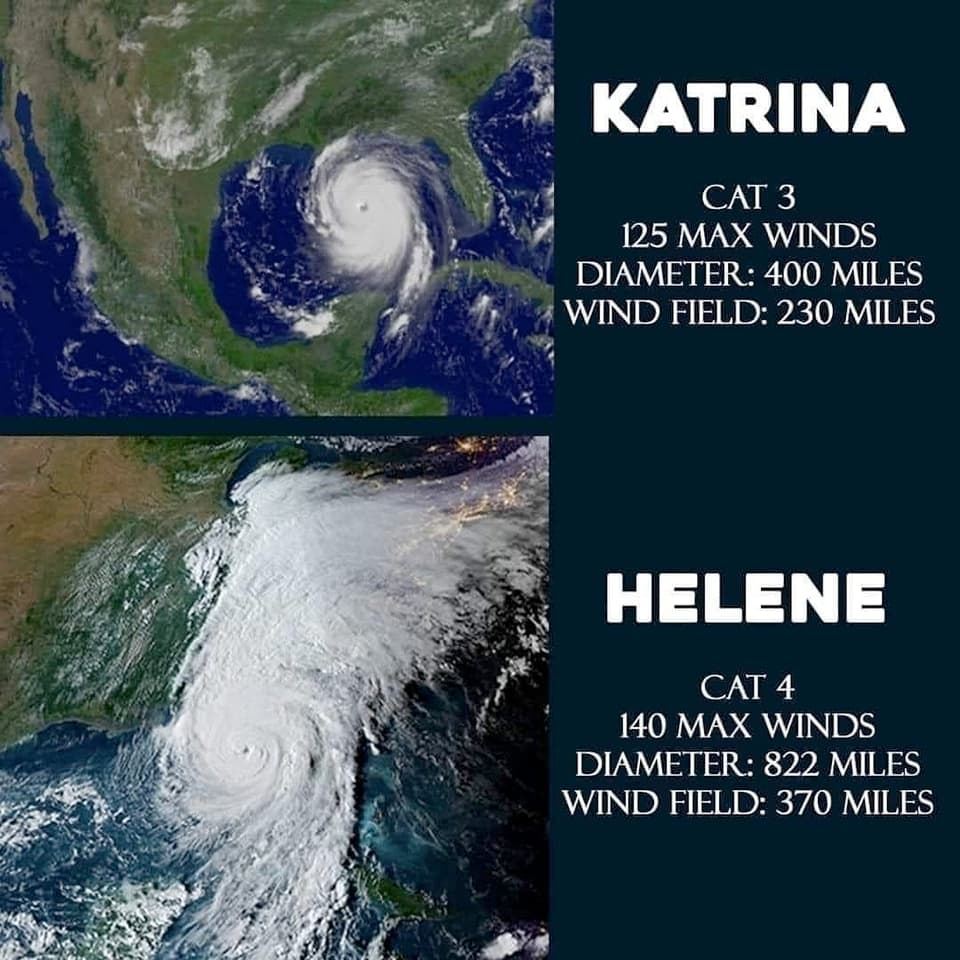
What I don't like about these graphics is there is no data source so you have to look it up to know how much to believe about what they say. So for those wondering, per Wikipedia:
-
Helene was a Cat 4, its max diameter was between 400-450 miles, max wind speed of 140 mph is correct. Known fatalities so far > 227 and counting.
-
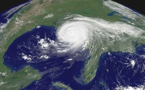
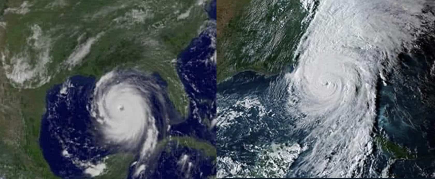
Katrina was a Cat 5, 400 miles in diameter as shown, but with a max windspeed of 175 mph, not 125. For those too young to remember, Katrina was a very, very bad storm. So bad. Over 1392 fatalities (official estimate; exact number unknown). BTW Katrina also had a big tail/wing(?) stretching to the north when it hit land like what Helene had, but thinner since further west--but those don't count as part of the measured diameter of the hurricane.
My opinion of this graphic: Hurricanes are getting worse because of climate change, but we don't need to convince people of that by downplaying Katrina or making Helene look scarier--Helene is also very very bad. It's all bad, folks.
Katrina photo:


