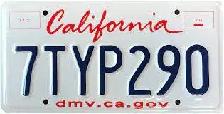
This ranks California’s 10/10 design near the bottom and Texas’ 9.5/10 design way too low.
The blobby multicolored designs ranked highly here don’t look good on an actual car.
All things graphic design!
This ranks California’s 10/10 design near the bottom and Texas’ 9.5/10 design way too low.
The blobby multicolored designs ranked highly here don’t look good on an actual car.

?
OP are you the author? I disagree with your rankings but enjoyed your commentary. You have good insights into intra-state social dynamics too. Thanks for posting.
Nope, not the author. 🙂 Just thought it was interesting. Trying to post more here to get the sub more active.
Yep. Iconic and looks fantastic on almost any car.
OP is making the classic mistake of form over function. The colorful backgrounds of the top license plates look nice in photos but they make it more difficult to read a license plate number on a moving vehicle.
Since design should take function into consideration, I think some of the more esthetically pleasing plates, at least according to OP, would be considered to have poor design.
Sure the plain plates are a little boring but I'd rather have a boring, easily legible plate than a pretty, indecipherable one any day.
I'm not the author. 🙂 Just posting interesting stuff to try and get this sub more active.
Fair enough. This community has been quiet
Wrong.
Missouri plates look like ass. They shouldn't even make the list.
Where's the New Mexico chili plate? That's my favorite one