this post was submitted on 12 Jun 2023
30 points (100.0% liked)

Technology

37727 readers
537 users here now

A nice place to discuss rumors, happenings, innovations, and challenges in the technology sphere. We also welcome discussions on the intersections of technology and society. If it’s technological news or discussion of technology, it probably belongs here.

Remember the overriding ethos on Beehaw: Be(e) Nice. Each user you encounter here is a person, and should be treated with kindness (even if they’re wrong, or use a Linux distro you don’t like). Personal attacks will not be tolerated.

Subcommunities on Beehaw:


This community's icon was made by Aaron Schneider, under the CC-BY-NC-SA 4.0 license.

founded 2 years ago
MODERATORS
 

cross-posted from: https://beehaw.org/post/511971

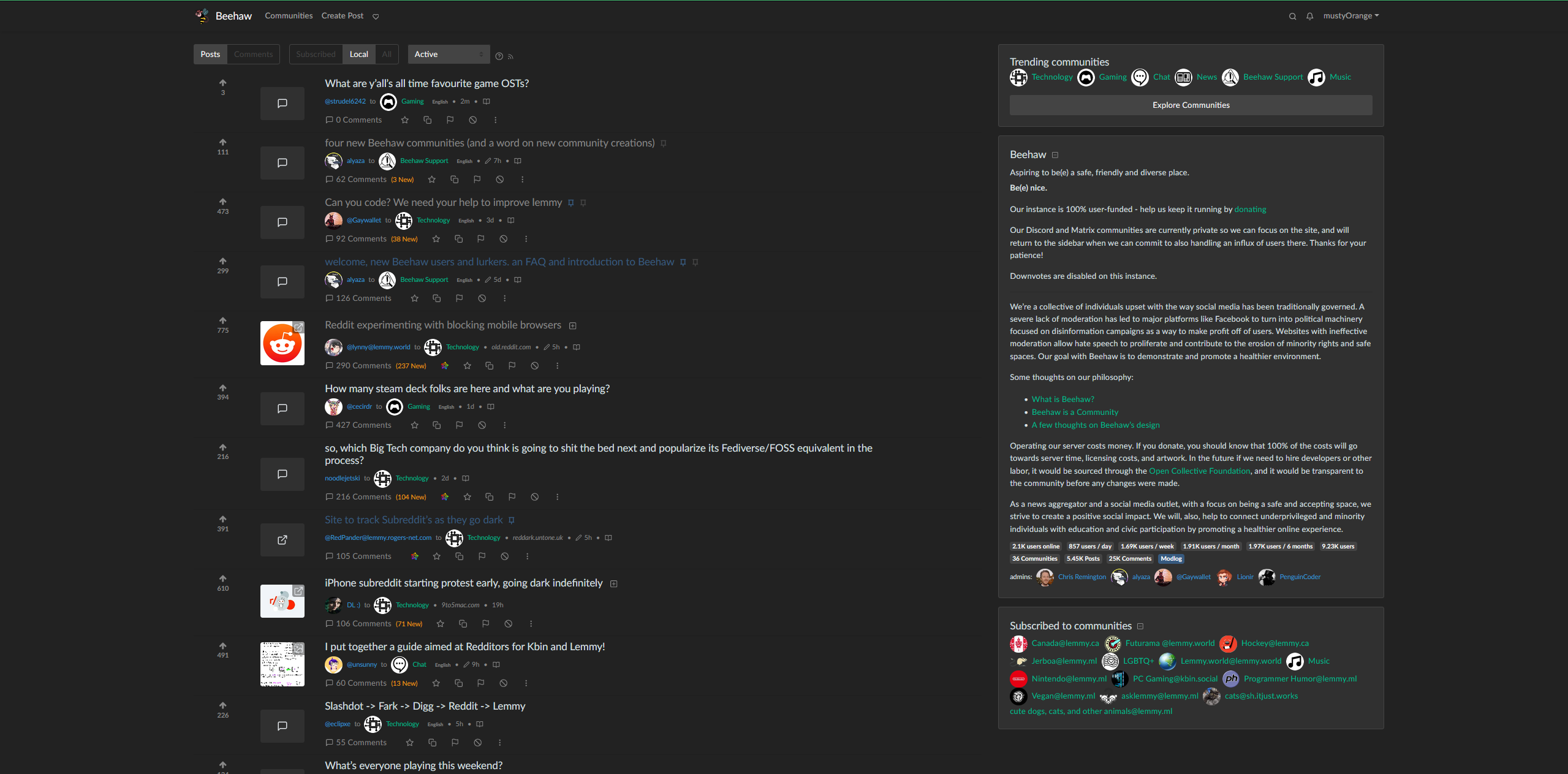
Not sure if this is the right community, but the narrowness of the default web page was driving me a little crazy. I still need to fix a few things (like vertically centering the votes) but I feel that this looks a lot better. If you have the Stylus browser add on, you should just be able to copy and paste this into a new style

@media (min-width:1400px) {
       .container,
       .container-lg,
       .container-md,
       .container-sm,
       .container-xl {
           max-width: 2200px;
       }
       .col-sm-2 {
           flex: 0 0 8%;
           max-width: 8%;
           display: flex;
           align-items: center;
           text-align: center;
       }
   }

   h5 {
       margin-bottom: .05rem!important;
   }
   .thumbnail {
       object-fit: cover;
       min-height: 60px;
       max-height: 80px;
       max-width: 80px;
       min-width: 80px;
       width: 100%;
   }
   .btn-block {
       margin-top: 1rem!important;
   }
   .mb-1,
   .my-1 {
       margin-top: .3rem!important;
       margin-bottom: .3rem!important;
   }
   .my-3 {
       margin-top: .3rem!important;
       margin-bottom: .5rem!important;
   }

   .vote-bar {
       min-width: 80px;
   }
top 5 comments
sorted by: hot top controversial new old
[–] [email protected] 2 points 1 year ago
[–] [email protected] 1 points 1 year ago

Oh thank god... This is much nicer.

[–] [email protected] 1 points 1 year ago

Thanks for this, I also added this to make the sidebar slimmer and more to the right. .d-md-block { max-width: 400px; padding: 0rem 3rem 2rem 3rem; margin: 0px 0px 0px auto; }

[–] [email protected] 1 points 1 year ago

Thanks, ill try it out later. As someone else suggested already, maybe this is of interest to the devs of lemmy As well.

[–] [email protected] 1 points 1 year ago* (last edited 1 year ago)

I suggest you don't set a background color, and instead use background-color: var(--light)
load more comments
view more: next ›