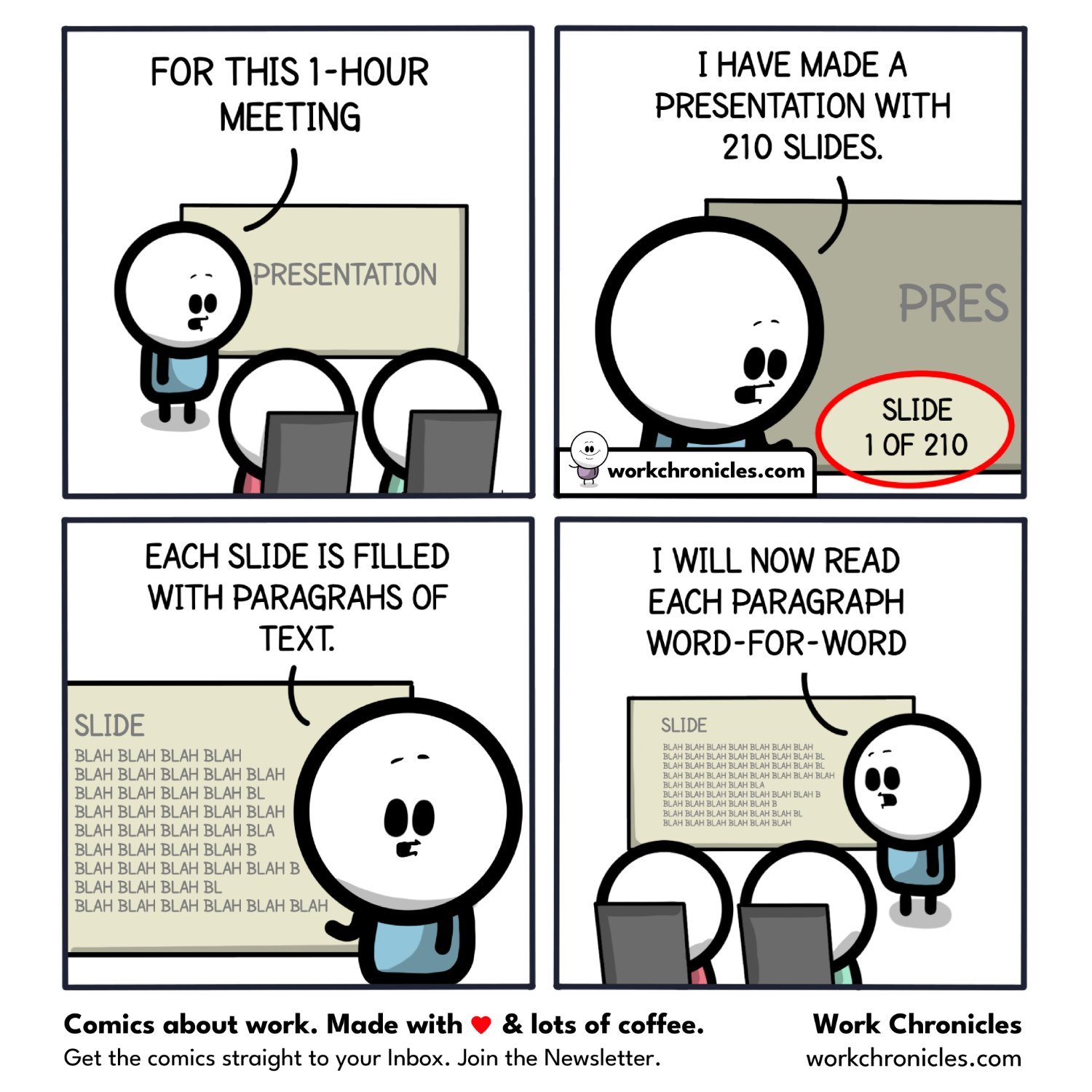
You scheduled 15 min for this presentation and I have another meeting after this. So cliff notes only please.
Comic Strips
Comic Strips is a community for those who love comic stories.
The rules are simple:
- The post can be a single image, an image gallery, or a link to a specific comic hosted on another site (the author's website, for instance).
- The comic must be a complete story.
- If it is an external link, it must be to a specific story, not to the root of the site.
- You may post comics from others or your own.
- If you are posting a comic of your own, a maximum of one per week is allowed (I know, your comics are great, but this rule helps avoid spam).
- The comic can be in any language, but if it's not in English, OP must include an English translation in the post's 'body' field (note: you don't need to select a specific language when posting a comic).
- Politeness.
- Adult content is not allowed. This community aims to be fun for people of all ages.
Web of links
- [email protected]: "I use Arch btw"
- [email protected]: memes (you don't say!)
Just email me the script. I’ll have an LLM summarize it.
I'm more prone to making the slides be my notes, possibly with data-driven visual aids. 3-5 short bullet points per slide is usually reasonable. I don't actually give a lot of presentations these days, though.
I take this to the extreme: my slides have little to no text, or even white space. Each slide is basically a collage for pointing at while I rant about the thing. I'm a mechanical engineer, so I also imitate the sounds the machine makes.
My issue with this is that I'd like to be able to distribute the slide deck afterwards for people who can't attend. I've heard people advocate for keeping separate infosheets to accompany the presentation but I can't be bothered usually.
I hate these kinds of slides because I'll come across them somewhere and be like "WHAT THE FUCK IS THE CONTEXT FOR THESE NUMBERS??? WHAT DOES THIS HALF-ASS DIAGRAM REPRESENT?" and the information I extract becomes less usable as a result.
I often won't read PowerPoints in that style unless a recording of the presentation is available, otherwise I just pretend it doesn't exist and get my information elsewhere because certainty ain't optional mf.
I think if you've chosen your bullet points well then the point should come across through them, but if you're looking for a higher level of detail then the slide deck is probably not gonna get you there regardless. It's standard practice to record this type of presentation, but if you're really wanting a deep dive, you probably want to see the supporting documents, not just an executive summary. I guess it depends on what kind of presentation we're talking about, too, because a presentation to push info up to management is pretty different from the type someone might give at a conference.
CDR time!
(except I've had CDRs that were scheduled for a full work week, 40 hours)
You had a 40-hour Colonoscopy Debris Removal procedure? Big ups to you!
One of my side projects at work is to record training presentations and I try to be so conscious about this--both trying to avoid the word salad slides, and also trying to make my lecture not just reading the slide word-for-word but actually explaining and expanding on the slide content (with my verbal lecture transcribed as a note in the slide and handed out for anybody who might be hard of hearing/doesn't want to sit through a 30-minute video)
Ugh, I always tell students to avoid this.
That said it reminds me of Larry David on Conan podcast of how he got out of a movie test screening. "I've got one question and then I've gotta go...".
Ah, treasures, both of them.
I remember back in high school my teachers would always warn students for doing presentations like that, yet all of them did exactly the same thing. And it was even worse in university, when we had to listen to 2 hours presentation read word by word with monotone voice.
Yup! I even tell them to experiment a little because they get full points either way (my logic is, the social pressure alone is enough to get a good effort, and usually that's true lol).
It's because they didn't trust their ability to remember stuff. But when I lecture, I'm often elaborating beyond the bulletpoints, engaging my audience with questions, making eye contact, etc, so it's not like I'm not setting a good example. I guess my university it's just too late to teach?
Rather than simply give you a piece of text to read, they do it like this so that you can't scan it to figure out what is actually important and focus on that. Every moment and detail must be indulged to the full.
Proper dickhead move.
Lets hope they forgot to run spellcheck
