this post was submitted on 16 May 2024
611 points (92.8% liked)
pics
20114 readers
480 users here now
Rules:
1.. Please mark original photos with [OC] in the title if you're the photographer
2..Pictures containing a politician from any country or planet are prohibited, this is a community voted on rule.
3.. Image must be a photograph, no AI or digital art.
4.. No NSFW/Cosplay/Spam/Trolling images.
5.. Be civil. No racism or bigotry.
Photo of the Week Rule(s):
1.. On Fridays, the most upvoted original, marked [OC], photo posted between Friday and Thursday will be the next week's banner and featured photo.
2.. The weekly photos will be saved for an end of the year run off.
Instance-wide rules always apply. https://mastodon.world/about
founded 2 years ago
MODERATORS
you are viewing a single comment's thread
view the rest of the comments
view the rest of the comments


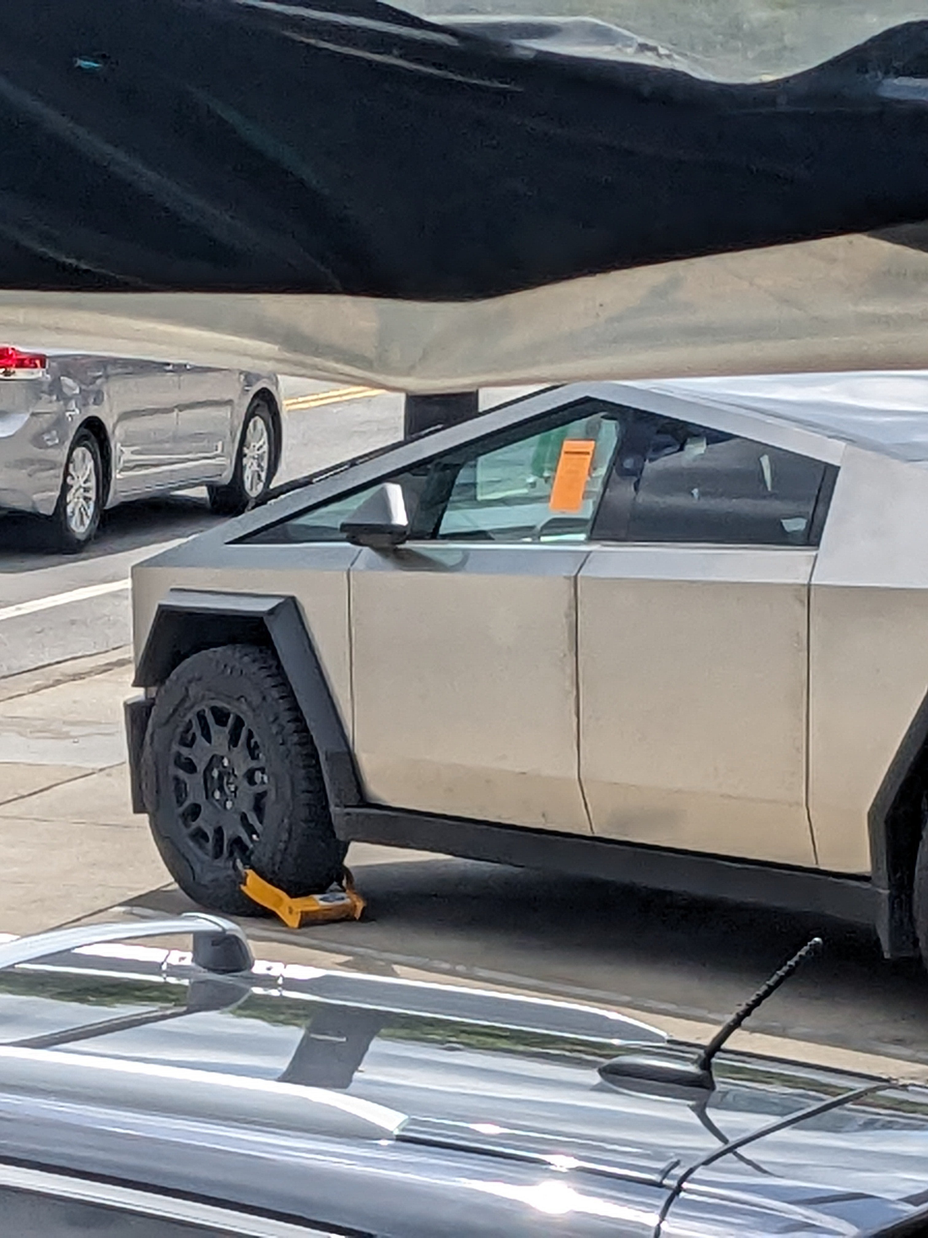
I can see the Multipla being uglier than the Cybertruck because it looks like two differently-sized cars spliced together. However, there is no way I agree the PT Cruiser, Chevy SSR, and Aztec are uglier than the Cybertruck. Look at the Cybertruck again. It looks like a 10 year-old drew a truck on MS Paint using a mouse.
Taste is subjective so if someone doesn't like it that's valid.
For me, designs are successful based on the impression and experience they give people. The cyber truck to me gives off a futuristic vibe, it's intentional, it's a design that knows what it wants. Minimal polygons, minimal rounded edges. Uncommon material/finish. Visually striking, unique, memorable.
I think the Aztec isn't a good design because it wants to be futuristic but doesn't go far enough. Because it's trying to retain some traditional elements it looks like design by committee.
My impression is the pt cruiser and SSR were intended to be modern takes on retro/classy designs from say, the 50s. In the sense that they're curved they succeed, but the curves are in the wrong places and the curve radiuses are wrong. They look bubbly. They look like toys. The effect is amplified because they don't have a lot of the fine detail that was present on old cars.
a design that throws any modern safety feature in designing overboard is a bad design. It's ugly, and it will age even uglier. It's an incredibly dangerous design for anyone not inside it, it should be banned.
To clarify I'm talking about aesthetics. I'm not defending anything safety wise. But that's an unrelated argument from "it's ugly".
It's clearly an emotionally charged object, which is why in one of my other comments here I said I'd probably accept a pt cruiser instead, just because people make the instant connection between the truck and elon musk.
It stands out, it's recognizable. I guess that works for some people, I personally think it's ugly. I stylewise somewhat get that the low-poly idea has an appeal to people, but then the no rounded corners and the choice of material totally kills it for me.