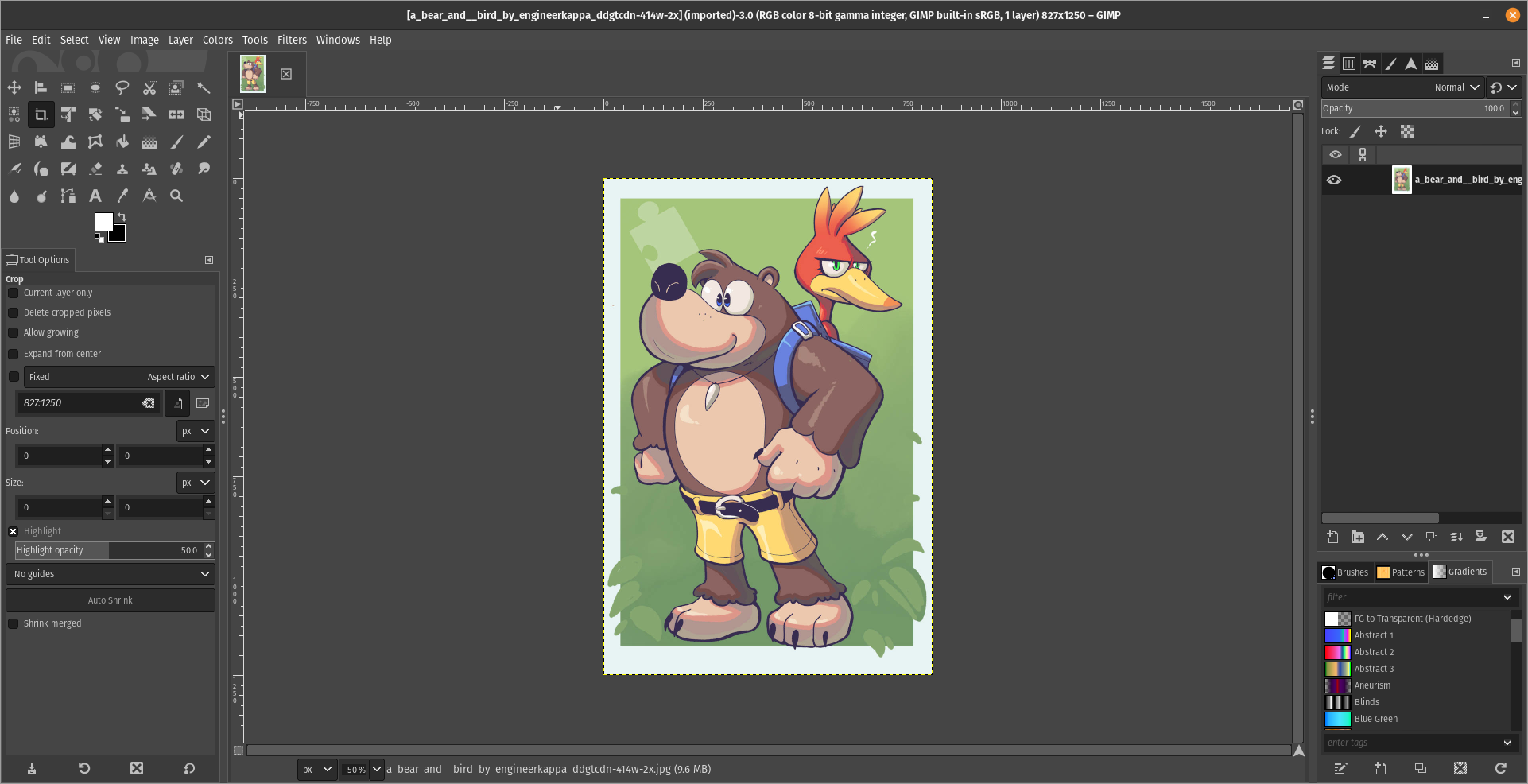
For what i heard, a lot of people on the Linux community use Krita for image manipulation, even though, it's intended for digital painting, and GIMP is the one intended for image manipulation, because people don't like the GIMP's UI.
My issue is, i never understood why they don't like the GIMP's UI, since i never have issues with it,(Although it's probably because i'm used to the UI) so i need to adress this problem and ask you What does the GIMP UI has that you don't like or hate so much and why you like Krita's UI over GIMP's?
Before you event comment your answer i need to ask you to do the following:
-
Address each specific issue along with an concise and direct explanation of why you don't like it
-
Answers such as "I just don't like it", "I don't like where it's placed" or anything alike doesn't count as "Concise and Direct", we are adults, not 4 year old children.
-
If you can provide a suggestion of how GIMP's UI can be improved, it would help a lot, and maybe this issue can be solved.
-
If someone else commented something you were about to comment, upvote them, this way we can address the most common issues effectively.
-
I need you to watch the screenshots of both UI's, because something that most people don't know, it's how similar Krita and GIMP's UIs are.
Krita's UI

GIMP's UI

(Credits to a friend of mine for lettig me use the screenshots.)
My ideas on how GIMP can improve it's UI
-
Adding the option of the new UI selected by default, but with the possibility to switch to the new UI.
-
Possibly addding "work spaces" like Krita would help too, along with the possibility of exporting and importing them, this way people can have custom arrangements of the UI according to the kind of work they will do.
Thanks for reading and hopefully we can address this issue effectively.
See, the thing with this argument is that, however much I agree with the basic idea, it's still not useful. We can agree, sure, that overall the UI and UX (two different things) on GIMP is not as subjectively good as Photoshop. But saying, it's easier, it's faster, it's whatever, still does not help at all. It's still all just vibes and impressions, it's not actionable.
“The default UI is not like Photoshop” is inactionable. It's different from the opinions I left on this thread. That GIMP need to have a way to save and reload layouts, that's an specific feedback, concise, concrete and actionable. I also agree that some workflows take too many clicks, maybe have simplified tools to do common actions. That is also actionable, specific, concrete.
Your comment offers nothing to go on with. It even manages to ignore and bypass my criticism, it doesn't address the “Industry standard” bias and privilege. Because when pros try GIMP the response “It doesn't work the way I expected and are used to, so I don't like it” is a garbage feedback. The only thing you are offering is “clone photoshop”, and that's just not what the project has ever been about, or will ever be about. So the conversation is fruitless.
What is actionable? Maybe this :Make ux more like ps so more people will be able to use it or want to use it? :)
You want small things to fix? Small actionable things. I'm saying there is a broader issue that you cannot easily patch. I don't care about your criticism of ps, many people have tons of criticism, I have tons, none of it matters with the situation at hand.
What was gimp project about? Pushing users away with design patterns that exist nowhere else?
OK, in terms you understand. The criticism "GIMP is not like Photoshop" is crap advice, its shit and your shitty attitude is offensive and insulting to the hard work of devs. Go keep sucking the adobe boot since you seem to like the taste of dirt on leather so much. "Just clone Photoshop" is a meme useless attitude to have.
In sorry I hurt your feelings, but come on. Read what you just wrote. Seriously? Lol.