this post was submitted on 12 Apr 2024
288 points (89.8% liked)
Programmer Humor
32024 readers
503 users here now
Post funny things about programming here! (Or just rant about your favourite programming language.)
Rules:
- Posts must be relevant to programming, programmers, or computer science.
- No NSFW content.
- Jokes must be in good taste. No hate speech, bigotry, etc.
founded 5 years ago
MODERATORS
you are viewing a single comment's thread
view the rest of the comments
view the rest of the comments
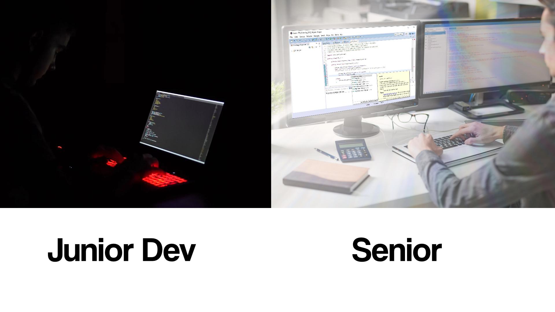
My eyes hurt too much nowadays to tolerate only dark themes. There's a good balance in the middle and sometimes light is very good to relax the eyes.
I think perfection is probably somewhere between dark and light themes. Light can frequently be too bright where it feels like you're looking into the sun. And dark can be like working in literally the dark, and it's sometimes too difficult to see the boundaries between objects. I think it would be cool if we had a sliding scale, where you can pick from several brightness levels.
It's the same as Color balancing. The best solution often depends on the light balance of the room. Nothing stopping you from editing the theme to keep optimize out
Problem is that contrast is not a thing for the "middle" levels.
So, for a white or light gray background, you can have black as contrast color. And for a dark gray or black background, you can have white as contrast color.
But for middle gray, both white and black don't really provide enough contrast.
A slider to at least choose between white, light gray, dark gray and black would still be cool, though.
Maybe you've been using themes with too much contrast ? I mean, I can't work on a light theme for any extended period of time, but most dark themes are too stark and eye searing for me, so that may be your case too?