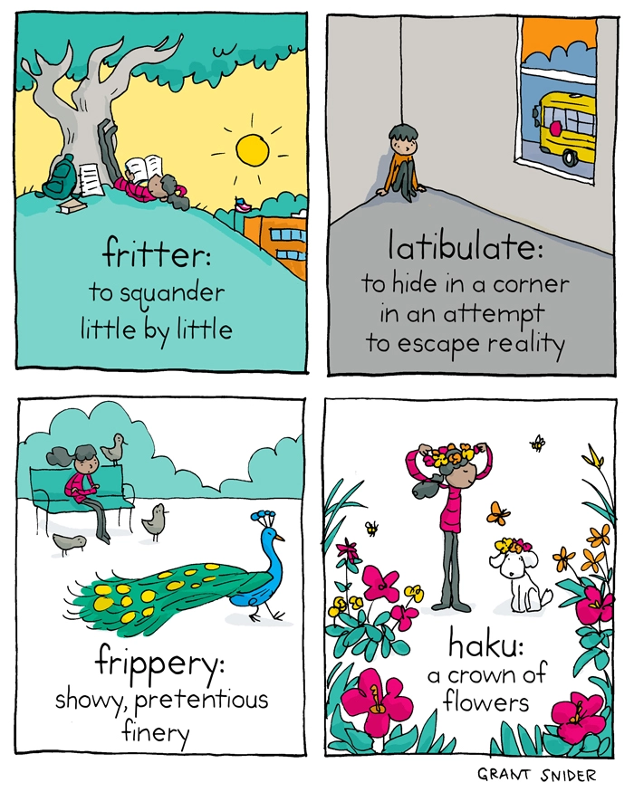
this post was submitted on 22 Feb 2024
473 points (98.4% liked)
Comic Strips
12583 readers
2925 users here now
Comic Strips is a community for those who love comic stories.
The rules are simple:
- The post can be a single image, an image gallery, or a link to a specific comic hosted on another site (the author's website, for instance).
- The comic must be a complete story.
- If it is an external link, it must be to a specific story, not to the root of the site.
- You may post comics from others or your own.
- If you are posting a comic of your own, a maximum of one per week is allowed (I know, your comics are great, but this rule helps avoid spam).
- The comic can be in any language, but if it's not in English, OP must include an English translation in the post's 'body' field (note: you don't need to select a specific language when posting a comic).
- Politeness.
- Adult content is not allowed. This community aims to be fun for people of all ages.
Web of links
- [email protected]: "I use Arch btw"
- [email protected]: memes (you don't say!)
founded 1 year ago
MODERATORS
you are viewing a single comment's thread
view the rest of the comments
view the rest of the comments

That sounds awesome, but in practice perhaps it should be called the dictionary of bad web design. I get one tiny column on the left side of my phone screen. The "Continue" and "Archive" buttons/links are seemingly only at the very bottom of the page, and they don't work when tapped on.
Is there an obscure sorrow in the dictionary for that?
The wends, perhaps?
The terrible formatting is basically because it's a blog in which each word is posted as the writer comes up with them rather than being an actual dictionary. I have the book and it's somewhat better sorted, but even then it's grouped into general themes rather than alphabetical order