this post was submitted on 20 Feb 2024
988 points (95.6% liked)
Programmer Humor
35022 readers
35 users here now
Post funny things about programming here! (Or just rant about your favourite programming language.)
Rules:
- Posts must be relevant to programming, programmers, or computer science.
- No NSFW content.
- Jokes must be in good taste. No hate speech, bigotry, etc.
founded 5 years ago
MODERATORS
you are viewing a single comment's thread
view the rest of the comments
view the rest of the comments

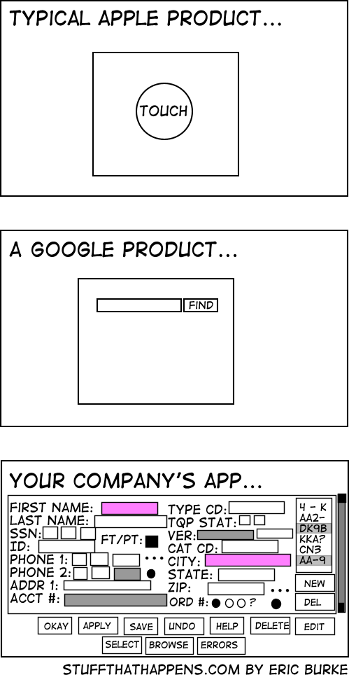
I would argue that the first two require you to jump through hoops for edge cases, while the last one requires you to jump through hoops for every case.
Without knowing what the user is actually doing, that's impossible to know. If the user has to input all those fields on a regular basis, then that one screen is the superior UX.
You're right, but:
I beginner friendly UX is a safer bet. Besides, if a user has to manually enter all those fields (assuming it continues off screen) then that's a job for a machine, not a human. Large data input jobs are dehumanizing.
Unless you've actually done the user research, you have no idea if a "beginner friendly UX is a safer bet" . It's just a guess. Sometimes it's a good guess. Sometimes it's not. The correct answer is always "it depends".
Hell, whether or not a form full of fields is or isn't "beginner" friendly is even debatable given the world "beginner" is context-specific. Without knowing who that user is, their background, their training, and the work context, you have no way of knowing for sure. You just have a bunch of assumptions you're making.
As for the rest, human data entry that cannot be automated is incredibly common, regardless of your personal feelings about it. If you've walked into a government office, healthcare setting, legal setting, etc, and had someone ask you a bunch of questions, you might be surprised to hear that the odds are very good that human was punching your answers into a computer.
There are more beginners then there are experts, so in the absence of research a beginner UI is a safer bet.
And yes, if you definite "beginner" to be someone with expert training and experience, then yes an expert UI would be better for that "beginner". What a strange way to define "beginner" though.
If you're in the business of creating high quality UX, and you're building a UI without even the most basic research--understanding your target user--you've already failed.
If I'm building a product that's targeting software developers, a "beginner" has a very different definition than if I'm targeting grade school children, and the UX considerations will be vastly different.
This is, like, first principles of product development stuff, here.
Right, but clearly this is a funny post using hyperbole. These aren't real UIs. They're comical exaggerations, and likewise we're making generalizations based on them.
Nobody actually makes UIs like this, but they're springboards for talking about actual problems.
This isn't a case of "well actually the last example was well researched and the others weren't".
If I'm going to jump through hoops anyway I'd like some degree of control over the experience.
What control do you have in either experience?