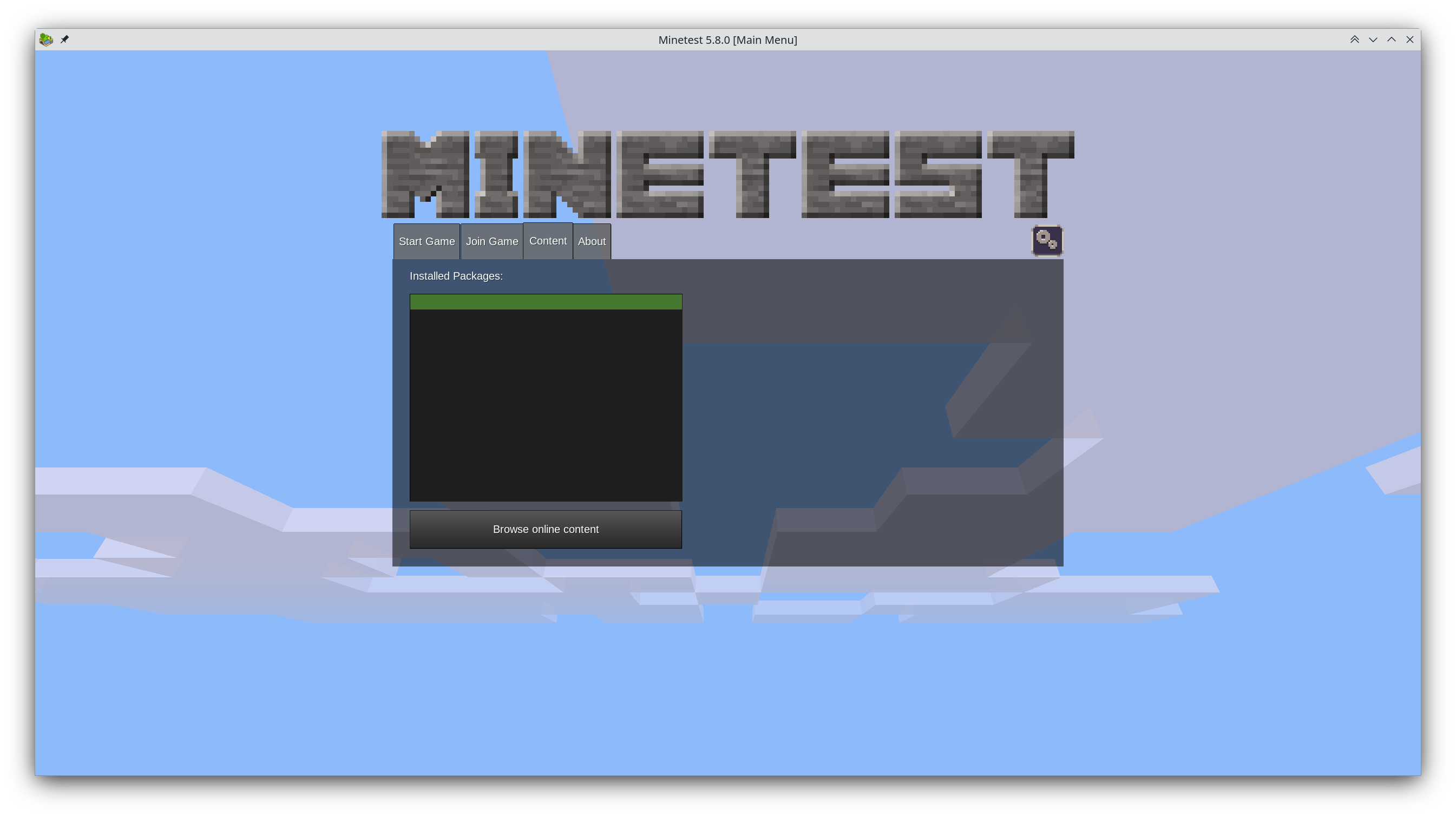
Years have gone by and hundreds of comments have been written about the proposal, but the main screen still looks like this:
What do you guys think is the cause of this stagnation? Too much discussion? Too few people willing to fork it?
I've thought about it myself and why I didn't contribute a new main menu and came to the following conclusion: It requires understanding Minetest's codebase and the libraries it uses, it requires C++ experience (which I don't have), and after all that effort there's zero guarantee that it ever gets used.
I read up on it at some point and it was essentially a matter of their UI framework just being custom-implemented. Any advanced UI concept would need so much overwhelming support from the community, that a core dev then sits down for a few months to dish out the necessary UI components, that this is just not really happening. The core devs aren't exactly bored most of the time anyways.
Having said that, they did recently renovate the settings menu using the UI components they already had, and that turned out really cool.
Also, I do feel like some smaller improvements could be made without big code changes, but yeah, those then end up in too many discussions.
The font has been discussed many times. To give you a taste:
Many want a font with fantasy style, but Minetest can also depict a futuristic setting. Others want a blocky font, but those usually aren't very legible (i.e. accessible) and often only support a narrow range of languages.
I think, just a font, which looks less serious and less thin, already improves it massively, but you can't even get folks to agree on that, because well, if the font is tweaked, you might need to adjust lots of UI components and mods and such to work with the different font dimensions. So, if a font change is made, people want to get it perfect from the start.
The button gradients are another case, where most people agree that something else would look better and it could be easily changed, but discussions just never end.
The community is just so big and so public, that there's always someone new joining into the discussion, so that no consensus can occur...