this post was submitted on 13 Jan 2024
488 points (92.1% liked)
memes
9806 readers
2 users here now
Community rules
1. Be civil
No trolling, bigotry or other insulting / annoying behaviour
2. No politics
This is non-politics community. For political memes please go to [email protected]
3. No recent reposts
Check for reposts when posting a meme, you can only repost after 1 month
4. No bots
No bots without the express approval of the mods or the admins
5. No Spam/Ads
No advertisements or spam. This is an instance rule and the only way to live.
Sister communities
- [email protected] : Star Trek memes, chat and shitposts
- [email protected] : Lemmy Shitposts, anything and everything goes.
- [email protected] : Linux themed memes
- [email protected] : for those who love comic stories.
founded 1 year ago
MODERATORS
you are viewing a single comment's thread
view the rest of the comments
view the rest of the comments

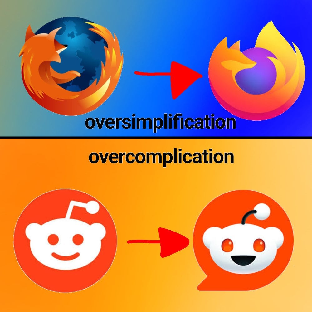
That Firefox logo was simplified, but not oversimplified. Even with a very small icon size you can still tell it's a fox that is (on?) fire. The Firefox Family logo is oversimplified, just being a swoosh, basically.
well the family logo is supposed to be as simple as possible
I beg to differ. Until now I never noticed the fox in the logo. And even now that I know it’s there I have a hard time finding it. And I’m looking at a version of almost 1cm on my screen.
Well, I suppose it makes sense that it doesn't apply to everyone, but my guess is that the majority can still see the fox.
Either way, the simplification of modern logos is a necessity, because they are used in small UI elements, often even appearing monochrome. At which point they still need to be recognizable. Whether they are simplified in a good or bad way, is subjective though.