this post was submitted on 12 Nov 2023
578 points (94.3% liked)
linuxmemes
20880 readers
8 users here now
I use Arch btw
Sister communities:
- LemmyMemes: Memes
- LemmyShitpost: Anything and everything goes.
- RISA: Star Trek memes and shitposts
Community rules
- Follow the site-wide rules and code of conduct
- Be civil
- Post Linux-related content
- No recent reposts
Please report posts and comments that break these rules!
founded 1 year ago
MODERATORS
you are viewing a single comment's thread
view the rest of the comments
view the rest of the comments

thanks! never clicked that for fear that they'd do something similar to windows.
I'll try it next time it comes up.
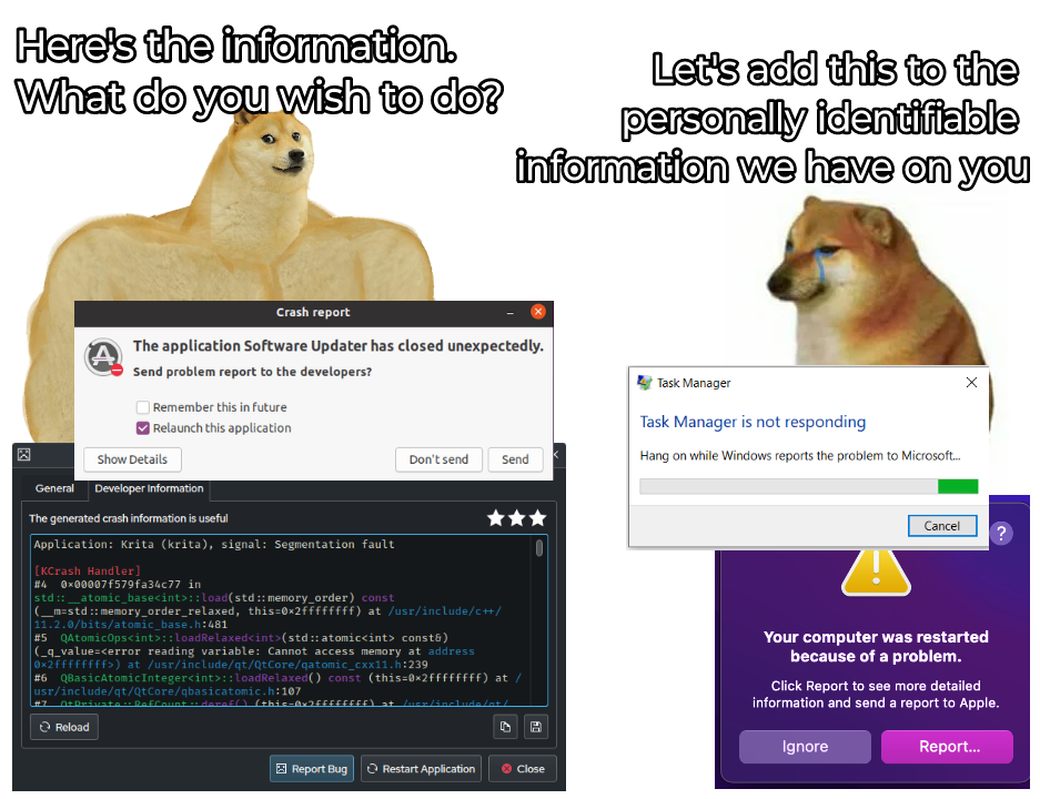
maybe there should be a third button for less confusion? or does it go against apple's "design" principles? :p
To demonstrate I got an app to crash, this is what you see when you click on the report button. The report is longer, trying to show where the app crashed, at the bottom there's a button to send a report to apple
looks much better than what I'd thought. thanks for sharing mate! BTW, the interface is in French, right?
Yes, on the bottom it says on the left to hide the details, and on the right don't send and send to apple.
I think it's fine as is. Three dots after a button / menu item imply more interaction is required before an action is taken.
update: doesn't have button on my machine.
just two buttons: show/hide details, and report. can't even go back or close it.