this post was submitted on 21 Sep 2023
1285 points (97.8% liked)
Memes
47099 readers
776 users here now
Rules:
- Be civil and nice.
- Try not to excessively repost, as a rule of thumb, wait at least 2 months to do it if you have to.
founded 5 years ago
MODERATORS
you are viewing a single comment's thread
view the rest of the comments
view the rest of the comments

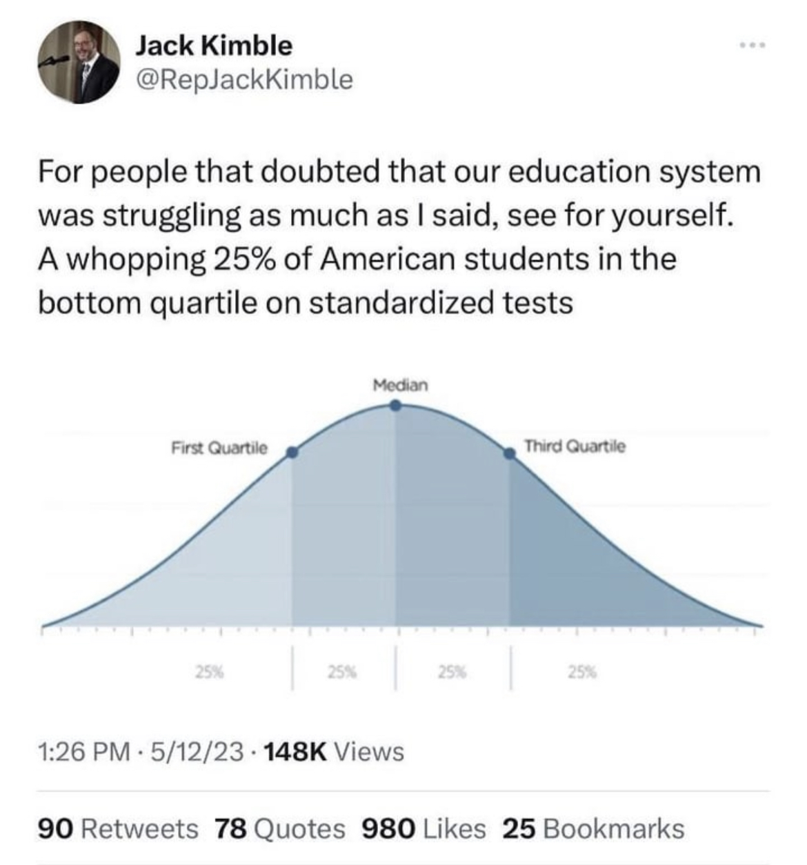
Yes I think it's very possible that if you were to graph a population's Intelligence using a some empirical score, then it has a high probability to NOT look exactly like a normal distribution.
For example, let's say that there was some score called "intelligence score" that scores people's intelligence from 0-100. Do you think that if you were to graph a given population's "intelligence score" that it would be EXACTLY centered around 50 in a Normal distribution? I think that's unlikely. It's more likely that there would be local maximums or minimums, or various skews in the graph. There could be a small peak at score 75, or a trough at 85. There could be all sorts of distributions.
And guess what? Given this hypothetical distribution, you could STILL draw lines somewhere on the graph showing quartiles. Those lines might not be at 25-50-75. They might not even be the same distance apart from each other. But you CAN draw them somewhere to split the scores. Just because a graph "has quartiles" does not mean it will always look like the OP.