this post was submitted on 07 Sep 2023
4 points (100.0% liked)
Photo Critique
406 readers
1 users here now
A community to critique photographs and learn from others.
Rules
- OC only for critique
- Film & Digital are both welcome!
- General photography questions are also welcome
- Critique requestor should critique their own work (it really helps!)
- Above all, be kind :)
Trying to create a similar space to /r/photocritique
founded 1 year ago
MODERATORS
you are viewing a single comment's thread
view the rest of the comments
view the rest of the comments

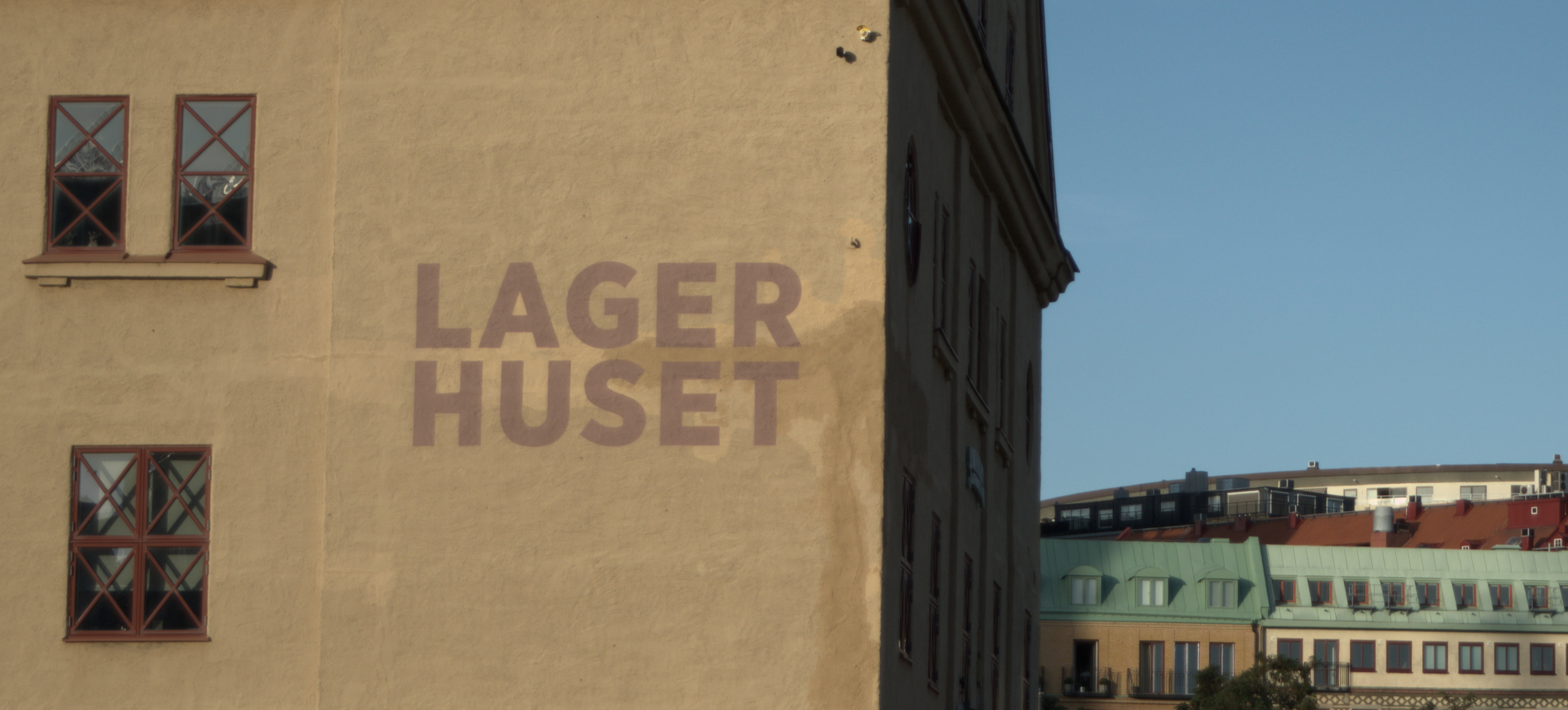
I passed by again today and got "the good angle". Turned out that had its downsides as well. I don't like that edge ruining the contrast between the building wall and the sky. Once again, perspective is messing with me.
At least it is a little better than the first attempts.
Glad you got a chance to retry - though sometimes the perfect shot just isn't there.
Yeah, it's better, but not perfect