this post was submitted on 07 Sep 2023
956 points (98.7% liked)
Memes
45584 readers
1801 users here now
Rules:
- Be civil and nice.
- Try not to excessively repost, as a rule of thumb, wait at least 2 months to do it if you have to.
founded 5 years ago
MODERATORS
you are viewing a single comment's thread
view the rest of the comments
view the rest of the comments

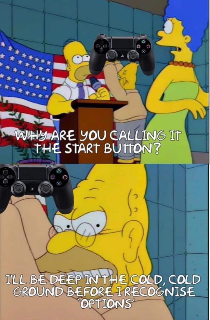
It's select and start.
What's it supposed to be, windows and hamburgers?
I won't give it up. Select and Start.
My wife makes fun of me for it whenever we play couch co-op games. "What do you mean press start? My controller doesn't have a Start"
So you married her for her looks, it could be worse.
Will you let it down?
It’s going to be windows and hamburgers to me from now on
I'm 100% Hamburger and Tie Fighter.
I thought it about it again. Should have said cheese slices and hamburgers.
You were spot on the first time. It’s windows and hamburgers!
⬆️⬆️⬇️⬇️⬅️➡️⬅️➡️🅱️🅰️🅱️🅰️[select][start]
REST 30 REST 30
🏅🏅🏅🏅 🎖️🎖️🎖️🎖️
WTF was the select button actually for? I get start because it was often the button on arcades or gamepads that allowed you to choose menu options (which still works but has mostly been replaced by A).
What were we supposed to be "selecting"?
On the title screen of older NES games, the select button changed what mode you played in, then you hit start to start that mode/variation.
Ahh this makes sense. I played a lot of NES as a kid but must have just never encountered it
You always played the default game mode.
Select and Start was how the Atari 2600 did things. At the time, everybody was designing in terms of having one set of controls for when you're in the game, and a set of meta-controls for adjusting stuff outside the game. The 2600 configuration GUI was the dumbest thing in the world. You look at a grid chart of game options in the manual, and you press the Select button 35 times to get to the version that you want.
The Famicom was much more able to draw and interact with a real configuration GUI. But Nintendo's own experience was mostly in making the arcade game "Donkey Kong", where you pick how many players by "pressing" the insert coin button and then Start. Nintendo was selling to a market that mostly knows home games from picking up a 2600 at a bankruptcy sale. So, keeping the separate meta-game buttons and game buttons was natural at the time. Later games developed a better design language for the meta-game UI, so most game studios left the Select/Start interface behind.
(Lol now I see that TubbyCustard said it all, but better)
I used to have a black and white Binatone TV game knockoff.
10 games, mostly variations of Pong. All the game options like speed and bat size were big physical toggle switches on the main unit.
The start button back then was called the reset switch. Hit reset when you get to game 13, you'd say. Now where was I? Oh yeah, the game select switch was on the console, which was the style at the time.
Oh yeah, they did put "reset" on it huh? I don't know how they ever came up with that. Everywhere else, "reset" means "device gets zeroed out to its initialization state". The only real reset was to turn the system off and on again. On some of those Atari originals, when you press select one time too many turning it off is the fastest way to start back around again. Video Olympics I'm looking at you
It was originally for selecting different options.
You're on the start screen and it says:
1 Player.
2 Players.
You press select to choose which one. That's just an example, lots of NES games were like that.
I actually have a windows button on my gaming device. Still searching for the hamburgers button though
Honestly I call them "start" and "the tab button."
I grew up with a PlayStation and PS2 but haven't owned any console since the switch, preferring PC. So I remember start because it's the start menu but select is usually on tab on PC.
This is the way.