this post was submitted on 29 Jun 2023
1 points (100.0% liked)
bless this jank
107 readers
3 users here now
post instance suggestions and complaints here
founded 2 years ago
MODERATORS
you are viewing a single comment's thread
view the rest of the comments
view the rest of the comments
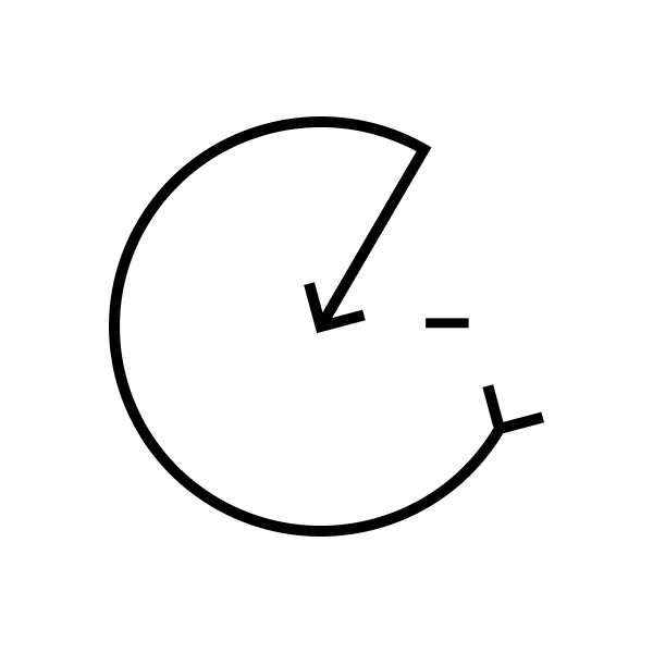
I made a logo a while back for a publication I was working on with friends called "Intropians" as a counter to extropianism. It's based on the extropianism/transhumanism symbol.
Transhumans: https://en.wikipedia.org/wiki/Extropianism#/media/File:Transhumanism_h+.svg
it's meant to be a face smiling in unavoidable death
if you wan't all the graphic designer semantic explanation bullshit, the circular arrow was also meant to symbolise a life line that ends.
Ha! I never said it was good. It was a weird time