this post was submitted on 27 Aug 2023
86 points (98.9% liked)
Personal Finance
4045 readers
1 users here now
Learn about budgeting, saving, getting out of debt, credit, investing, and retirement planning. Join our community, read the PF Wiki, and get on top of your finances!
Note: This community is not region centric, so if you are posting anything specific to a certain region, kindly specify that in the title (something like [USA], [EU], [AUS] etc.)
founded 2 years ago
MODERATORS
you are viewing a single comment's thread
view the rest of the comments
view the rest of the comments

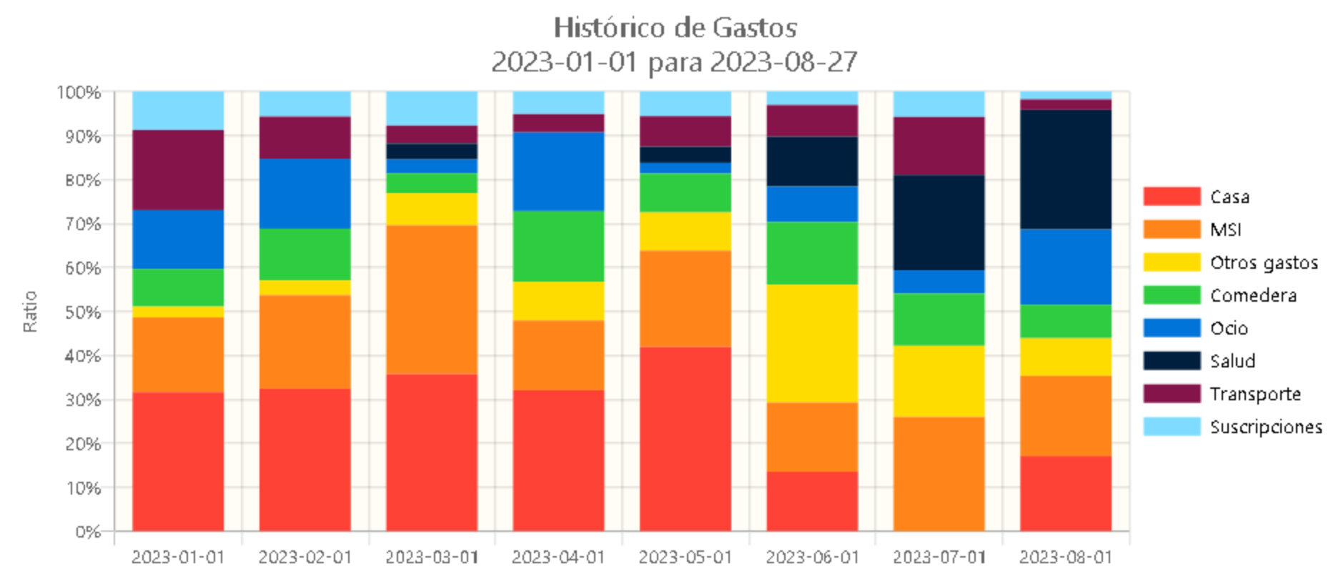
I'm unsure how the interface has changed in recent years. What'd be some more decent visuals you'd like to see?
By the way, what drove you to Moneydance, any feature you'd highlight?
Charts in Ynab4 were fairly sophisticated. For example, I could easily drill down into categories on monthly income/expenses. They also looked great since the devs put a lot of thought into the UX.
I switched to Moneydance after nYnab came out and Ynab4 was killed off. I'm not an adherent to Ynab's budgeting philosophy and I didn't see the worth in the monthly fee.
Like Ynab4, Moneydance is a standalone product. It's manual accounting, which I don't mind. It's quick to enter transactions, has a nice summary view, and can backup to separate locations. When I decide to migrate, I can export my data to QIF or other formats.