this post was submitted on 17 Aug 2023
51 points (80.0% liked)
Starfield
2850 readers
1 users here now
Welcome to the Starfield community on Lemmy.zip!
- Follow instance rules (no spam, keep it civil and respectful, be constructive, tag NSFW)
Helpful links:
Spoiler policy:
- No spoilers in titles; if you want to share images with spoilers, preferably post the image in the body of the post. If you do make an image post, mark it NSFW.
- Add
[Spoilers]to your title if there will be untagged spoilers in the post. - Game mechanics and general discoveries (ship parts, weapons, etc) don't need a spoiler tag.
- Details about questlines and other story related content are spoilers. Use your best judgement!
Post & comment spoiler syntax:
<spoiler here>
founded 1 year ago
MODERATORS
you are viewing a single comment's thread
view the rest of the comments
view the rest of the comments

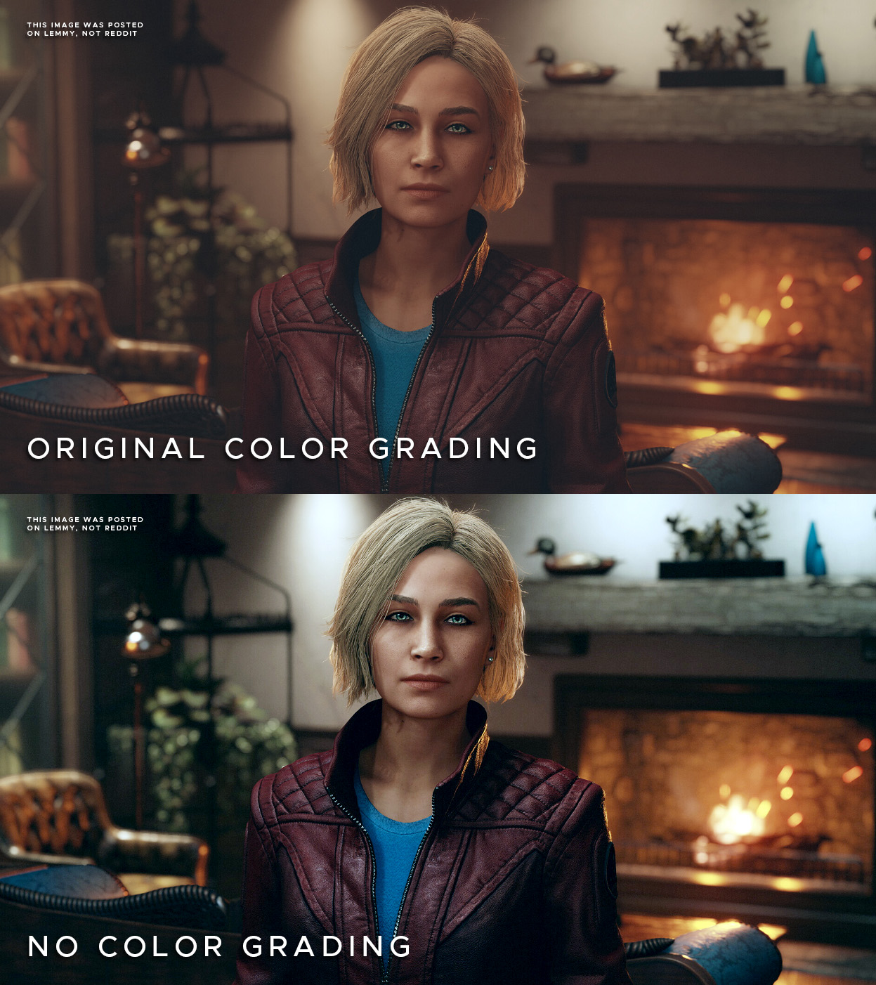
The first one looks natural to me. The second grade looks like a 1st year film school grade where they think the full range has to be used at all times. In a soft well lit room the contrast would never be that high.
The intention was clearly to make it look like a warm interior, adding all those grungy green tones make it look like she's standing by a window. I dunno the context of the room, but number 1 looks way better to me..
Edit: Final thought - crushing blacks like that, from a game perspective means you may miss details that may have been meant to be seen. But power to you! Options are always better.
Eyesight is wild, personally the second one looks more realistic to me.
But you are right, options are always better