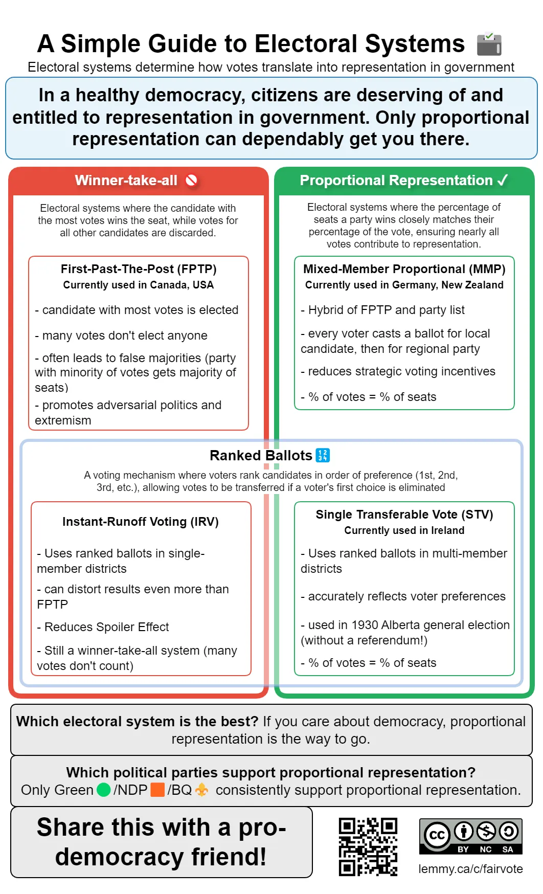
Alt text: Infographic titled "A Simple Guide to Electoral Systems" with a light blue background. At the top, a highlighted box states: "In a healthy democracy, citizens are deserving of and entitled to representation in government. Only proportional representation can dependably get you there."
The content is organized in two main columns. The left column labeled "Winner-Take-All Systems 🚫" (in red) describes First-Past-The-Post (FPTP) used in Canada/USA where the candidate with most votes wins but many votes don't elect anyone, and Instant-Runoff Voting (IRV) which uses ranked ballots but still wastes votes.
The right column labeled "Proportional Representation ✓" (in green) describes Mixed-Member Proportional (MMP) used in Germany/New Zealand where voters cast ballots for both local candidates and parties, and Single Transferable Vote (STV) used in Ireland which uses ranked ballots in multi-member districts. Both proportional systems ensure the percentage of votes equals percentage of seats.
A blue band across the middle highlights "Systems using Ranked Ballots: IRV and STV."
The bottom contains three gray boxes stating: "Which electoral system is best? If you care about democracy, proportional representation is the way to go," "Which political parties support proportional representation? Only Green🟢/NDP🟧/RPC🟨 consistently support proportional representation," and "Share this with a pro-democracy friend!"
The content is licensed under CC-BY-NC-SA-4.0.
List of parties that support proportional representation:
- 🟢Green
- 🟧New Democratic Party (NDP)
- 🟨Revolution Party of Canada (RPC)
- ⚜️Bloc Québécois
- 🐮Animal Protection Party
- Communist Party of Canada
- The Canadian Future Party
Why would we need to tell people what to think, if fighting for a healthy democracy was not already a presupposition?
I think it's more of a design preference... and overall doesn't interfere with respect to the overall messaging.
Right, why tell them what the “correct” conclusion is with the red/green marks then?
And, you asked for feedback; I gave it.
Well the point of the infographic is to highlight what the correct conclusion is, without ambiguity.
In a world where people could take time to deeply evaluate each electoral system, yes I'd agree with you. But I don't think any infographic sets out to do that, and this one does not.