this post was submitted on 01 Feb 2025
39 points (89.8% liked)
Aotearoa / New Zealand
1691 readers
2 users here now
Kia ora and welcome to !newzealand, a place to share and discuss anything about Aotearoa in general
- For politics , please use [email protected]
- Shitposts, circlejerks, memes, and non-NZ topics belong in [email protected]
- If you need help using Lemmy.nz, go to [email protected]
- NZ regional and special interest communities
Rules:
FAQ ~ NZ Community List ~ Join Matrix chatroom
Banner image by Bernard Spragg
Got an idea for next month's banner?
founded 2 years ago
MODERATORS
you are viewing a single comment's thread
view the rest of the comments
view the rest of the comments

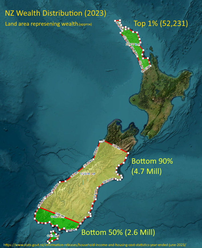
This doesn't look like. If the top 1% is only 52 thousand people and the bottom 90% is 5.4 million people the areas don't look right.
The areas don't reflect the population, it reflects the wealth of that percentage of the population. Using the map is just so fun way to represent the values.
So, bottom of the south is the total wealth of the bottom 50% of the population (2.6m). From Kaikoura north is the wealth of the top 10% with the Auckland/Northland representing just the 1% (around 52k people) who own about the same as the bottom 50%
I get what you are trying to do but it still doesn't look right to my eyes. Maybe you should have just stuck to bar graphs.